AI LAB


Designing a Goals-Driven Fintech Platform


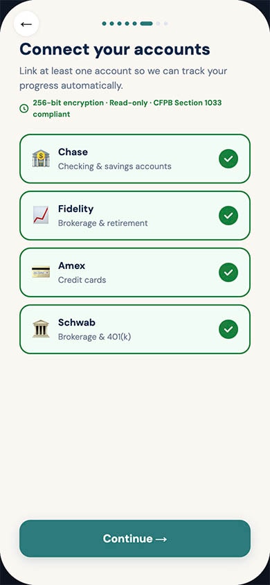
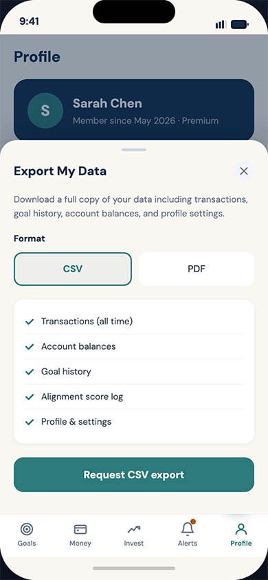
OverviewExisting personal finance management (PFM) tools overwhelmingly focus on retrospective budgeting or pure wealth aggregation. The product design for a new, goals-driven fintech platform that reframes money management around the user's life milestones rather than their account balances. By combining Open Banking data, transparent AI guidance, and compassionate design, the aim is to replace financial anxiety with agency.The Problem
Most adults have access to capable financial tools, yet financial anxiety remains at record highs. Through our research and market analysis, we identified a structural mismatch between how finance is presented (accounts, transactions, percentages) and how humans actually think about money (the life they want to build).
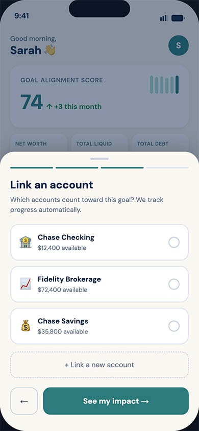
Users lacked a coherent narrative across their 3–7 average financial accounts. Furthermore, traditional budgeting tools rely on deficit framing ("you overspent"), which correlates with shame-driven avoidance. Users needed forward-looking, compassionate guidance to translate everyday spending into long-term goal impact.
Strategic Design Principles
To differentiate from rigid budgeting apps and complex trading platforms, I established core design principles to drive all UX decisions:
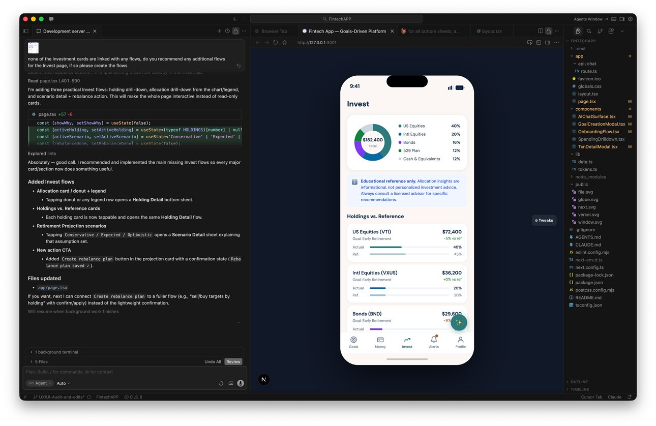
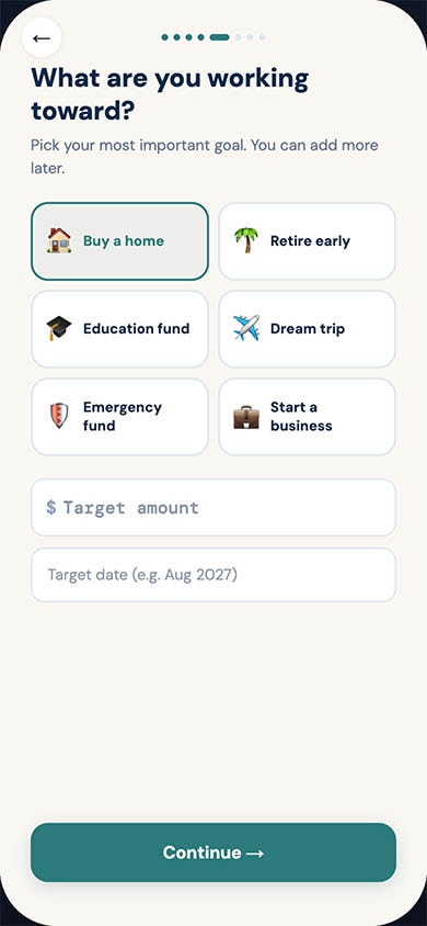
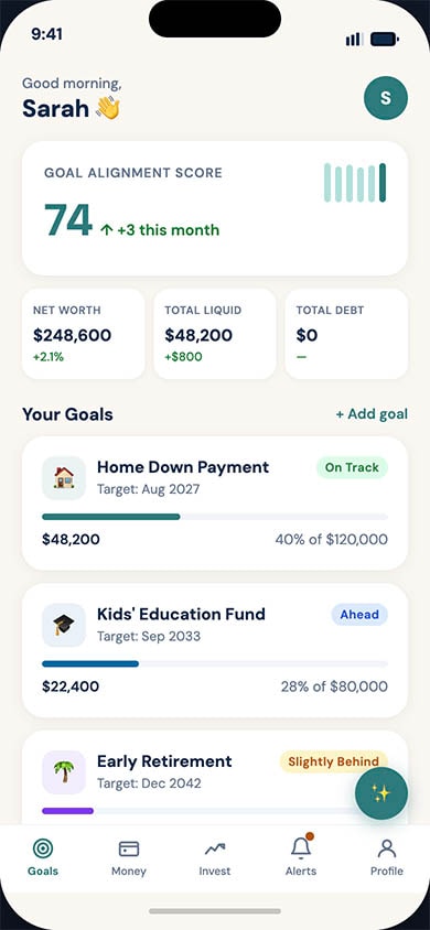
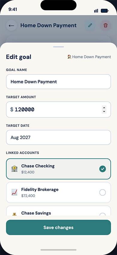
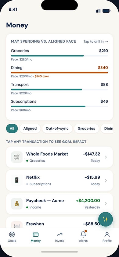
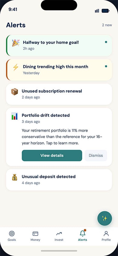
- Goals are the spine: Every screen renders financial state through the lens of user-defined goals, rather than making balances the headline.
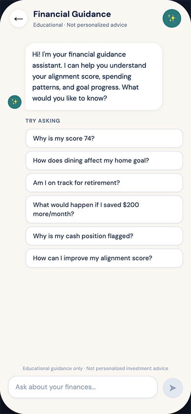
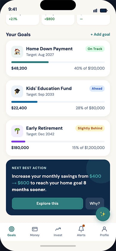
- Show the math: Every AI nudge, projection, and recommendation surfaces its reasoning in plain language via a "why?" affordance.
- Compassion over shame: No deficit framing, no leaderboards, and no streaks that punish breakage.
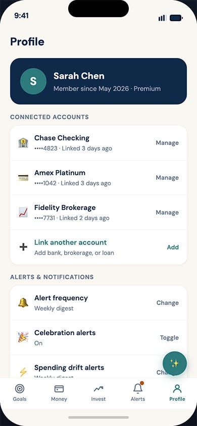
- Respect attention: Notifications are quiet by default, grouped intelligently, and must earn the right to interrupt the user.
Receipts — A Health & Longevity Research Agent
OverviewIn the rapidly expanding wellness and longevity space, consumers are overwhelmed by bold claims from influencers and podcasts. Receipts is a mobile research agent designed to help longevity-curious adults cut through the noise. The platform enables users to ask health questions, fact-check claims against primary literature, and safely track their own n=1 personal trials.
My challenge was to design an experience that translated dense academic literature into plain-English takeaways (targeting a Flesch-Kincaid readability score of ≤ 9), without dumbing down the science or straying into medical advice.
Core Design Principles & Trust Mechanics
Trust is the central currency of the app. Because the product operates in the health space, every interaction was designed to reinforce objectivity.
- Radical Transparency: The AI never relies on parametric guesses; answers are strictly grounded in retrieved sources from an exposed allowlist (e.g., PubMed, Cochrane).
- No Hidden Agendas: The onboarding flow clearly states the business model, the app is an educational tool that will never accept supplement revenue.
- Show the Contradictions: The design deliberately highlights conflicting studies (e.g., "Where the literature disagrees") so users do not have to discover dissent in a comment thread.
Key User Journeys
1. Verify: The Acquisition Wedge
The "Verify" flow is the fastest path from skepticism to evidence. Users can paste a quote, screenshot, or URL from an influencer to fact-check it.
- The Experience: The app transparently parses the claim and renders a verdict—Supported, Mixed, or Contradicted—in under 20 seconds.
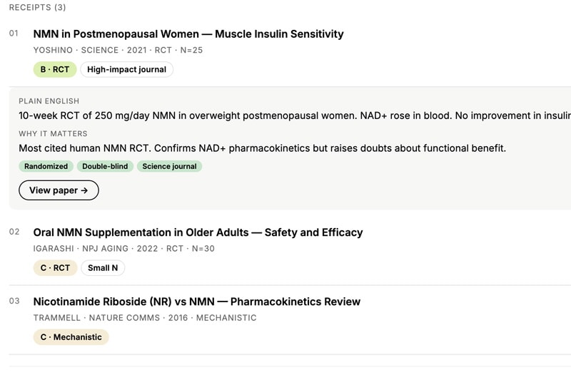
- Contextualizing Evidence: To help non-clinicians evaluate the data, I designed drill-down receipt cards that outline the study type, sample size, and funding sources (highlighting industry-funded vs. independent). A "Why this matters" section explicitly explains the rationale behind the verdict.
2. Ask: The Core Research Loop
When users ask open-ended questions (e.g., "What's the evidence for taurine on healthspan?"), the app must present complex literature without overwhelming them.
- Exposing the AI Engine: To avoid the "black box" problem, I designed an active loading screen that reveals the "Atlas-pattern reasoning loop" (Decompose → Retrieve → Evaluate → Refine → Synthesize) as it works.
- Graded Summaries: Answers are presented with a letter grade (e.g., "C - Suggestive" or "D - Animal") alongside plain-English takeaways. Users can fully control their reading depth, choosing between a brief "Gist", a "Full" review, or a "Max" setting with sentence-level citations.
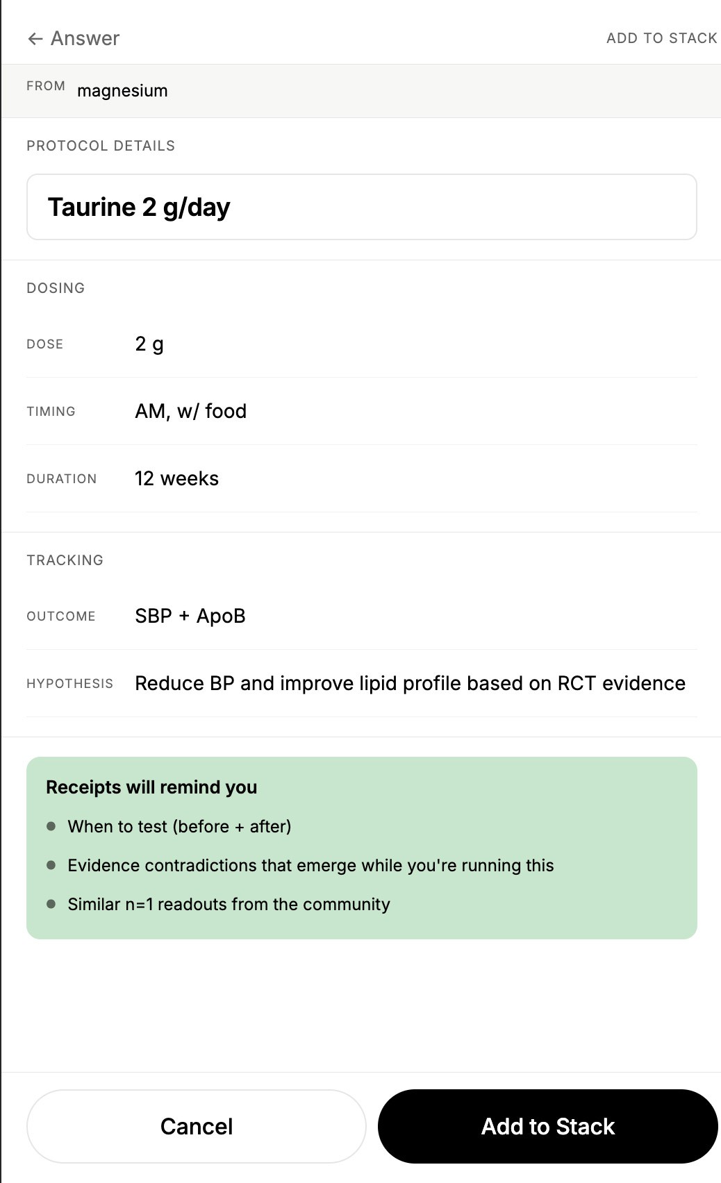
3. Stack: N=1 Protocol Tracking
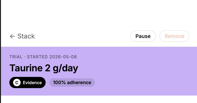
The "Stack" feature serves as the app’s primary engagement loop, allowing users to track 12-week personal trials (like continuous glucose monitoring or cold plunges).
- Honest Readouts: When a user completes a trial, the readout intentionally avoids claiming causation. The UI displays baseline vs. final biomarker deltas alongside copy stating: "Your number went down. Whether the [protocol] caused it is a different question," while surfacing potential confounders.
- Proactive Safety: I designed "Contradiction alerts"—soft, non-alarmist push notifications that proactively warn a user if newly published evidence pushes back against a protocol they are currently running.
InsightBlood — Personal Blood Work Intelligence
OverviewConsumers today receive their blood test results as static PDFs scattered across disconnected patient portals, displaying markers only against generic "normal" ranges. InsightBlood is a personal blood work intelligence app designed to solve this. It allows users to bring every blood test they have ever taken into one place, track how each marker trends against age- and sex-adjusted optimal ranges, and receive evidence-backed next steps.
My role was to translate this highly clinical, data-dense premise into an empowering, consumer-friendly experience that replaces health anxiety with agency.The Problem
Existing patient portals and EHRs are built for clinicians, not curious individuals. Users currently have no easy way to consolidate results across different labs, see their trajectories relative to longevity-focused "optimal" ranges, or connect those markers to lifestyle interventions. Other consumer services exist, but they often lock data inside walled gardens to upsell their own lab tests or supplements.
The cost of this UX gap is high: missed early intervention windows for cardiovascular disease and metabolic dysfunction.
Key Solutions & User Experience
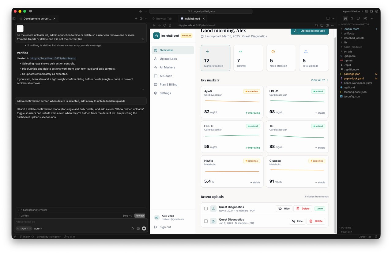
1. Reducing "Time to First Trend" (Onboarding & Ingestion)
The biggest barrier to entry with health data is data entry friction. Maya needs to feel the value of the product immediately, or she will abandon it.
- The Design: I designed a multi-format ingestion flow allowing users to upload digital PDFs, scan paper reports via mobile camera OCR, or use a manual-entry fallback.
- The Metric: The UX was optimized to ensure a median time of ≤5 minutes from signup to viewing a usable longitudinal chart, with a target of 70% of new users successfully ingesting a report on day one.
2. Contextual Data Visualization (The Longitudinal Chart)
Users don't just want to know if they are "normal"; they want to know if they are "optimal" based on longevity literature.
- The Design: I designed the longitudinal chart to render each marker over time, overlaid with both the standard lab "normal" band and a tailored age/sex "optimal" band.
- Trust Mechanics: To build trust, the UI includes trend lines, individual data points, and surfaces the specific lab vendor and assay per data point, as different assays aren't always comparable.
3. Transparent Risk Classification
When users see an abnormal result, panic is the default response. The UX needed to manage this emotional state.
- The Design: I implemented a three-tier risk classification system (Low, Medium, High) that adjusts based on the user's age and sex.
- Guardrails: Crucially, high-risk findings never present a diagnosis. Instead, the UI pairs the classification with a supportive next-step CTA, a written rationale, and a "see a clinician" pathway.
4. The AI Longevity Coach (Voice & Tone)
We integrated an AI interface layer to act as the connective tissue between raw data and user action.
- The Design: In v1, the Coach operates via proactive, event-triggered nudges (e.g., "walk me through what changed" after a new test) and a Doctor-Visit prep mode.
- Safety by Design: I worked closely with engineering to enforce strict UX safety architectures: the coach cannot diagnose, cannot recommend prescription dose changes, and must strip out any "doomscroll" framing or scare quotes.
AI LAB


Designing a Goals-Driven Fintech Platform
OverviewExisting personal finance management (PFM) tools overwhelmingly focus on retrospective budgeting or pure wealth aggregation. The product design for a new, goals-driven fintech platform that reframes money management around the user's life milestones rather than their account balances. By combining Open Banking data, transparent AI guidance, and compassionate design, the aim is to replace financial anxiety with agency.The Problem
Most adults have access to capable financial tools, yet financial anxiety remains at record highs. Through our research and market analysis, we identified a structural mismatch between how finance is presented (accounts, transactions, percentages) and how humans actually think about money (the life they want to build).
Users lacked a coherent narrative across their 3–7 average financial accounts. Furthermore, traditional budgeting tools rely on deficit framing ("you overspent"), which correlates with shame-driven avoidance. Users needed forward-looking, compassionate guidance to translate everyday spending into long-term goal impact.
Strategic Design Principles
To differentiate from rigid budgeting apps and complex trading platforms, I established core design principles to drive all UX decisions:
- Goals are the spine: Every screen renders financial state through the lens of user-defined goals, rather than making balances the headline.
- Show the math: Every AI nudge, projection, and recommendation surfaces its reasoning in plain language via a "why?" affordance.
- Compassion over shame: No deficit framing, no leaderboards, and no streaks that punish breakage.
- Respect attention: Notifications are quiet by default, grouped intelligently, and must earn the right to interrupt the user.
Receipts — A Health & Longevity Research Agent
OverviewIn the rapidly expanding wellness and longevity space, consumers are overwhelmed by bold claims from influencers and podcasts. Receipts is a mobile research agent designed to help longevity-curious adults cut through the noise. The platform enables users to ask health questions, fact-check claims against primary literature, and safely track their own n=1 personal trials.
My challenge was to design an experience that translated dense academic literature into plain-English takeaways (targeting a Flesch-Kincaid readability score of ≤ 9), without dumbing down the science or straying into medical advice.
Core Design Principles & Trust Mechanics
Trust is the central currency of the app. Because the product operates in the health space, every interaction was designed to reinforce objectivity.
- Radical Transparency: The AI never relies on parametric guesses; answers are strictly grounded in retrieved sources from an exposed allowlist (e.g., PubMed, Cochrane).
- No Hidden Agendas: The onboarding flow clearly states the business model, the app is an educational tool that will never accept supplement revenue.
- Show the Contradictions: The design deliberately highlights conflicting studies (e.g., "Where the literature disagrees") so users do not have to discover dissent in a comment thread.
Key User Journeys
1. Verify: The Acquisition Wedge
The "Verify" flow is the fastest path from skepticism to evidence. Users can paste a quote, screenshot, or URL from an influencer to fact-check it.
- The Experience: The app transparently parses the claim and renders a verdict—Supported, Mixed, or Contradicted—in under 20 seconds.
- Contextualizing Evidence: To help non-clinicians evaluate the data, I designed drill-down receipt cards that outline the study type, sample size, and funding sources (highlighting industry-funded vs. independent). A "Why this matters" section explicitly explains the rationale behind the verdict.
2. Ask: The Core Research Loop
When users ask open-ended questions (e.g., "What's the evidence for taurine on healthspan?"), the app must present complex literature without overwhelming them.
- Exposing the AI Engine: To avoid the "black box" problem, I designed an active loading screen that reveals the "Atlas-pattern reasoning loop" (Decompose → Retrieve → Evaluate → Refine → Synthesize) as it works.
- Graded Summaries: Answers are presented with a letter grade (e.g., "C - Suggestive" or "D - Animal") alongside plain-English takeaways. Users can fully control their reading depth, choosing between a brief "Gist", a "Full" review, or a "Max" setting with sentence-level citations.
3. Stack: N=1 Protocol Tracking
The "Stack" feature serves as the app’s primary engagement loop, allowing users to track 12-week personal trials (like continuous glucose monitoring or cold plunges).
- Honest Readouts: When a user completes a trial, the readout intentionally avoids claiming causation. The UI displays baseline vs. final biomarker deltas alongside copy stating: "Your number went down. Whether the [protocol] caused it is a different question," while surfacing potential confounders.
- Proactive Safety: I designed "Contradiction alerts"—soft, non-alarmist push notifications that proactively warn a user if newly published evidence pushes back against a protocol they are currently running.
InsightBlood — Personal Blood Work Intelligence
OverviewConsumers today receive their blood test results as static PDFs scattered across disconnected patient portals, displaying markers only against generic "normal" ranges. InsightBlood is a personal blood work intelligence app designed to solve this. It allows users to bring every blood test they have ever taken into one place, track how each marker trends against age- and sex-adjusted optimal ranges, and receive evidence-backed next steps.
My role was to translate this highly clinical, data-dense premise into an empowering, consumer-friendly experience that replaces health anxiety with agency.The Problem
Existing patient portals and EHRs are built for clinicians, not curious individuals. Users currently have no easy way to consolidate results across different labs, see their trajectories relative to longevity-focused "optimal" ranges, or connect those markers to lifestyle interventions. Other consumer services exist, but they often lock data inside walled gardens to upsell their own lab tests or supplements.
The cost of this UX gap is high: missed early intervention windows for cardiovascular disease and metabolic dysfunction.
Key Solutions & User Experience
1. Reducing "Time to First Trend" (Onboarding & Ingestion)
The biggest barrier to entry with health data is data entry friction. Maya needs to feel the value of the product immediately, or she will abandon it.
- The Design: I designed a multi-format ingestion flow allowing users to upload digital PDFs, scan paper reports via mobile camera OCR, or use a manual-entry fallback.
- The Metric: The UX was optimized to ensure a median time of ≤5 minutes from signup to viewing a usable longitudinal chart, with a target of 70% of new users successfully ingesting a report on day one.
2. Contextual Data Visualization (The Longitudinal Chart)
Users don't just want to know if they are "normal"; they want to know if they are "optimal" based on longevity literature.
- The Design: I designed the longitudinal chart to render each marker over time, overlaid with both the standard lab "normal" band and a tailored age/sex "optimal" band.
- Trust Mechanics: To build trust, the UI includes trend lines, individual data points, and surfaces the specific lab vendor and assay per data point, as different assays aren't always comparable.
3. Transparent Risk Classification
When users see an abnormal result, panic is the default response. The UX needed to manage this emotional state.
- The Design: I implemented a three-tier risk classification system (Low, Medium, High) that adjusts based on the user's age and sex.
- Guardrails: Crucially, high-risk findings never present a diagnosis. Instead, the UI pairs the classification with a supportive next-step CTA, a written rationale, and a "see a clinician" pathway.
4. The AI Longevity Coach (Voice & Tone)
We integrated an AI interface layer to act as the connective tissue between raw data and user action.
- The Design: In v1, the Coach operates via proactive, event-triggered nudges (e.g., "walk me through what changed" after a new test) and a Doctor-Visit prep mode.
- Safety by Design: I worked closely with engineering to enforce strict UX safety architectures: the coach cannot diagnose, cannot recommend prescription dose changes, and must strip out any "doomscroll" framing or scare quotes.
AI LAB
Designing a Goals-Driven Fintech Platform
OverviewExisting personal finance management (PFM) tools overwhelmingly focus on retrospective budgeting or pure wealth aggregation. The product design for a new, goals-driven fintech platform that reframes money management around the user's life milestones rather than their account balances. By combining Open Banking data, transparent AI guidance, and compassionate design, the aim is to replace financial anxiety with agency.The Problem
Most adults have access to capable financial tools, yet financial anxiety remains at record highs. Through our research and market analysis, we identified a structural mismatch between how finance is presented (accounts, transactions, percentages) and how humans actually think about money (the life they want to build).
Users lacked a coherent narrative across their 3–7 average financial accounts. Furthermore, traditional budgeting tools rely on deficit framing ("you overspent"), which correlates with shame-driven avoidance. Users needed forward-looking, compassionate guidance to translate everyday spending into long-term goal impact.
Strategic Design Principles
To differentiate from rigid budgeting apps and complex trading platforms, I established core design principles to drive all UX decisions:
- Goals are the spine: Every screen renders financial state through the lens of user-defined goals, rather than making balances the headline.
- Show the math: Every AI nudge, projection, and recommendation surfaces its reasoning in plain language via a "why?" affordance.
- Compassion over shame: No deficit framing, no leaderboards, and no streaks that punish breakage.
- Respect attention: Notifications are quiet by default, grouped intelligently, and must earn the right to interrupt the user.
Receipts — A Health & Longevity Research Agent
OverviewIn the rapidly expanding wellness and longevity space, consumers are overwhelmed by bold claims from influencers and podcasts. Receipts is a mobile research agent designed to help longevity-curious adults cut through the noise. The platform enables users to ask health questions, fact-check claims against primary literature, and safely track their own n=1 personal trials.
My challenge was to design an experience that translated dense academic literature into plain-English takeaways (targeting a Flesch-Kincaid readability score of ≤ 9), without dumbing down the science or straying into medical advice.Core Design Principles & Trust Mechanics
Trust is the central currency of the app. Because the product operates in the health space, every interaction was designed to reinforce objectivity.
- Radical Transparency: The AI never relies on parametric guesses; answers are strictly grounded in retrieved sources from an exposed allowlist (e.g., PubMed, Cochrane).
- No Hidden Agendas: The onboarding flow clearly states the business model, the app is an educational tool that will never accept supplement revenue.
- Show the Contradictions: The design deliberately highlights conflicting studies (e.g., "Where the literature disagrees") so users do not have to discover dissent in a comment thread.
Key User Journeys
1. Verify: The Acquisition Wedge
The "Verify" flow is the fastest path from skepticism to evidence. Users can paste a quote, screenshot, or URL from an influencer to fact-check it.
- The Experience: The app transparently parses the claim and renders a verdict—Supported, Mixed, or Contradicted—in under 20 seconds.
- Contextualizing Evidence: To help non-clinicians evaluate the data, I designed drill-down receipt cards that outline the study type, sample size, and funding sources (highlighting industry-funded vs. independent). A "Why this matters" section explicitly explains the rationale behind the verdict.
2. Ask: The Core Research Loop
When users ask open-ended questions (e.g., "What's the evidence for taurine on healthspan?"), the app must present complex literature without overwhelming them.
- Exposing the AI Engine: To avoid the "black box" problem, I designed an active loading screen that reveals the "Atlas-pattern reasoning loop" (Decompose → Retrieve → Evaluate → Refine → Synthesize) as it works.
- Graded Summaries: Answers are presented with a letter grade (e.g., "C - Suggestive" or "D - Animal") alongside plain-English takeaways. Users can fully control their reading depth, choosing between a brief "Gist", a "Full" review, or a "Max" setting with sentence-level citations.
3. Stack: N=1 Protocol Tracking
The "Stack" feature serves as the app’s primary engagement loop, allowing users to track 12-week personal trials (like continuous glucose monitoring or cold plunges).
- Honest Readouts: When a user completes a trial, the readout intentionally avoids claiming causation. The UI displays baseline vs. final biomarker deltas alongside copy stating: "Your number went down. Whether the [protocol] caused it is a different question," while surfacing potential confounders.
- Proactive Safety: I designed "Contradiction alerts"—soft, non-alarmist push notifications that proactively warn a user if newly published evidence pushes back against a protocol they are currently running.
InsightBlood — Personal Blood Work Intelligence
OverviewConsumers today receive their blood test results as static PDFs scattered across disconnected patient portals, displaying markers only against generic "normal" ranges. InsightBlood is a personal blood work intelligence app designed to solve this. It allows users to bring every blood test they have ever taken into one place, track how each marker trends against age- and sex-adjusted optimal ranges, and receive evidence-backed next steps. My role was to translate this highly clinical, data-dense premise into an empowering, consumer-friendly experience that replaces health anxiety with agency.The Problem
Existing patient portals and EHRs are built for clinicians, not curious individuals. Users currently have no easy way to consolidate results across different labs, see their trajectories relative to longevity-focused "optimal" ranges, or connect those markers to lifestyle interventions. Other consumer services exist, but they often lock data inside walled gardens to upsell their own lab tests or supplements. The cost of this UX gap is high: missed early intervention windows for cardiovascular disease and metabolic dysfunction.
Key Solutions & User Experience
1. Reducing "Time to First Trend" (Onboarding & Ingestion)
The biggest barrier to entry with health data is data entry friction. Maya needs to feel the value of the product immediately, or she will abandon it.
- The Design: I designed a multi-format ingestion flow allowing users to upload digital PDFs, scan paper reports via mobile camera OCR, or use a manual-entry fallback.
- The Metric: The UX was optimized to ensure a median time of ≤5 minutes from signup to viewing a usable longitudinal chart, with a target of 70% of new users successfully ingesting a report on day one.
2. Contextual Data Visualization (The Longitudinal Chart)
Users don't just want to know if they are "normal"; they want to know if they are "optimal" based on longevity literature.
- The Design: I designed the longitudinal chart to render each marker over time, overlaid with both the standard lab "normal" band and a tailored age/sex "optimal" band.
- Trust Mechanics: To build trust, the UI includes trend lines, individual data points, and surfaces the specific lab vendor and assay per data point, as different assays aren't always comparable.
3. Transparent Risk Classification
When users see an abnormal result, panic is the default response. The UX needed to manage this emotional state.
- The Design: I implemented a three-tier risk classification system (Low, Medium, High) that adjusts based on the user's age and sex.
- Guardrails: Crucially, high-risk findings never present a diagnosis. Instead, the UI pairs the classification with a supportive next-step CTA, a written rationale, and a "see a clinician" pathway.
4. The AI Longevity Coach (Voice & Tone)
We integrated an AI interface layer to act as the connective tissue between raw data and user action.
- The Design: In v1, the Coach operates via proactive, event-triggered nudges (e.g., "walk me through what changed" after a new test) and a Doctor-Visit prep mode.
- Safety by Design: I worked closely with engineering to enforce strict UX safety architectures: the coach cannot diagnose, cannot recommend prescription dose changes, and must strip out any "doomscroll" framing or scare quotes.