PATENTS

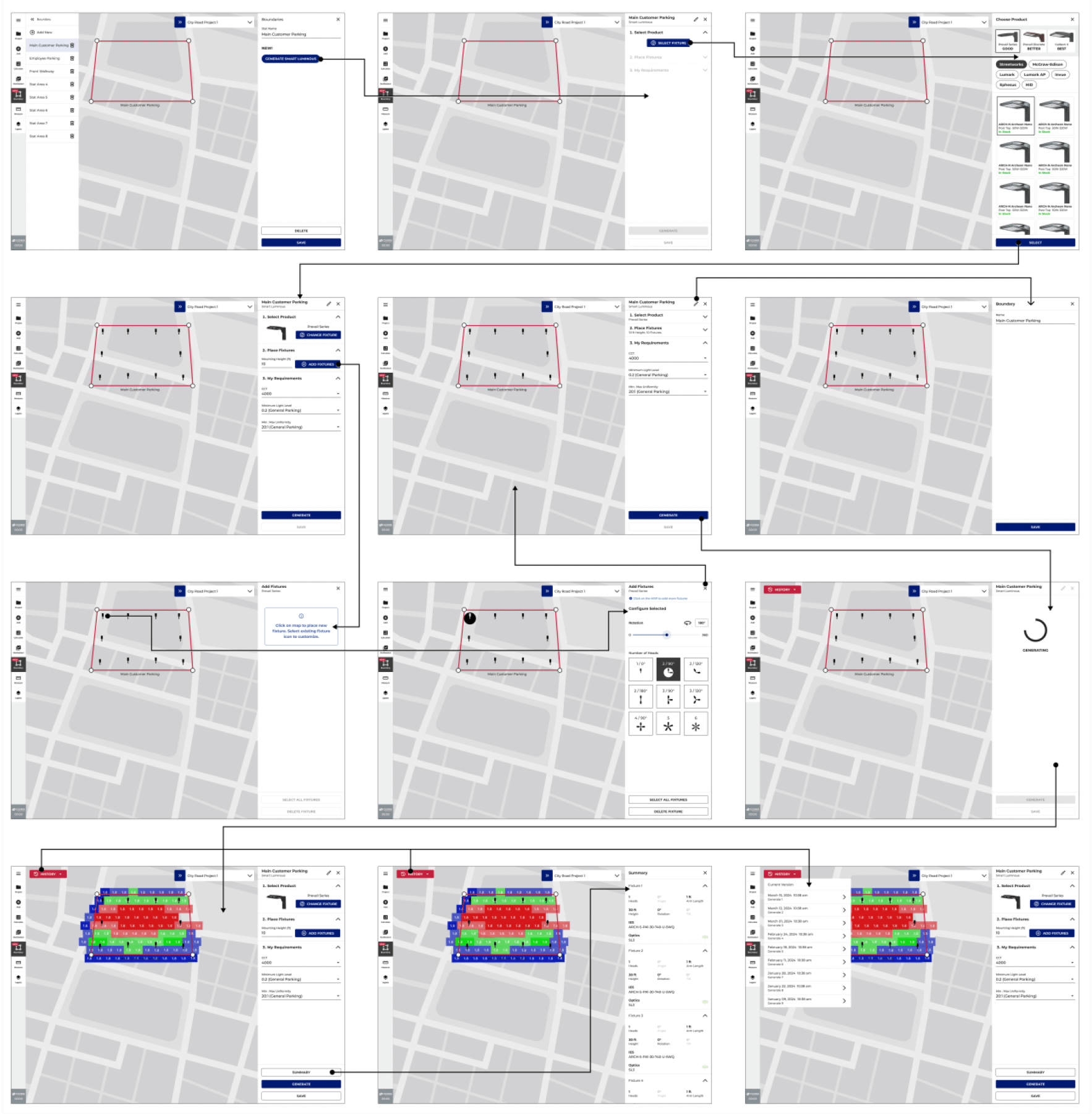
Guided Lighting DesignA lighting design method includes receiving a map of a geographic area and displaying the map of the geographic area on a screen. The method includes displaying a boundary line overlaid on the map in response to a boundary line user input provided to the user device, where a lighting design target area is bound by the boundary line. The method includes displaying a light fixture model overlaid on the map within the lighting design target area, where the light fixture model is overlaid at a location indicated by a location indicator user input and where the light fixture model represents a light fixture selected from a light fixture menu. The method further includes generating illuminance information at least based on user provided information including a configuration of the light fixture and displaying, by the user device, the illuminance information overlaid on the lighting design target area.
Patent HistoryPublication number: 20260057124Type: ApplicationFiled: Aug 14, 2025Publication Date: Feb 26, 2026Inventors: NAM CHIN CHO (PEACHTREE CITY, GA), ROBERT BABIARZ (MISSISSAUGA), SANDYA BALAKRISHNAN (ATLANTA, GA), KAITLIN BURKE (ATLANTA, GA), CAROL CARR-ADAMS (ATLANTA, GA), TRAVIS JOHNSON (FAYETTEVILLE, TN)Application Number: 19/299,696
SEE PATENT

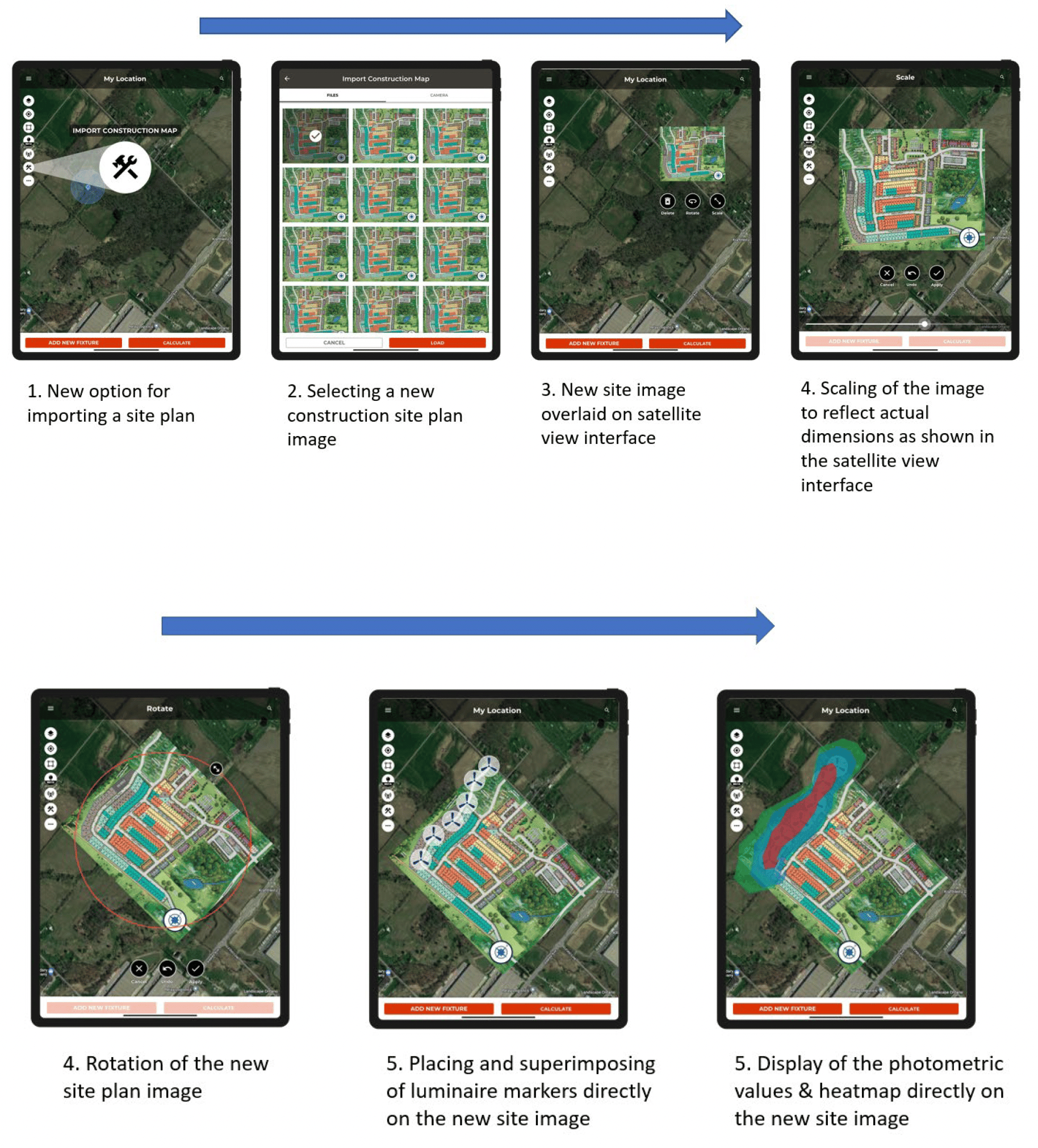
Lighting Design of New Outdoor SiteA lighting design method for outdoor areas based on light fixture model augmentation includes displaying a satellite view image of an area on a display screen. The method further includes displaying a site plan image on the display screen, where the site plan image is displayed overlaid on the satellite view image that is displayed on the display screen. The method also includes displaying a light fixture model, where the light fixture model is augmented onto the site plan image displayed on the display screen. The method further includes generating illuminance information based on at least one or more parameters associated with a light fixture represented by the light fixture model and displaying the illuminance information on the display screen, where the illuminance information is displayed overlaid on the site plan image.
Patent HistoryPublication number: 20240249035Type: ApplicationFiled: Jan 24, 2023Publication Date: Jul 25, 2024Inventors: NAM CHIN CHO (PEACHTREE CITY, GA), KAITLIN BURKE (ATLANTA, GA), ROBERT BABIARZ (MISSISSAUGA)Application Number: 18/100,884
SEE PATENT
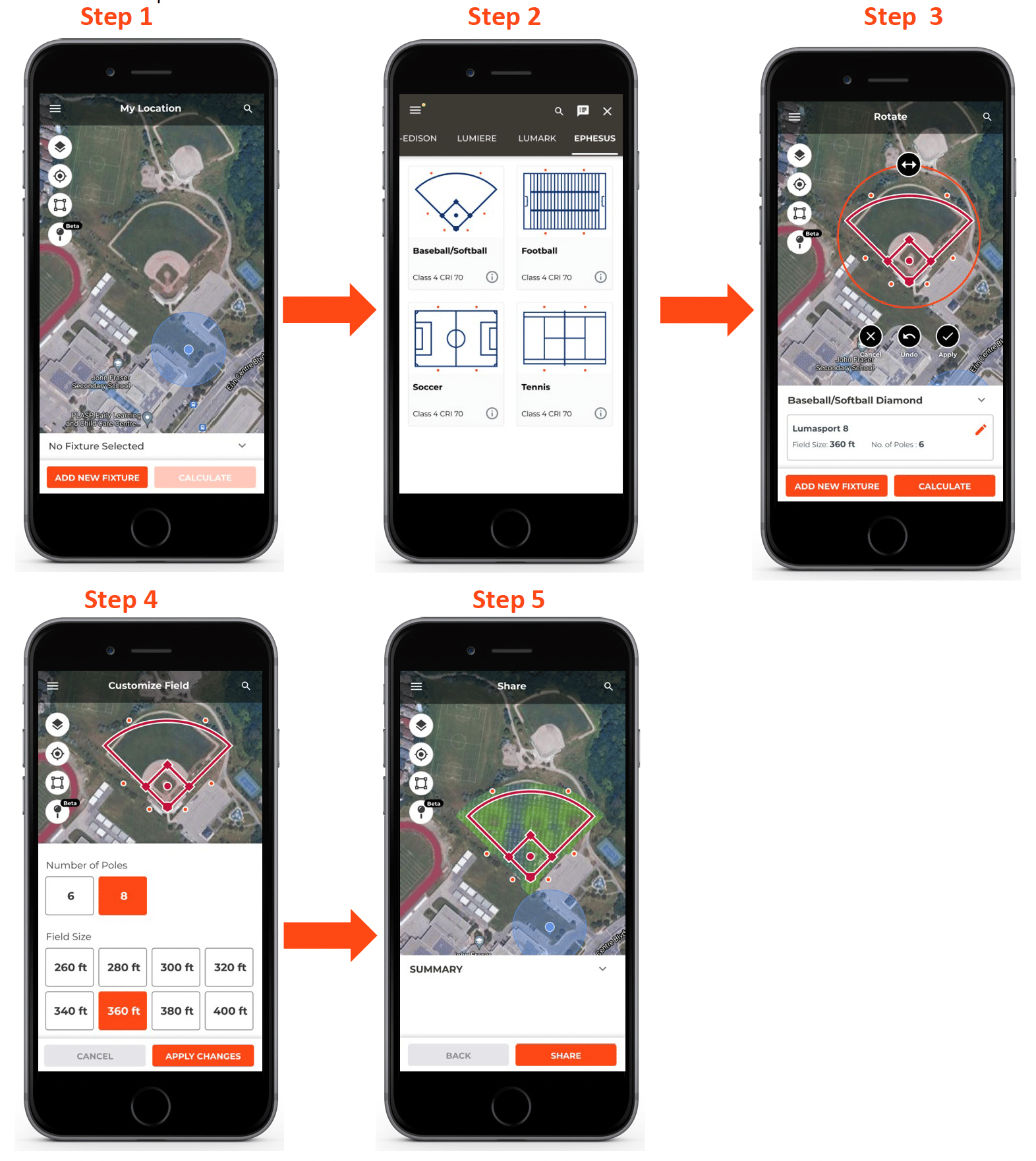
Template-Based Lighting DesignA template-based lighting design method includes displaying, by a user device, a satellite view image on a display screen, wherein the satellite view image includes a sports area. The method further includes displaying, by the user device, a lighting design template on the display screen, where the lighting design template is overlaid on the sports area, where the lighting design template includes a template frame and one or more light pole markers, where each light pole marker of the one or more light pole markers corresponds to a light pole and one or more light fixtures attached to the light pole, and where the template frame matches an outline of the sports area. The method also includes identifying an existing lighting design based on the lighting design template and parameters associated with the lighting design template.
Patent HistoryPublication number: 20230281351Type: ApplicationFiled: Mar 2, 2023Publication Date: Sep 7, 2023Inventors: KAITLIN BURKE (ATLANTA, GA), NAM CHIN CHO (PEACHTREE CITY, GA), WALTEN PETER OWENS (MANLIUS, NY), ROBERT BABIARZ (MISSISSAUGA), PARTH JOSHI (ATLANTA, GA)Application Number: 18/116,350
SEE PATENT

1 PATENT PENDING
PATENTS
Guided Lighting DesignA lighting design method includes receiving a map of a geographic area and displaying the map of the geographic area on a screen. The method includes displaying a boundary line overlaid on the map in response to a boundary line user input provided to the user device, where a lighting design target area is bound by the boundary line. The method includes displaying a light fixture model overlaid on the map within the lighting design target area, where the light fixture model is overlaid at a location indicated by a location indicator user input and where the light fixture model represents a light fixture selected from a light fixture menu. The method further includes generating illuminance information at least based on user provided information including a configuration of the light fixture and displaying, by the user device, the illuminance information overlaid on the lighting design target area.
Patent HistoryPublication number: 20260057124Type: ApplicationFiled: Aug 14, 2025Publication Date: Feb 26, 2026Inventors: NAM CHIN CHO (PEACHTREE CITY, GA), ROBERT BABIARZ (MISSISSAUGA), SANDYA BALAKRISHNAN (ATLANTA, GA), KAITLIN BURKE (ATLANTA, GA), CAROL CARR-ADAMS (ATLANTA, GA), TRAVIS JOHNSON (FAYETTEVILLE, TN)Application Number: 19/299,696
SEE PATENT
Lighting Design of New Outdoor SiteA lighting design method for outdoor areas based on light fixture model augmentation includes displaying a satellite view image of an area on a display screen. The method further includes displaying a site plan image on the display screen, where the site plan image is displayed overlaid on the satellite view image that is displayed on the display screen. The method also includes displaying a light fixture model, where the light fixture model is augmented onto the site plan image displayed on the display screen. The method further includes generating illuminance information based on at least one or more parameters associated with a light fixture represented by the light fixture model and displaying the illuminance information on the display screen, where the illuminance information is displayed overlaid on the site plan image.
Patent HistoryPublication number: 20240249035Type: ApplicationFiled: Jan 24, 2023Publication Date: Jul 25, 2024Inventors: NAM CHIN CHO (PEACHTREE CITY, GA), KAITLIN BURKE (ATLANTA, GA), ROBERT BABIARZ (MISSISSAUGA)Application Number: 18/100,884
SEE PATENT
Template-Based Lighting DesignA template-based lighting design method includes displaying, by a user device, a satellite view image on a display screen, wherein the satellite view image includes a sports area. The method further includes displaying, by the user device, a lighting design template on the display screen, where the lighting design template is overlaid on the sports area, where the lighting design template includes a template frame and one or more light pole markers, where each light pole marker of the one or more light pole markers corresponds to a light pole and one or more light fixtures attached to the light pole, and where the template frame matches an outline of the sports area. The method also includes identifying an existing lighting design based on the lighting design template and parameters associated with the lighting design template.
Patent HistoryPublication number: 20230281351Type: ApplicationFiled: Mar 2, 2023Publication Date: Sep 7, 2023Inventors: KAITLIN BURKE (ATLANTA, GA), NAM CHIN CHO (PEACHTREE CITY, GA), WALTEN PETER OWENS (MANLIUS, NY), ROBERT BABIARZ (MISSISSAUGA), PARTH JOSHI (ATLANTA, GA)Application Number: 18/116,350
SEE PATENT

1 PATENT PENDING