InsightBlood — Personal Blood Work Intelligence
OverviewConsumers today receive their blood test results as static PDFs scattered across disconnected patient portals, displaying markers only against generic "normal" ranges. InsightBlood is a personal blood work intelligence app designed to solve this. It allows users to bring every blood test they have ever taken into one place, track how each marker trends against age- and sex-adjusted optimal ranges, and receive evidence-backed next steps.
My role was to translate this highly clinical, data-dense premise into an empowering, consumer-friendly experience that replaces health anxiety with agency.The Problem
Existing patient portals and EHRs are built for clinicians, not curious individuals. Users currently have no easy way to consolidate results across different labs, see their trajectories relative to longevity-focused "optimal" ranges, or connect those markers to lifestyle interventions. Other consumer services exist, but they often lock data inside walled gardens to upsell their own lab tests or supplements.
The cost of this UX gap is high: missed early intervention windows for cardiovascular disease and metabolic dysfunction.


Key Solutions & User Experience
1. Reducing "Time to First Trend" (Onboarding & Ingestion)
The biggest barrier to entry with health data is data entry friction. Maya needs to feel the value of the product immediately, or she will abandon it.
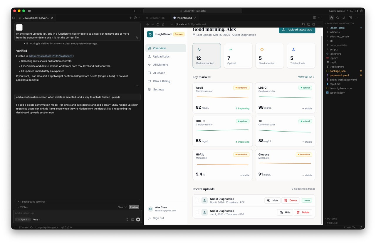
- The Design: I designed a multi-format ingestion flow allowing users to upload digital PDFs, scan paper reports via mobile camera OCR, or use a manual-entry fallback.
- The Metric: The UX was optimized to ensure a median time of ≤5 minutes from signup to viewing a usable longitudinal chart, with a target of 70% of new users successfully ingesting a report on day one.
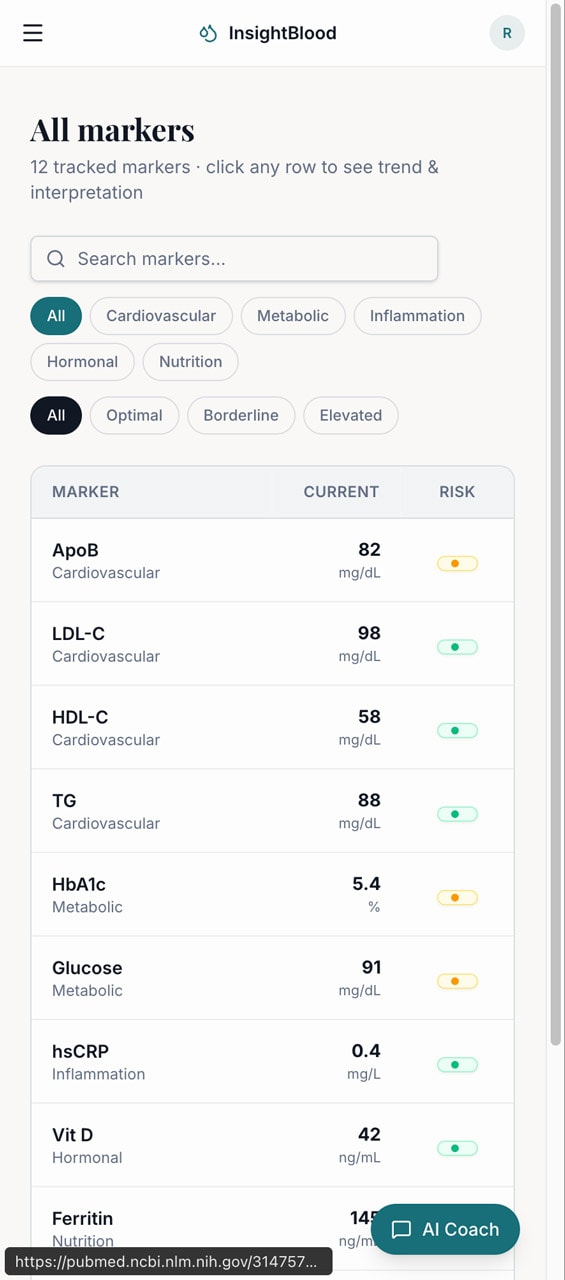
2. Contextual Data Visualization (The Longitudinal Chart)
Users don't just want to know if they are "normal"; they want to know if they are "optimal" based on longevity literature.
- The Design: I designed the longitudinal chart to render each marker over time, overlaid with both the standard lab "normal" band and a tailored age/sex "optimal" band.
- Trust Mechanics: To build trust, the UI includes trend lines, individual data points, and surfaces the specific lab vendor and assay per data point, as different assays aren't always comparable.
3. Transparent Risk Classification
When users see an abnormal result, panic is the default response. The UX needed to manage this emotional state.
- The Design: I implemented a three-tier risk classification system (Low, Medium, High) that adjusts based on the user's age and sex.
- Guardrails: Crucially, high-risk findings never present a diagnosis. Instead, the UI pairs the classification with a supportive next-step CTA, a written rationale, and a "see a clinician" pathway.
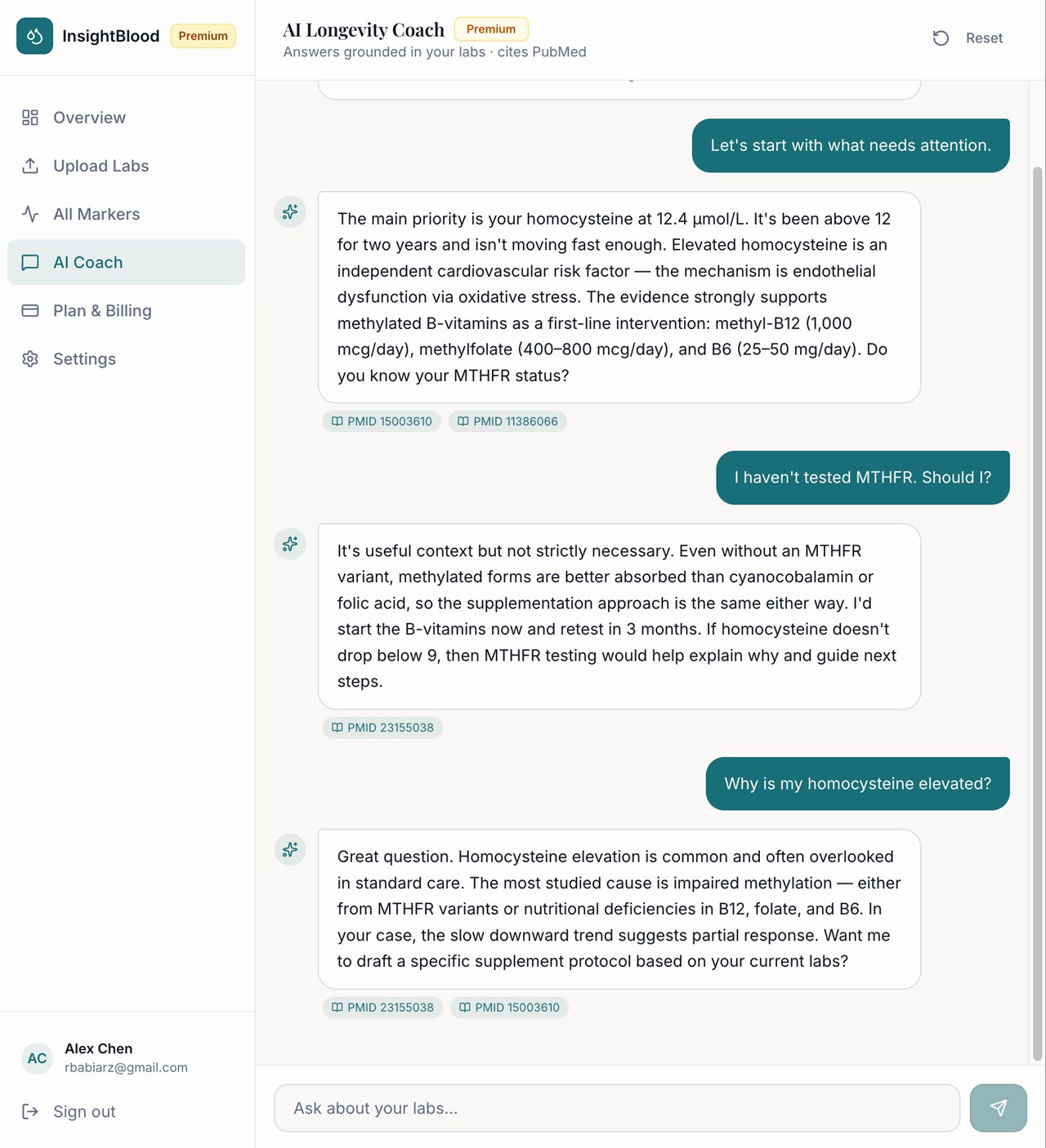
4. The AI Longevity Coach (Voice & Tone)
We integrated an AI interface layer to act as the connective tissue between raw data and user action.
- The Design: In v1, the Coach operates via proactive, event-triggered nudges (e.g., "walk me through what changed" after a new test) and a Doctor-Visit prep mode.
- Safety by Design: I worked closely with engineering to enforce strict UX safety architectures: the coach cannot diagnose, cannot recommend prescription dose changes, and must strip out any "doomscroll" framing or scare quotes.
InsightBlood — Personal Blood Work Intelligence
OverviewConsumers today receive their blood test results as static PDFs scattered across disconnected patient portals, displaying markers only against generic "normal" ranges. InsightBlood is a personal blood work intelligence app designed to solve this. It allows users to bring every blood test they have ever taken into one place, track how each marker trends against age- and sex-adjusted optimal ranges, and receive evidence-backed next steps.
My role was to translate this highly clinical, data-dense premise into an empowering, consumer-friendly experience that replaces health anxiety with agency.The Problem
Existing patient portals and EHRs are built for clinicians, not curious individuals. Users currently have no easy way to consolidate results across different labs, see their trajectories relative to longevity-focused "optimal" ranges, or connect those markers to lifestyle interventions. Other consumer services exist, but they often lock data inside walled gardens to upsell their own lab tests or supplements.
The cost of this UX gap is high: missed early intervention windows for cardiovascular disease and metabolic dysfunction.
Key Solutions & User Experience
1. Reducing "Time to First Trend" (Onboarding & Ingestion)
The biggest barrier to entry with health data is data entry friction. Maya needs to feel the value of the product immediately, or she will abandon it.
- The Design: I designed a multi-format ingestion flow allowing users to upload digital PDFs, scan paper reports via mobile camera OCR, or use a manual-entry fallback.
- The Metric: The UX was optimized to ensure a median time of ≤5 minutes from signup to viewing a usable longitudinal chart, with a target of 70% of new users successfully ingesting a report on day one.
2. Contextual Data Visualization (The Longitudinal Chart)
Users don't just want to know if they are "normal"; they want to know if they are "optimal" based on longevity literature.
- The Design: I designed the longitudinal chart to render each marker over time, overlaid with both the standard lab "normal" band and a tailored age/sex "optimal" band.
- Trust Mechanics: To build trust, the UI includes trend lines, individual data points, and surfaces the specific lab vendor and assay per data point, as different assays aren't always comparable.
3. Transparent Risk Classification
When users see an abnormal result, panic is the default response. The UX needed to manage this emotional state.
- The Design: I implemented a three-tier risk classification system (Low, Medium, High) that adjusts based on the user's age and sex.
- Guardrails: Crucially, high-risk findings never present a diagnosis. Instead, the UI pairs the classification with a supportive next-step CTA, a written rationale, and a "see a clinician" pathway.
4. The AI Longevity Coach (Voice & Tone)
We integrated an AI interface layer to act as the connective tissue between raw data and user action.
- The Design: In v1, the Coach operates via proactive, event-triggered nudges (e.g., "walk me through what changed" after a new test) and a Doctor-Visit prep mode.
- Safety by Design: I worked closely with engineering to enforce strict UX safety architectures: the coach cannot diagnose, cannot recommend prescription dose changes, and must strip out any "doomscroll" framing or scare quotes.
InsightBlood — Personal Blood Work Intelligence
OverviewConsumers today receive their blood test results as static PDFs scattered across disconnected patient portals, displaying markers only against generic "normal" ranges. InsightBlood is a personal blood work intelligence app designed to solve this. It allows users to bring every blood test they have ever taken into one place, track how each marker trends against age- and sex-adjusted optimal ranges, and receive evidence-backed next steps. My role was to translate this highly clinical, data-dense premise into an empowering, consumer-friendly experience that replaces health anxiety with agency.The Problem
Existing patient portals and EHRs are built for clinicians, not curious individuals. Users currently have no easy way to consolidate results across different labs, see their trajectories relative to longevity-focused "optimal" ranges, or connect those markers to lifestyle interventions. Other consumer services exist, but they often lock data inside walled gardens to upsell their own lab tests or supplements. The cost of this UX gap is high: missed early intervention windows for cardiovascular disease and metabolic dysfunction.
Key Solutions & User Experience
1. Reducing "Time to First Trend" (Onboarding & Ingestion)
The biggest barrier to entry with health data is data entry friction. Maya needs to feel the value of the product immediately, or she will abandon it.
- The Design: I designed a multi-format ingestion flow allowing users to upload digital PDFs, scan paper reports via mobile camera OCR, or use a manual-entry fallback.
- The Metric: The UX was optimized to ensure a median time of ≤5 minutes from signup to viewing a usable longitudinal chart, with a target of 70% of new users successfully ingesting a report on day one.
2. Contextual Data Visualization (The Longitudinal Chart)
Users don't just want to know if they are "normal"; they want to know if they are "optimal" based on longevity literature.
- The Design: I designed the longitudinal chart to render each marker over time, overlaid with both the standard lab "normal" band and a tailored age/sex "optimal" band.
- Trust Mechanics: To build trust, the UI includes trend lines, individual data points, and surfaces the specific lab vendor and assay per data point, as different assays aren't always comparable.
3. Transparent Risk Classification
When users see an abnormal result, panic is the default response. The UX needed to manage this emotional state.
- The Design: I implemented a three-tier risk classification system (Low, Medium, High) that adjusts based on the user's age and sex.
- Guardrails: Crucially, high-risk findings never present a diagnosis. Instead, the UI pairs the classification with a supportive next-step CTA, a written rationale, and a "see a clinician" pathway.
4. The AI Longevity Coach (Voice & Tone)
We integrated an AI interface layer to act as the connective tissue between raw data and user action.
- The Design: In v1, the Coach operates via proactive, event-triggered nudges (e.g., "walk me through what changed" after a new test) and a Doctor-Visit prep mode.
- Safety by Design: I worked closely with engineering to enforce strict UX safety architectures: the coach cannot diagnose, cannot recommend prescription dose changes, and must strip out any "doomscroll" framing or scare quotes.