Dynamic
Space Partitioning
Designing the industry's first mobile-capable partitioning UX for commercial connected lighting enabling hotels, conference centres, and schools to divide spaces and have their lighting automatically adapt in real time.
★
INDUSTRY FIRST, NO COMPARABLE MOBILE UX EXISTED IN CONNECTED LIGHTING

ROLE
Lead / Principal Enterprise Designer
COMPANY
Cooper Lighting Solutions (Signify)
PLATFORM
Mobile + Desktop
SCOPE
Research → Delivery
TEAM SIZE
15 Cross-functional
DESIGNED
2023-2024 - Figma

01
CONTENT
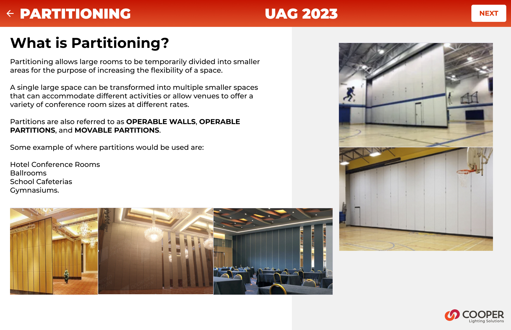
What is partitioning?
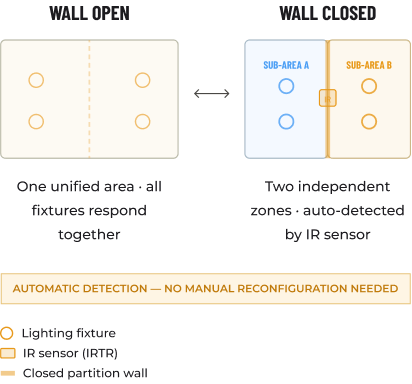
Commercial buildings routinely contain large open spaces with ballrooms, conference centres, school cafeterias, and training rooms that use operable partition walls to subdivide into smaller, independent rooms on demand.
When those walls move, everything about the space changes: occupancy, lighting needs, scene control, and privacy. Until now, lighting systems had no way to know the walls had moved, and no way to automatically adapt.
WaveLinx CORE Partitioning solves this. When a partition wall closes, an IR Transmitter/Receiver (IRTR) sensor at each wall detects the change and automatically reconfigures the lighting control topology with no human intervention required.
Each sub-space then behaves as a completely independent lighting zone: its own occupancy sensing, dimming curves, scene presets, and wall station scope.
1ST
Mobile partitioning UX in connected commercial lighting
40–60%
Reduction in on-site commissioning time cited by field teams
~90%
Reduction in API calls on partition area detail pages
11+
Critical usability issues resolved before a single line of code
3
New market segments won: hotel, education, enterprise campus
0
Manual steps required when a partition wall opens or closes
02
THE CHALLENGE
A new class of problem
Partitioning in commercial lighting is not a new concept, installers have been manually rewiring and reprogramming light controllers when rooms change configuration for decades. What was new was the expectation that a connected lighting platform should handle this automatically, and that the people configuring it as in electricians, lighting commissioning agents, and facilities managers would do so on whatever device they had in their pocket.
THE CORE PROBLEM
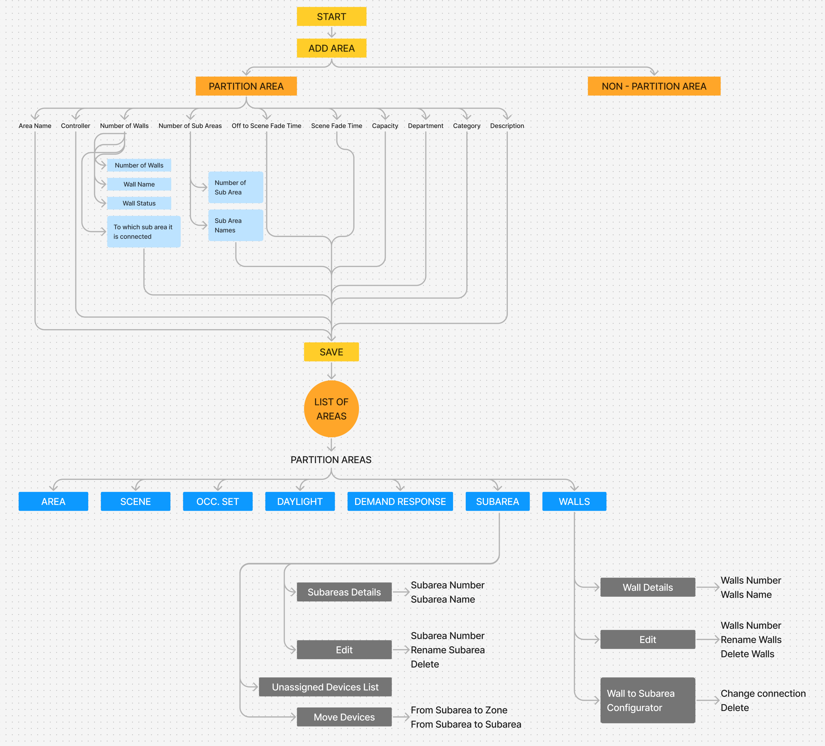
Partitioning configuration existed only in legacy desktop tools. The WaveLinx CORE mobile app had no concept of partition areas, sub-areas, walls, or IR sensors. There was no UX framework to model, configure, or operate a partitioned space. We were designing from zero, for a domain that had never had a mobile-first interface, for a feature that had no established UX patterns in the industry.
The complexity underneath
This wasn't a simple form redesign. Partitioning introduced an entirely new layer of the data hierarchy:
NEW CONCEPTS TO DESIGN FOR
- Partition Areas (parent spaces capable of subdivision)
- Sub-areas (dynamically created sub-spaces)
- Partition Walls (operable walls with open/closed state)
- IR sensors (IRTR) detecting wall state automatically
- Zone-to-subarea linkage (scoping control messages)
- Device movement within the new hierarchy
UX CONSTRAINTS AND TENSIONS
- No industry precedent for mobile partitioning UX
- Complex 3-step configuration on a 6-inch screen
- Commissioning agents work on-site with limited connectivity
- Wall configuration must survive future area topology changes
- API performance limits on partitioned area detail pages
- Backward compatibility with non-partitioned controller firmware
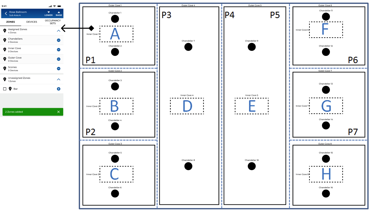
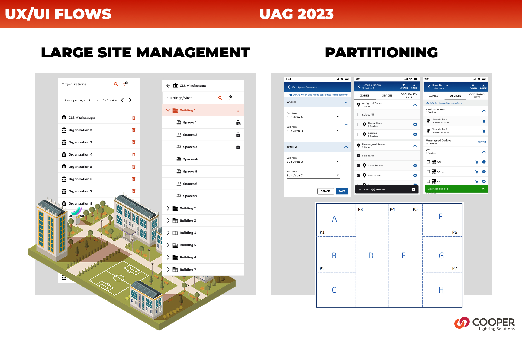
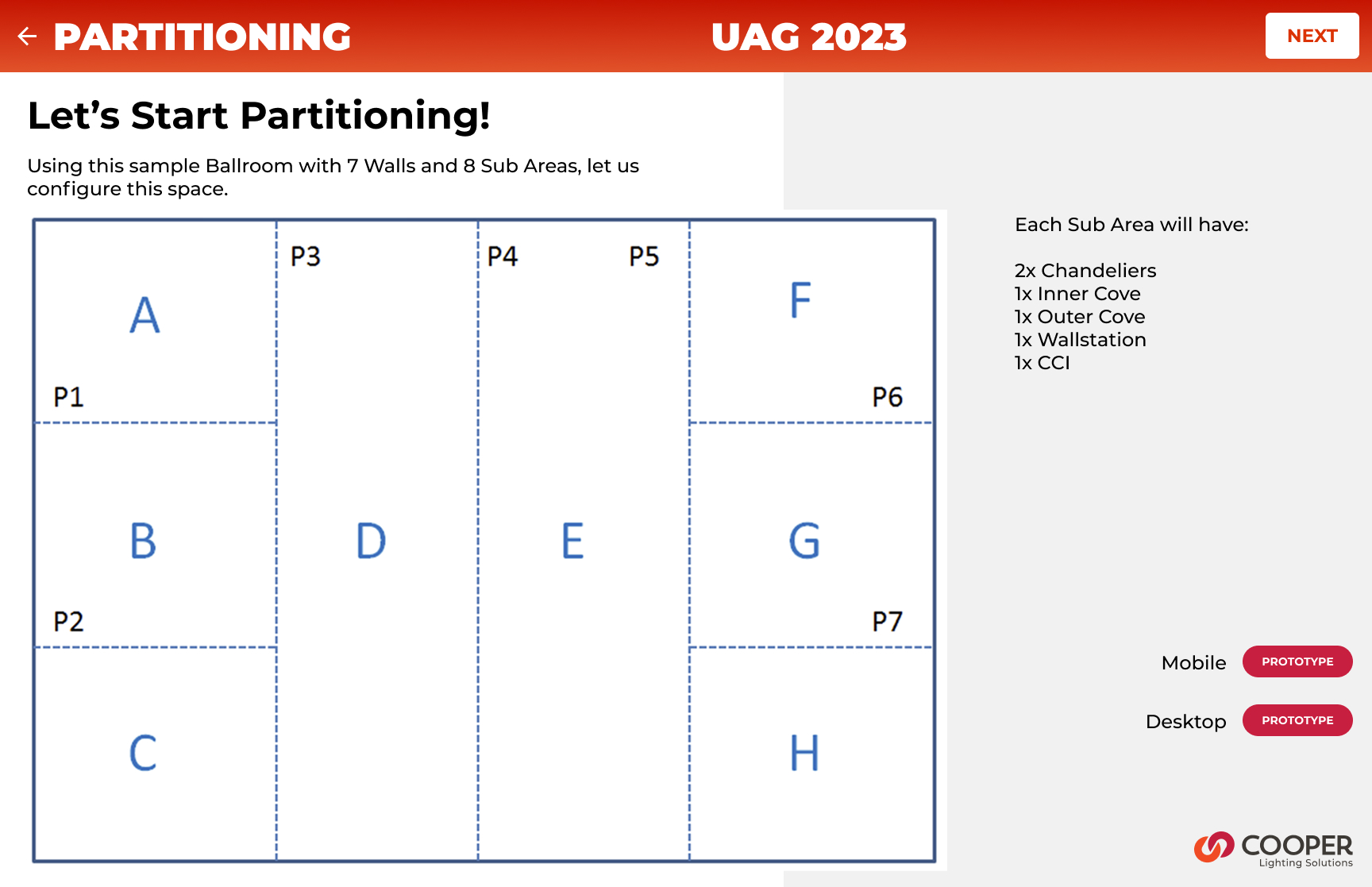
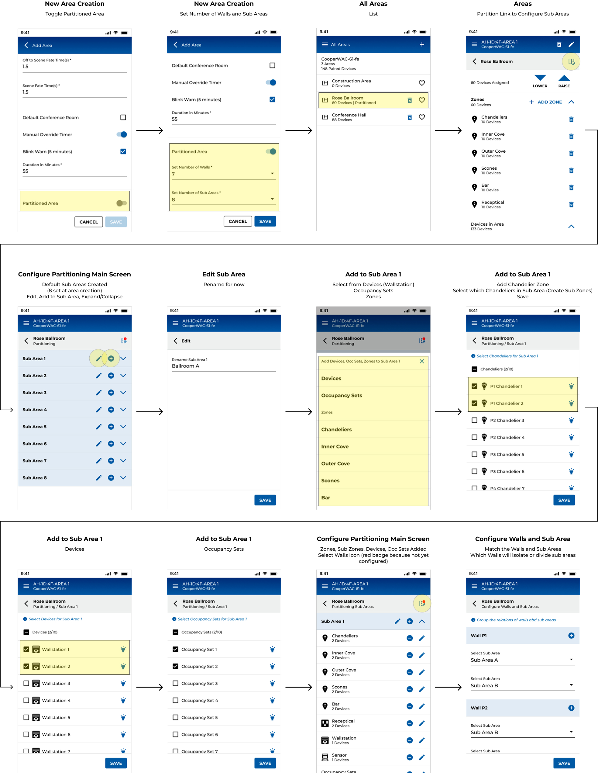
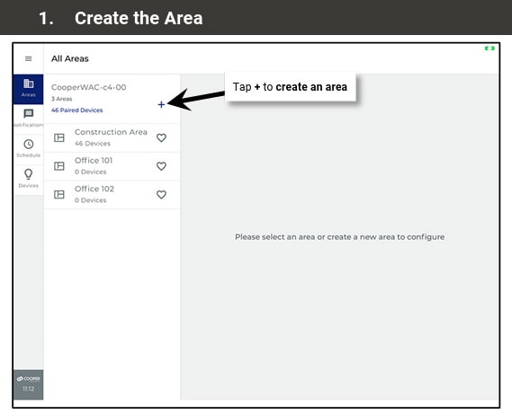
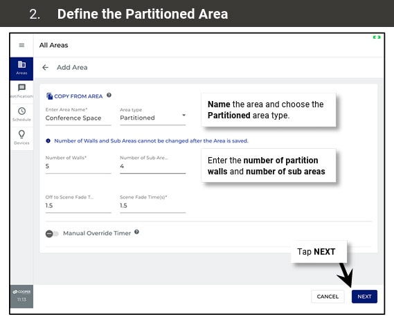
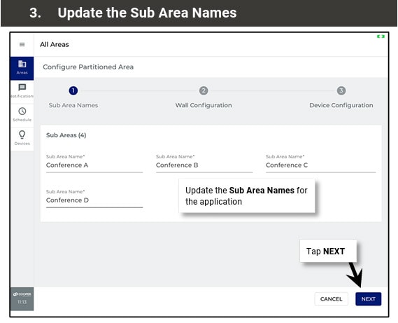
Let’s Start Partitioning!
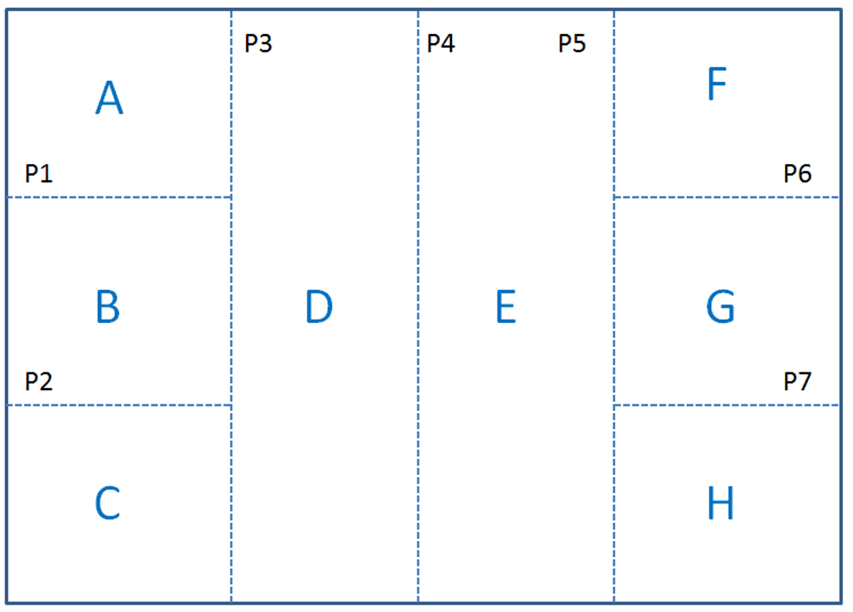
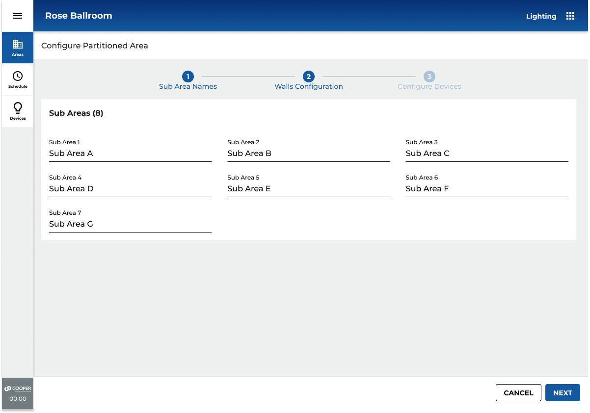
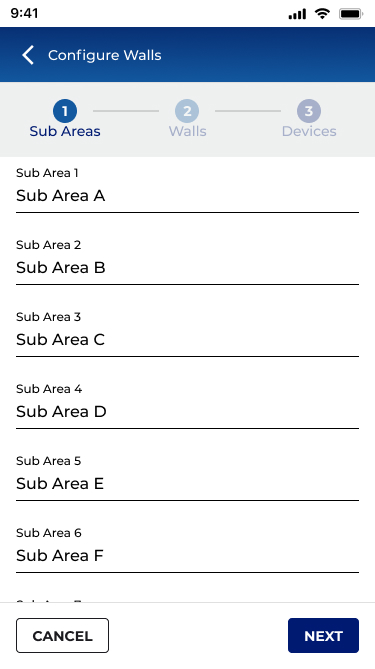
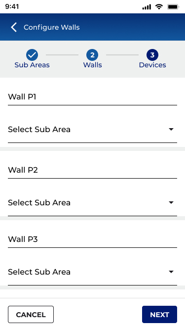
Using this sample Ballroom with 7 Walls and 8 Sub Areas, let us configure this space.
Each Sub Area will have:2x Chandeliers
1x Inner Cove
1x Outer Cove
1x Wallstation
1x CCI

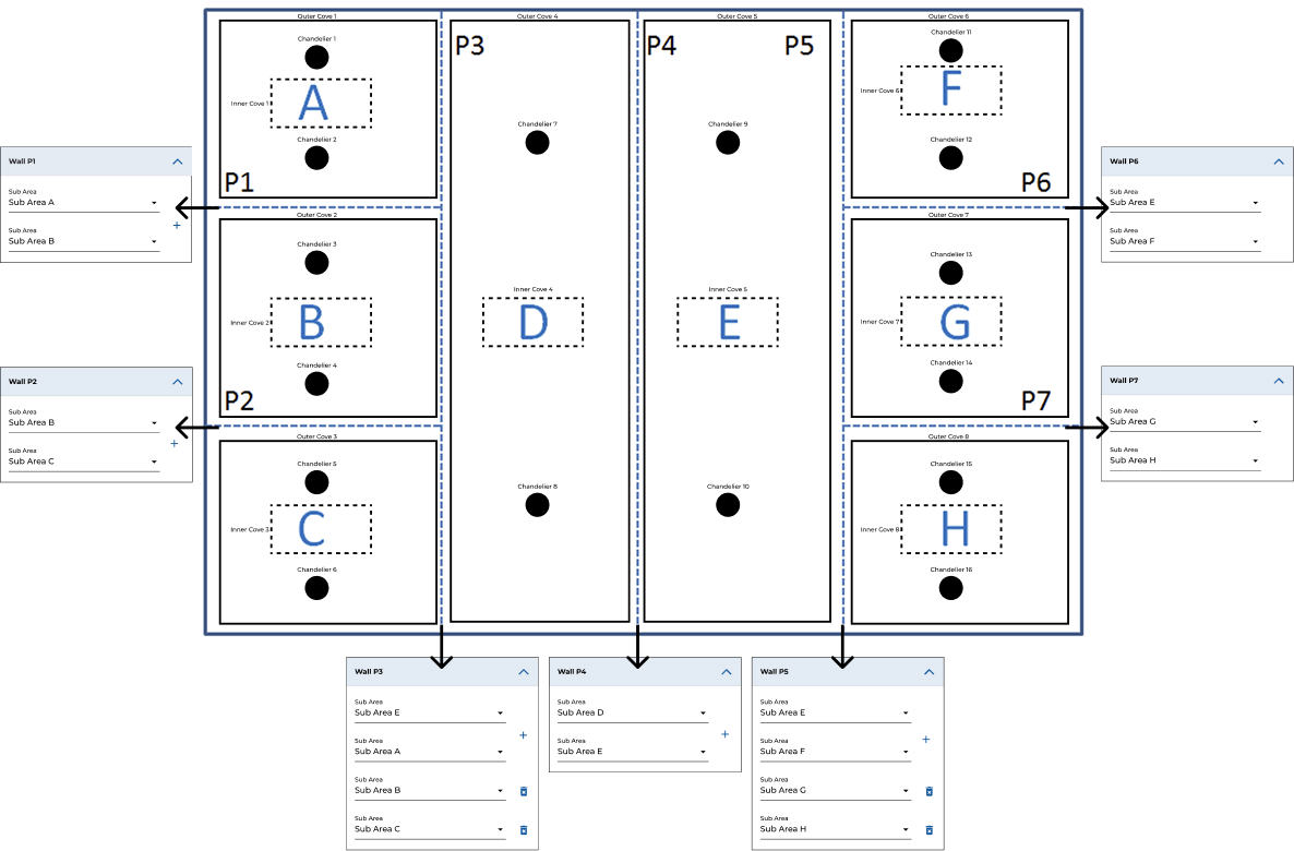
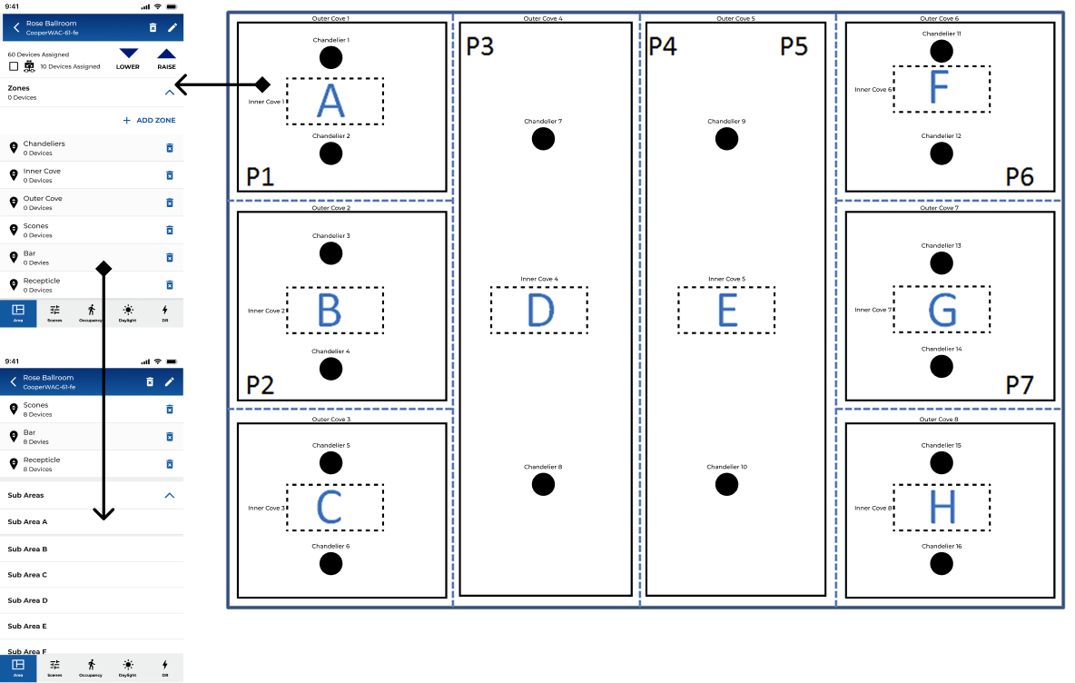
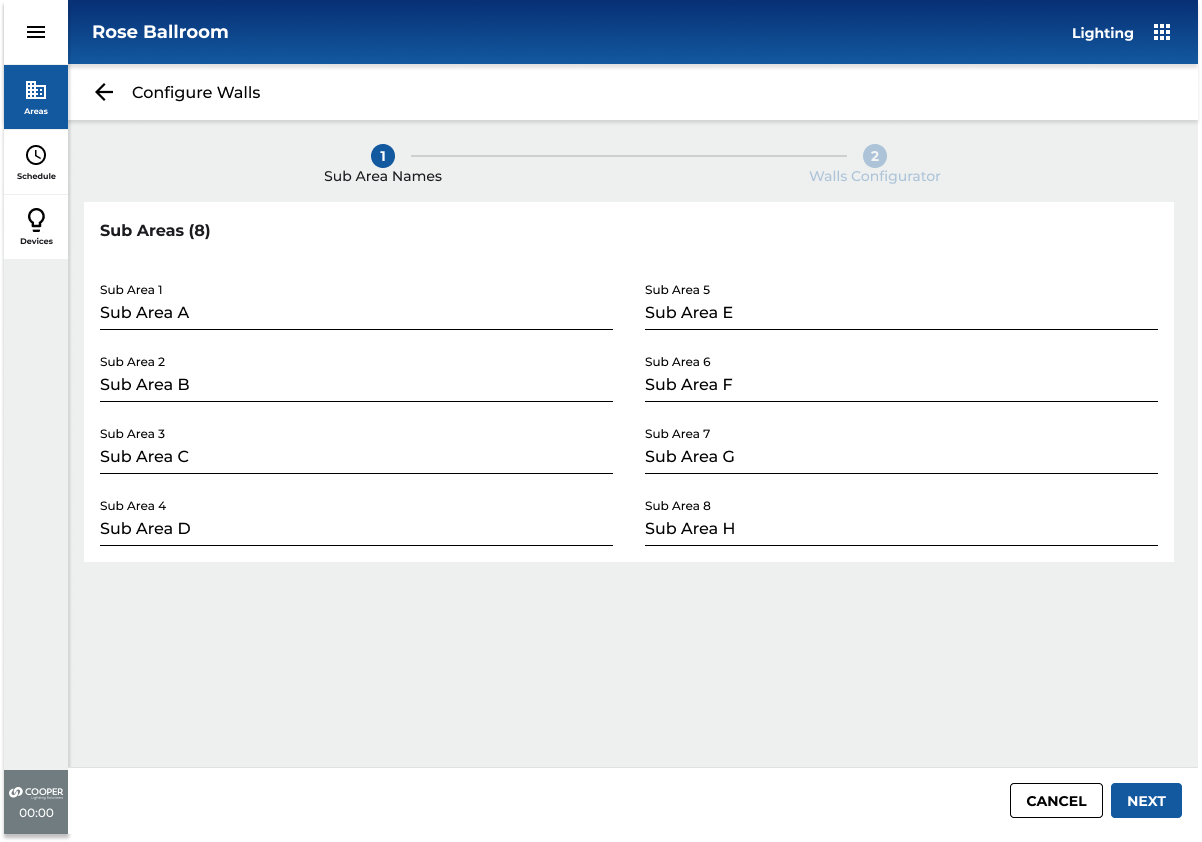
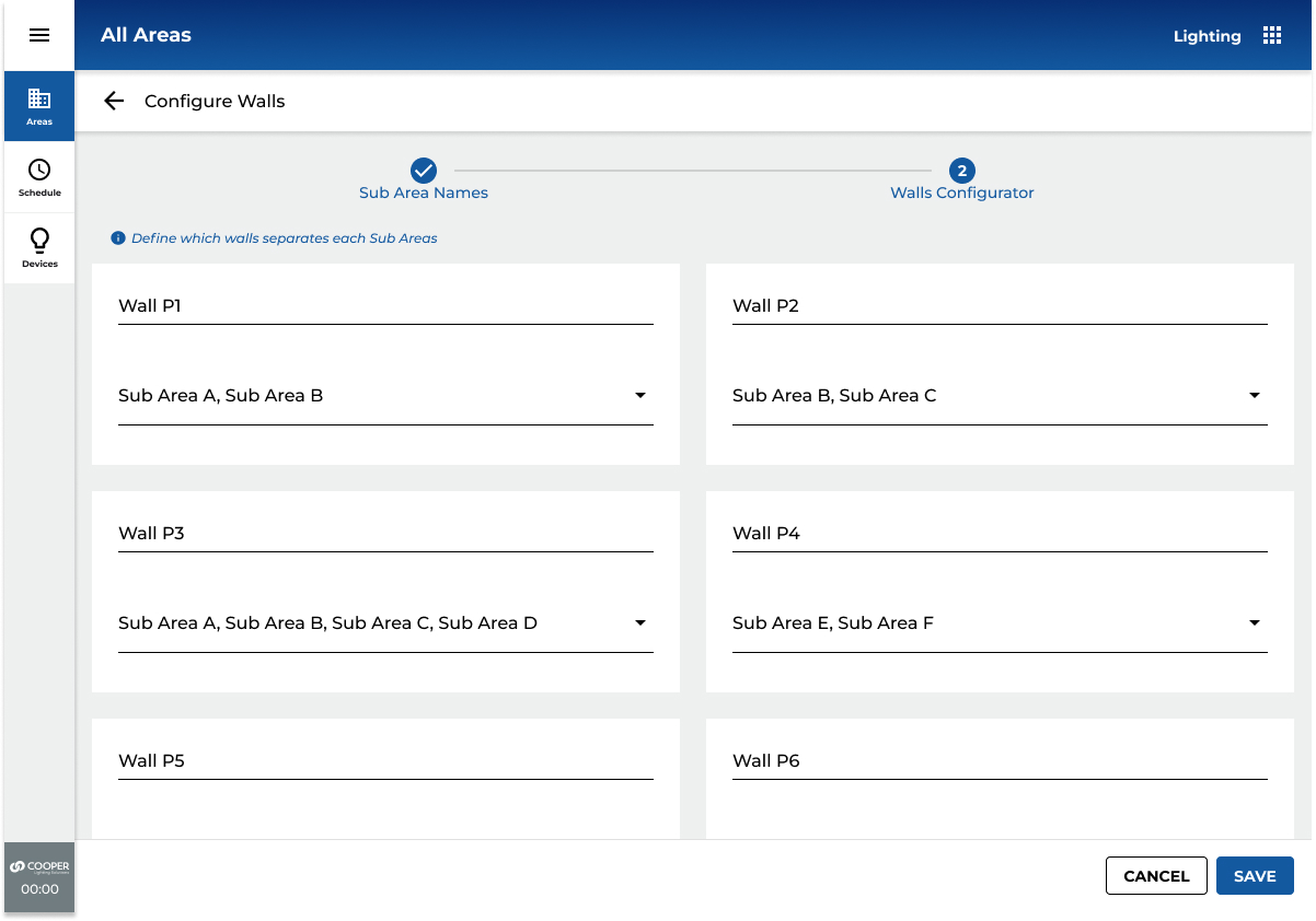
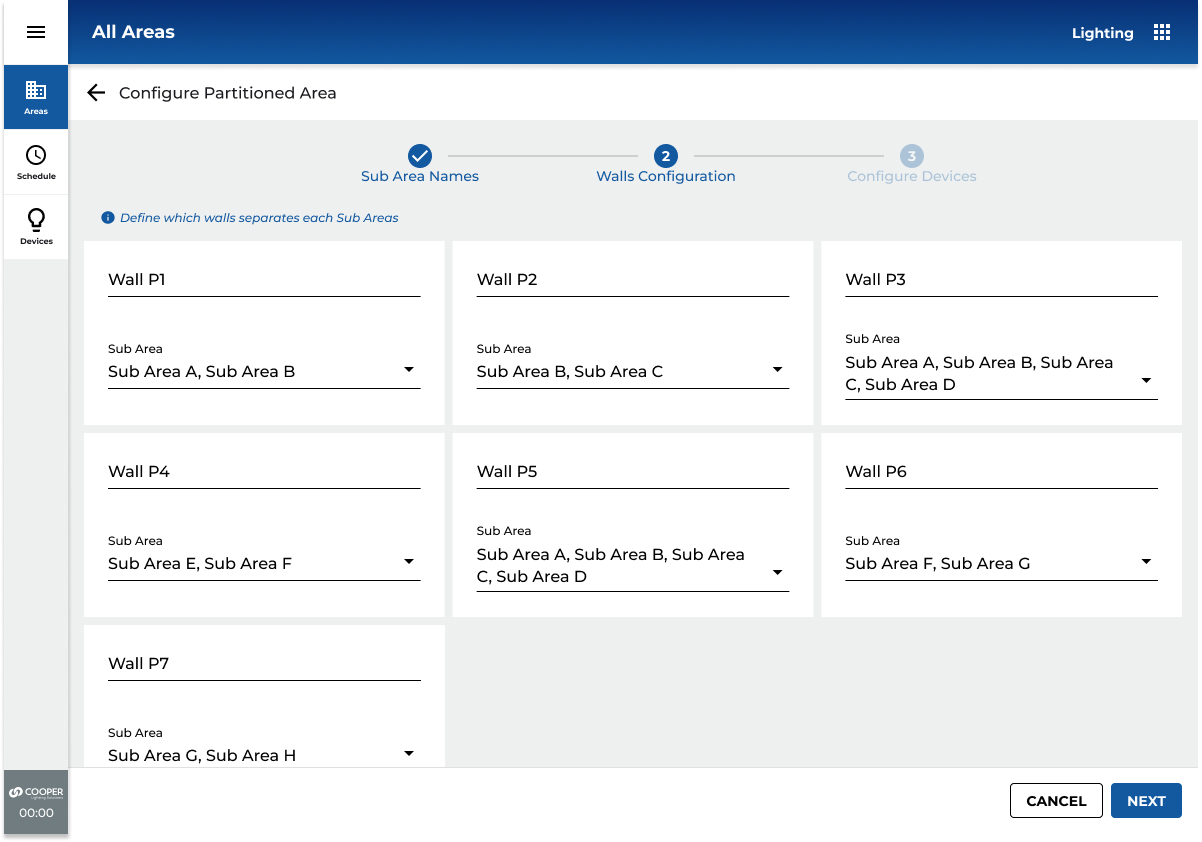
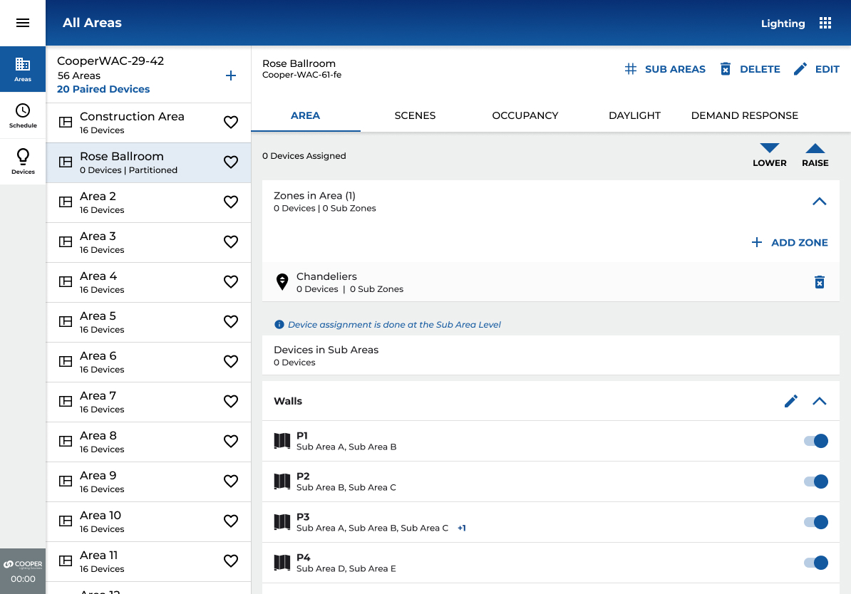
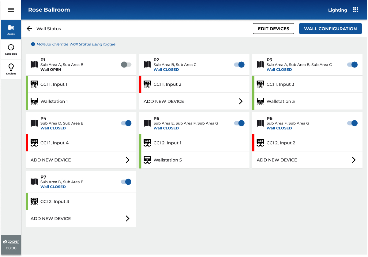
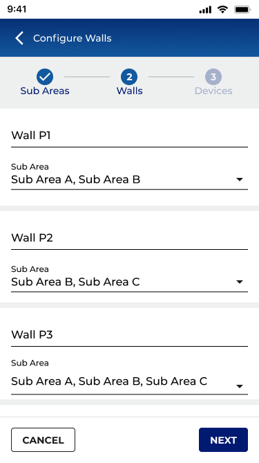
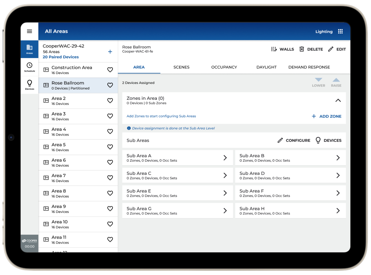
Walls and Sub Areas Configuration - Rose Ballroom
A sticker will be added to the HUB hardware providing specifications, describing install/setup and technical assistance. Design was created in Adobe Illustrator and is press ready with die cut marks in PDF format.
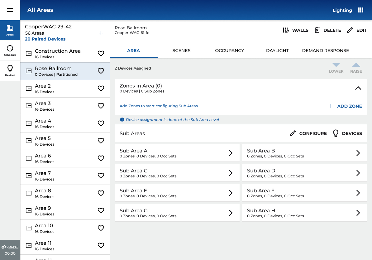
Area and Zones
Main Areas screen will have an add zones link and a list of container zones, sub areas links and a summary of the walls configuration.
The list of Walls will also have a toggle to manually change the wall status.
Tapping the zones from the main areas page will show a breakdown of all the zonable devices in each sub area.
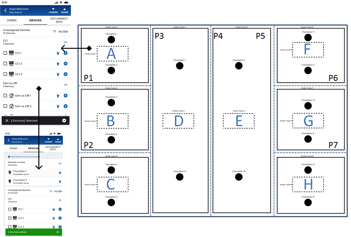
Sub Area Zone Assignment
After selecting the sub area from the main areas screen, you will enter the sub area configuration screen. Here you will be able to assign zones, devices, and occupancy sets.

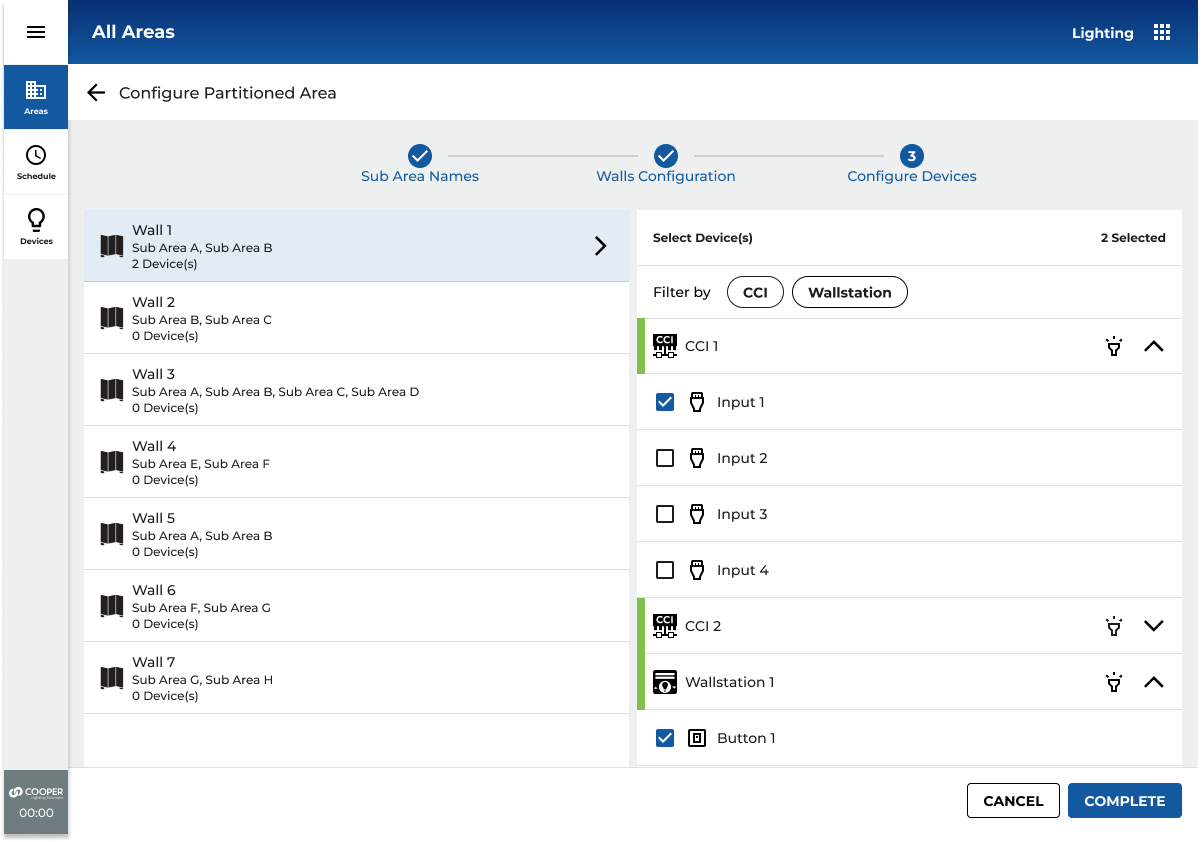
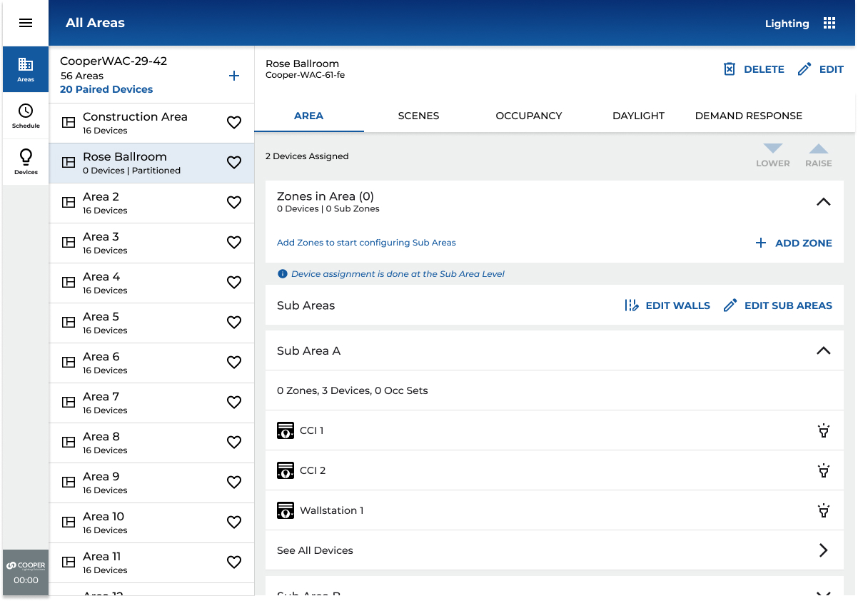
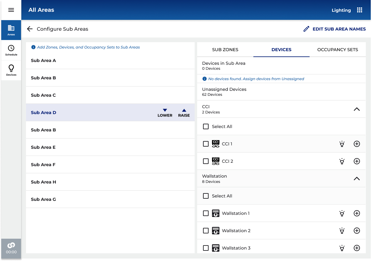
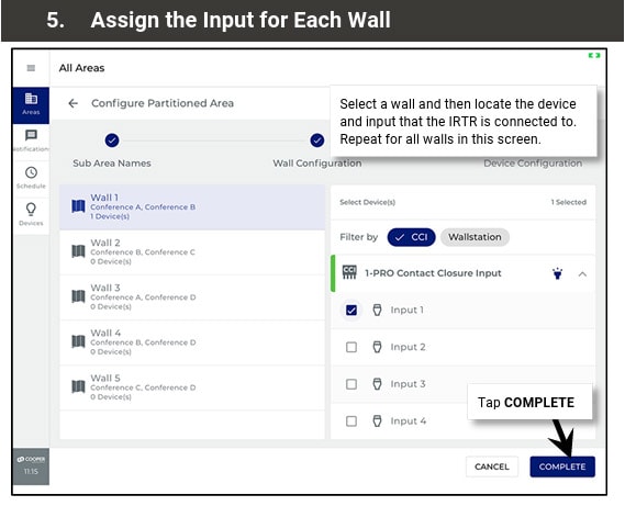
Sub Area Device Assignment
In Devices, zonable devices will show a list of zones to assign to. Non zonable devices like wallstations and CCI will be automatically added to Devices in Area panel.
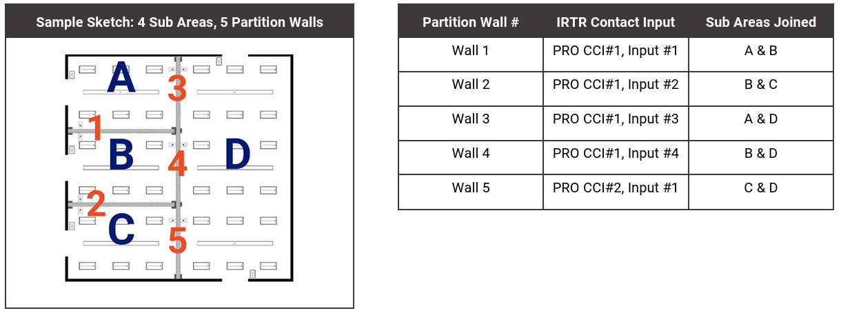
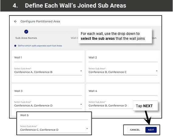
Create a Configuration Sketch
For the easiest partition area setup, create a sketch and a table identifying each partition wall, the sub areas that each wall joins, and the device and contact closure input number that is connected
03
MY ROLE
LEAD EXPERIENCE DESIGNER
As Lead/Principal Experience Designer on the Partitioning feature, I owned the end-to-end UX for this new product capability across both the mobile app and desktop web interface. This included defining the information architecture for a new hierarchy level, facilitating VOC research sessions, producing flows and wireframes, driving design critique with the cross-functional team, and iterating through three major prototype rounds with user testing feedback.
WHAT I OWNED
- End-to-end UX strategy and design for Partitioning
- Information architecture for new Partition Area hierarchy
- Mobile-first flows for area creation, configuration, and operation
- Desktop responsive adaptation
- Prototype creation and UAG facilitation
- Design system extension for new components
- Stakeholder alignment and priority-setting board reviews
WHO I COLLABORATED WITH
- Product Management (feature scope and release planning)
- Engineering (API feasibility, firmware capabilities)
- Field Application Engineers (domain expertise, VOC)
- QA (acceptance criteria and edge case definition)
- Regional Sales (customer requirements synthesis)
- Cross-platform architects (firmware teams)
04
RESEARCH & DISCOVERY
Understanding the field
Because no comparable mobile UX existed in connected lighting, I couldn't benchmark competitors. Research was grounded in the people who would actually use this feature: commissioning agents, electrical contractors, and facilities managers who configure and operate commercial lighting systems in hotels, conference centres, schools, and enterprise campuses.
01
VOC INTERVIEWS
Structured interviews with commissioning agents and installers, the primary users, to understand current configuration workflows, pain points, and where they work (on-site, often in the space being configured).
02
CONTEXTUAL INQUIRY
Shadowing installs of partitioning hardware in hotel ballrooms and conference centres. Understanding the physical environment, time pressure, and tool constraints that define the commissioning context.
03
DOMAIN RESEARCH
Deep study of partitioning hardware vendors (Skyfold, Modernfold, Canuck Door), industry standards for operable walls, and how adjacent systems (HVAC, AV) handled partition-state awareness.
04
PROTOTYPE TESTING
Three iterative prototype rounds (Figma) with internal user testing, plus a formal UAG session. Feedback was captured in a structured matrix reviewed by the Priority Setting Board before implementation.
PRESENTATION AND USER TESTING AT UAG
User Input
"The wall moves. The lights should just know. I don't want to go find a laptop and open a program, I'm holding a phone."Commissioning Agent, field research interview
Key research finding
Commissioning agents almost universally use their phone as their primary tool on-site. Desktop-only tools require carrying additional hardware, finding a power outlet, and context-switching away from the physical space they're configuring. A mobile-first approach wasn't a nice-to-have, it was a prerequisite for adoption.
05
KEY INSIGHTS
What we learned
01
MENTAL MODEL
Users think in rooms, not in zones
Commissioning agents describe the space physically ("the left half of the ballroom") not technically ("zones 3 and 4 in Area 12"). The UX needed to mirror spatial thinking and sub-areas needed to feel like rooms, not database records. This drove the decision to prioritize floor plan and naming over device lists.
02
CONFIGURATION FLOW
Device linking to walls was the highest confusion point
Early prototypes showed that connecting CCI (Closed Contact Input) devices to wall sensors was universally misunderstood. Users didn't know which step this happened in, what they were assigning, or what would override what. This became the primary focus for the 3-step stepper redesign.
03
NAVIGATION
Sub-area hierarchy needed progressive disclosure
Showing all sub-area detail on the partition area landing page created cognitive overload and unacceptable API load times (3–4+ seconds for large installations). Expand/collapse per sub-area, with lazy loading, resolved both the UX and performance issues simultaneously.
04
PLATFORM CONSISTENCY
Desktop should mirror mobile, not diverge
Early desktop designs used a 50/50 split-panel layout that added development effort with minimal UX benefit. Research showed that commissioning agents switch between devices, a consistent interaction model reduced the learning curve regardless of form factor.
05
EDGE CASES
The empty-state scenarios defined the quality of the design
What happens when no device is paired to a WAC? When a zone has no linked sub-area? When a wall is configured but the sensor hasn't fired yet? These edge cases, surfaced through testing, required explicit design treatment and became the standard for production quality.
06
DESIGN PROCESS
HOW WE GOT THERE
The design process ran in parallel with firmware and API development, a reality of enterprise IoT product development. This required tight communication loops with engineering to ensure UX decisions were grounded in what was technically achievable at each sprint boundary.
PHASE 01 WEEKS 1 – 4
DISCOVERY & FRAMING
VOC interviews with commissioning agents and FAEs. Domain immersion in partitioning hardware and installation workflows. Defined the problem statement and established design principles for the feature.
INTERVIEW SYNTHESIS
DESIGN PRINCIPLES
DOMAIN GLOSSARY
CONSTRAIN MAP
PHASE 02 WEEKS 5 – 8
INFORMATION ARCHITECTURE
Defined the new Partition Area hierarchy within the existing WaveLinx CORE data model. Mapped how Partition Areas, Sub-areas, Walls, Zones, and Devices would relate and navigate. Aligned with engineering on API feasibility, critical given that adding 10 sub-areas to a detail page would require too many API calls without careful design.
HIERARCHY DIAGRAM
NAVIGATION MODEL
API CALL BUDGET
CONTENT AUDIT
PHASE 03 WEEKS 9 – 16
CONCEPT DESIGN & PROTOTYPE V1
Created initial flows and wireframes for all key journeys: creating a partition area, configuring sub-areas and walls, assigning zones, moving devices, and monitoring wall status. Built Figma prototype for mobile (iOS). Conducted internal design critique and stakeholder review with the Priority Setting Board.
MOBILE FLOWS (FIGMA)
DESKTOP ADAPTATION
EDGE CASE MATRIX
PROTOTYPE V1
PHASE 04 WEEKS 17 – 24
USER TESTING & ITERATION
Conducted two rounds of prototype testing. Feedback surfaced the CCI device-linking confusion, sub-area navigation opacity, and the need for consistent mobile/desktop patterns. Iterated significantly on the 3-step configuration stepper, the partition area landing page, and the wall status experience.
UAG FEEDBACK MATRIX
PROTOTYPE V2 & V3
PRIORITY BOARD REVIEW
DESIGN DECISION LOG
PHASE 05 WEEKS 25 – 36
HANDOFF & BUILD SUPPORT
Final design specifications delivered via Figma with annotated flows, component documentation, and state matrices. Worked alongside engineering during implementation to address emerging edge cases, review build fidelity, and refine interactions where technical constraints required adaptation.
ANNOTATED SPECS
COMPONENT LIBRARY
DEV QA REVIEWS
PRODUCT RELEASE
NEW AREA CREATION SCREENS
VERSION 1 (NEW AREA)
Added Step 3 - Assign Device to Control Wall

VERSION 2
CHANGES TO AREA PAGE
VERSION 1 (WALLS)
VERSION 2A (SUB AREAS)
VERSION 2B (SUB AREAS EXPAND/COLLAPSE)
CONSOLIDATED VIEW MODE AND EDIT MODES
SUB AREAS CONFIGURATION (CONSOLIDATION)
WALL CONFIGURATION (CONSOLIDATION)
07
KEY DESIGN DECISION
THE HARD CALLS
Every significant design decision involved a tradeoff. These are the ones with the most impact on the final product, and the reasoning behind them.
DECISION 01
Linear stepper vs. non-linear stepper for 3-step wall configuration
Radial (non-linear) stepper
vs
Horizontal linear stepper
Team discussion favoured a radial stepper for the 3-step configuration process (Create Area → Configure Subareas → Link Walls to Devices). I championed the horizontal linear stepper, while radial steppers aren't prohibited by Material Design, they're uncommon enough to introduce learning friction in a commissioning context where users need to move quickly. The linear model was clearer and testable. Confirmed through UAG.
DECISION 02
Sub-area detail on the partition area landing page
Full detail loaded on page entry
vs
Expand / collapse with lazy loading
A stakeholder requested full sub-area detail visible on the partition area page. Engineering analysis showed this would require 30+ API calls for a 10-sub-area space, adding 3–5 seconds to load time. I designed an expand/collapse pattern that fetches one sub-area's detail at a time, giving a high-level summary in the collapsed state. This preserved the information architecture stakeholders wanted while keeping performance acceptable.
DECISION 03
Mobile / desktop layout consistency
50/50 split panel desktop layout
vs
Consistent mobile-like layout
Early desktop explorations used a traditional 50/50 panel layout (left: list, right: detail). Given that commissioning agents switch between devices mid-job, and that the mobile layout already tested well, the development overhead of a distinct desktop layout wasn't justified by the user value. The consistent layout across platforms reduced the learning curve to near zero.
DECISION 04
View toggle for sub-areas and devices
Toggle between sub-areas view / devices
vs
Combined card with expandable sub-areas
An early proposal used a toggle to switch between sub-areas and devices in the partition area view. View toggles create implicit state that users lose track of, and performing API calls on toggle creates a jarring UX. I combined sub-areas and devices into a single card with expandable sub-area rows. This eliminated the toggle entirely and reduced cognitive load.
DECISION 05
Wall icon placement in mobile header
Replace device icon with wall icon
vs
Wall icon in top header same location as mobile
The partition wall status icon needed a home. One suggestion was to replace the existing device icon. I kept it in the top header bar, a location used consistently across the platform for fast-access navigation because this allowed future additions without crowding the primary action area, and created parity between mobile and desktop placement.
DECISION 06
Device movement during configuration step 3
Auto move devices on stop completion
vs
Action assignment only - no auto-movement
An initial proposal auto-moved devices into sub-areas on completing step 3 of the stepper. Testing revealed this was unexpected and alarming, users didn't understand why their device assignments had changed. Step 3 was redesigned to assign actions to CCI inputs and wall station buttons only, keeping device movement as an explicit separate action the user initiates consciously.
The complexity underneath
08
THE SOLUTION
WHAT SHIPPED
WaveLinx CORE Partitioning shipped as a fully mobile-capable feature, the first of its kind in connected commercial lighting. The solution covered the complete lifecycle of a partitioned space: creation, configuration, operation, and monitoring.
DEVICE MOVEMENT
Explicit device movement UI supports moving devices to partition area level, sub-area level, or zone level within sub-areas. Zones without linked sub-areas are clearly labelled to prevent misassignment.
Partition Area Creation
Redesigned area creation with a new Partition Area type. Users define sub-area count and wall count upfront, establishing the spatial model before configuring devices.
WALL STATUS PAGE
Real-time wall state (open/closed) with associated devices per wall. Wall icon in the top header provides a fast path to this view from any point in the partition area context.
3-step configuration stepper
Guided horizontal stepper covering area setup, sub-area & zone assignment, and wall-to-device linking. Designed for mobile-first, all steps reachable from a 6" screen with no laptop required.
ZONE & WALL ASSIGNMENT
Tabbed interface for Sub-Areas and Walls, each with an explicit assignment flow. Zone-to-sub-area and wall-to-sub-area linkages are separate, intentional actions, not automatic.
sub-area management
Expand/collapse sub-area cards with lazy loading. Each sub-area shows zone count, device count, and occupancy set summary. Full sub-area detail on drill-down, not on page load.
09
OUTCOMES & IMPACT
WHAT IT ACHIEVED
Metrics below are drawn from UAG session data, engineering feasibility documentation, field team interviews, and product management records. Ranges reflect variance across site types and install configurations.
BUSINESS & COMMERCIAL IMPACT
3
New market segments won following feature release
Hotel/hospitality · K–12 & higher education · Enterprise campus
previously unaddressable
desktop-only blocked sales
40–60%
Reduction in on-site commissioning time cited by field teams
Cited by field application engineers post-release, mobile vs. laptop workflow
consistent across hotel and education
installs
$0
Additional hardware required on-site, phone replaces laptop entirely
Eliminates cost of carrying dedicated commissioning hardware to site
~80%
Reduction in service calls triggered by room reconfiguration events
IR auto-detection eliminates the technician-visit category for wall-state changes
significant OpEx reduction for
facilitiesteams
Tier 1
Feature positioned as a flagship differentiator in enterprise and hospitality RFPs
Cited in sales enablement and competitive positioning materials post-launch
0
Shipped on schedule, no scope cuts, full mobile + desktop coverage
12-month engagement · 3 prototype rounds · Priority Setting Board approval
UX QUALITY & VALIDATION
3
Prototype rounds with structured UAG before engineering build
Figma · mobile + desktop · Priority Setting Board sign-off after each round
~40→85%
Task completion rate on the core 3-step configuration flow
Round 1 baseline → Round 3 final UAG session
+45% points across prototype
interactions
11+
Critical usability issues identified, documented, and resolved before build
Captured in structured feedback matrix, 0 carried into production
zero usability regressions in release
R1→R3
RCCI device-linking confusion: #1 issue in Round 1, fully resolved by Round 3
Primary redesign driver, 3-step stepper, explicit action assignment, blink icons
absent from round 3 feedback entirely
6
Major design decisions documented with rationale and stakeholder approval
Stepper type · lazy load · platform consistency · toggle · device movement · icon placement
2→1
Platforms, one consistent interaction model, zero relearning between devices
Mobile-first approach adopted for desktop · validated in cross-device UAG
FULL KPI SUMMARY
MetricOn-site commissioning time (partitioned spaces)
Before45–60 min (laptop-dependent)
After / Result15–25 min (mobile)
Magnitude40–60% ↓
MetricService calls from wall-state reconfiguration
BeforeRequired per wall-state change
After / ResultAuto-detected, zero intervention
Magnitude~80% ↓
MetricMarket segments addressable
Before0 (desktop-only blocked adoption)
After / Result3+ (hotel, education, enterprise)
Magnitude3 new
MetricUAG task completion, core 3-step flow
Before~40% (Round 1)
After / Result~85% (Round 3)
Magnitude+45 pts
MetricCritical usability issues reaching production
Before11+ identified pre-UAG
After / Result0 shipped
Magnitude100% resolved
MetricDetail page API calls (10 sub-area site)
Before30+ simultaneous
After / Result3 (one per expand)
Magnitude~90% ↓
MetricPartition area detail page load time
Before3–4+ seconds
After / ResultSub-1 second (typical)
Magnitude>70% ↓
Metric
Manual reconfiguration on wall-state change
BeforeFull re-program required
After / ResultZero - IR auto-detection
MagnitudeEliminated
MetricPlatforms requiring separate learning curve
Before2 (mobile and desktop diverged)
After / Result1 consistent model across both
MagnitudeUnified
BUSINESS AND COMMERCIAL CONTEXT
Before Partitioning shipped, WaveLinx CORE could not credibly bid on hotel ballroom, school gymnasium, or large enterprise conference centre projects, the desktop-only configuration requirement was a disqualifying factor in competitive evaluations. The mobile-first design directly expanded the addressable market for the platform.
The ~80% reduction in service calls for wall-state reconfiguration had immediate OpEx impact for facilities teams, the cost of a technician dispatch for what is now a zero-touch automatic event is a meaningful saving across a large hotel or campus deployment.
UX AND PLATFORM IMPACT
The design established a new UX pattern within WaveLinx CORE for hierarchical spatial configuration, a pattern that informed how the team approached similar problems in subsequent features. The expand/collapse lazy-load approach for sub-entities became a platform standard. The principle of "device assignment is explicit, never automatic" was codified as a design guideline that carried forward into DALI-2 and other subsequent features.
The UAG feedback process, structured in a matrix format with Priority Setting Board review became a repeatable design governance model adopted beyond Partitioning.
10
REFLECTION
What I'd do differently
Every project teaches something. These are the honest reflections from Partitioning.
WHAT WORKED WELL
MOBILE-FIRST FROM DAY ONE
Starting with mobile forced constraints that made the desktop design better. The progressive disclosure patterns and expand/collapse approach emerged from mobile constraints, and they solved the API performance problem on desktop as a side effect.
WHAT I’D DO DIFFERENTLY
EARLIER FIELD OBSERVATION SESSIONS
We conducted contextual inquiry, but I would front-load more time observing commissioning agents in actual hotel ballroom installs before wireframing started. The confusion around CCI linking might have been caught earlier if we'd watched more real configuration sessions in week 2 rather than week 8.
WHAT WORKED WELL
THE UAG FEEDBACK MATRIX
Structured the user testing feedback in a formal matrix with columns for issue, proposed solution, stakeholder comments, and approval status. This created accountability and reduced subjective debate at the Priority Setting Boardzz decisions were grounded in documented user behaviour.
WHAT I’D DO DIFFERENTLY
EARLIER CONTRACT ALIGNMENT
The sub-area detail page performance issue surfaced late, a result of design and engineering working somewhat in parallel without fully aligned data contracts. I would advocate for a "design feasibility spike" session with engineering at the IA phase, before high-fidelity prototyping, to stress-test data architecture assumptions.
LASTING PRINCIPLE
CONFIGURATION SHOULD BE INTENTIONAL, NEVER AUTOMATIC
Every time we proposed automatic device reassignment or state change, testing revealed user anxiety and confusion. The principle "the system can suggest, but the user must confirm" became foundational to WaveLinx CORE's configuration UX philosophy and informed work on DALI-2 and other features that followed.
FUTURE OPPORTUNITY
FLOOR PLAN VISUALISATION
The most requested follow-on feature from commissioning agents was a floor plan view showing sub-area boundaries and wall positions visually. This was deferred to a future roadmap item. Given the spatial nature of partitioning, a visual floor plan would dramatically reduce configuration errors.
Dynamic
Space Partitioning
Designing the industry's first mobile-capable partitioning UX for commercial connected lighting enabling hotels, conference centres, and schools to divide spaces and have their lighting automatically adapt in real time.
★
INDUSTRY FIRST, NO COMPARABLE MOBILE UX EXISTED IN CONNECTED LIGHTING

ROLE
Lead / Principal Enterprise Designer
COMPANY
Cooper Lighting Solutions (Signify)
PLATFORM
Mobile + Desktop
SCOPE
Research → Delivery
TEAM SIZE
15 Cross-functional
DESIGNED
2023-2024 - Figma
01
CONTENT
What is partitioning?
Commercial buildings routinely contain large open spaces with ballrooms, conference centres, school cafeterias, and training rooms that use operable partition walls to subdivide into smaller, independent rooms on demand.
When those walls move, everything about the space changes: occupancy, lighting needs, scene control, and privacy. Until now, lighting systems had no way to know the walls had moved, and no way to automatically adapt.
WaveLinx CORE Partitioning solves this. When a partition wall closes, an IR Transmitter/Receiver (IRTR) sensor at each wall detects the change and automatically reconfigures the lighting control topology with no human intervention required.
Each sub-space then behaves as a completely independent lighting zone: its own occupancy sensing, dimming curves, scene presets, and wall station scope.
WALL OPEN

One unified area · all fixtures respond together
WALL CLOSED


IR


SUB-AREA A
SUB-AREA B
Two independent zones · auto-detected by IR sensor

AUTOMATIC DETECTION, NO MANUAL RECONFIGURATION NEEDED

Lighting fixture

IR sensor (IRTR)

Closed partition wall
1ST
Mobile partitioning UX in connected commercial lighting
40–60%
Reduction in on-site commissioning time cited by field teams
~90%
Reduction in API calls on partition area detail pages
11+
Critical usability issues resolved before a single line of code
3
New market segments won: hotel, education, enterprise campus
0
Manual steps required when a partition wall opens or closes
02
THE CHALLENGE
A new class of problem
Partitioning in commercial lighting is not a new concept, installers have been manually rewiring and reprogramming light controllers when rooms change configuration for decades. What was new was the expectation that a connected lighting platform should handle this automatically, and that the people configuring it as in electricians, lighting commissioning agents, and facilities managers would do so on whatever device they had in their pocket.
THE CORE PROBLEM
Partitioning configuration existed only in legacy desktop tools. The WaveLinx CORE mobile app had no concept of partition areas, sub-areas, walls, or IR sensors. There was no UX framework to model, configure, or operate a partitioned space. We were designing from zero, for a domain that had never had a mobile-first interface, for a feature that had no established UX patterns in the industry.
The complexity underneath
This wasn't a simple form redesign. Partitioning introduced an entirely new layer of the data hierarchy:
NEW CONCEPTS TO DESIGN FOR
- Partition Areas (parent spaces capable of subdivision)
- Sub-areas (dynamically created sub-spaces)
- Partition Walls (operable walls with open/closed state)
- IR sensors (IRTR) detecting wall state automatically
- Zone-to-subarea linkage (scoping control messages)
- Device movement within the new hierarchy
UX CONSTRAINTS AND TENSIONS
- No industry precedent for mobile partitioning UX
- Complex 3-step configuration on a 6-inch screen
- Commissioning agents work on-site with limited connectivity
- Wall configuration must survive future area topology changes
- API performance limits on partitioned area detail pages
- Backward compatibility with non-partitioned controller firmware
Let’s Start Partitioning!
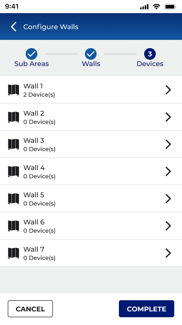
Using this sample Ballroom with 7 Walls and 8 Sub Areas, let us configure this space.
Each Sub Area will have:2x Chandeliers
1x Inner Cove
1x Outer Cove
1x Wallstation
1x CCI

Walls and Sub Areas Configuration - Rose Ballroom
A sticker will be added to the HUB hardware providing specifications, describing install/setup and technical assistance. Design was created in Adobe Illustrator and is press ready with die cut marks in PDF format.
Area and Zones
Main Areas screen will have an add zones link and a list of container zones, sub areas links and a summary of the walls configuration.
The list of Walls will also have a toggle to manually change the wall status.
Tapping the zones from the main areas page will show a breakdown of all the zonable devices in each sub area.
Sub Area Zone Assignment
After selecting the sub area from the main areas screen, you will enter the sub area configuration screen. Here you will be able to assign zones, devices, and occupancy sets.

Sub Area Device Assignment
In Devices, zonable devices will show a list of zones to assign to. Non zonable devices like wallstations and CCI will be automatically added to Devices in Area panel.
Create a Configuration Sketch
For the easiest partition area setup, create a sketch and a table identifying each partition wall, the sub areas that each wall joins, and the device and contact closure input number that is connected
03
MY ROLE
LEAD EXPERIENCE DESIGNER
As Lead/Principal Experience Designer on the Partitioning feature, I owned the end-to-end UX for this new product capability across both the mobile app and desktop web interface. This included defining the information architecture for a new hierarchy level, facilitating VOC research sessions, producing flows and wireframes, driving design critique with the cross-functional team, and iterating through three major prototype rounds with user testing feedback.
WHAT I OWNED
- End-to-end UX strategy and design for Partitioning
- Information architecture for new Partition Area hierarchy
- Mobile-first flows for area creation, configuration, and operation
- Desktop responsive adaptation
- Prototype creation and UAG facilitation
- Design system extension for new components
- Stakeholder alignment and priority-setting board reviews
WHO I COLLABORATED WITH
- Product Management (feature scope and release planning)
- Engineering (API feasibility, firmware capabilities)
- Field Application Engineers (domain expertise, VOC)
- QA (acceptance criteria and edge case definition)
- Regional Sales (customer requirements synthesis)
- Cross-platform architects (firmware teams)
04
RESEARCH & DISCOVERY
Understanding the field
Because no comparable mobile UX existed in connected lighting, I couldn't benchmark competitors. Research was grounded in the people who would actually use this feature: commissioning agents, electrical contractors, and facilities managers who configure and operate commercial lighting systems in hotels, conference centres, schools, and enterprise campuses.
01
VOC INTERVIEWS
Structured interviews with commissioning agents and installers, the primary users, to understand current configuration workflows, pain points, and where they work (on-site, often in the space being configured).
02
CONTEXTUAL INQUIRY
Shadowing installs of partitioning hardware in hotel ballrooms and conference centres. Understanding the physical environment, time pressure, and tool constraints that define the commissioning context.
03
DOMAIN RESEARCH
Deep study of partitioning hardware vendors (Skyfold, Modernfold, Canuck Door), industry standards for operable walls, and how adjacent systems (HVAC, AV) handled partition-state awareness.
04
PROTOTYPE TESTING
Three iterative prototype rounds (Figma) with internal user testing, plus a formal UAG session. Feedback was captured in a structured matrix reviewed by the Priority Setting Board before implementation.
PRESENTATION AND USER TESTING AT UAG
User Input
"The wall moves. The lights should just know. I don't want to go find a laptop and open a program, I'm holding a phone."Commissioning Agent, field research interview
Key research finding
Commissioning agents almost universally use their phone as their primary tool on-site. Desktop-only tools require carrying additional hardware, finding a power outlet, and context-switching away from the physical space they're configuring. A mobile-first approach wasn't a nice-to-have, it was a prerequisite for adoption.
05
KEY INSIGHTS
What we learned
01
MENTAL MODEL
Users think in rooms, not in zones
Commissioning agents describe the space physically ("the left half of the ballroom") not technically ("zones 3 and 4 in Area 12"). The UX needed to mirror spatial thinking and sub-areas needed to feel like rooms, not database records. This drove the decision to prioritize floor plan and naming over device lists.
02
CONFIGURATION FLOW
Device linking to walls was the highest confusion point
Early prototypes showed that connecting CCI (Closed Contact Input) devices to wall sensors was universally misunderstood. Users didn't know which step this happened in, what they were assigning, or what would override what. This became the primary focus for the 3-step stepper redesign.
03
NAVIGATION
Sub-area hierarchy needed progressive disclosure
Showing all sub-area detail on the partition area landing page created cognitive overload and unacceptable API load times (3–4+ seconds for large installations). Expand/collapse per sub-area, with lazy loading, resolved both the UX and performance issues simultaneously.
04
PLATFORM CONSISTENCY
Desktop should mirror mobile, not diverge
Early desktop designs used a 50/50 split-panel layout that added development effort with minimal UX benefit. Research showed that commissioning agents switch between devices, a consistent interaction model reduced the learning curve regardless of form factor.
05
EDGE CASES
The empty-state scenarios defined the quality of the design
What happens when no device is paired to a WAC? When a zone has no linked sub-area? When a wall is configured but the sensor hasn't fired yet? These edge cases, surfaced through testing, required explicit design treatment and became the standard for production quality.
06
DESIGN PROCESS
HOW WE GOT THERE
The design process ran in parallel with firmware and API development, a reality of enterprise IoT product development. This required tight communication loops with engineering to ensure UX decisions were grounded in what was technically achievable at each sprint boundary.
PHASE 01 WEEKS 1 – 4
DISCOVERY & FRAMING
VOC interviews with commissioning agents and FAEs. Domain immersion in partitioning hardware and installation workflows. Defined the problem statement and established design principles for the feature.
INTERVIEW SYNTHESIS
DESIGN PRINCIPLES
DOMAIN GLOSSARY
CONSTRAIN MAP
PHASE 02 WEEKS 5 – 8
INFORMATION ARCHITECTURE
Defined the new Partition Area hierarchy within the existing WaveLinx CORE data model. Mapped how Partition Areas, Sub-areas, Walls, Zones, and Devices would relate and navigate. Aligned with engineering on API feasibility, critical given that adding 10 sub-areas to a detail page would require too many API calls without careful design.
HIERARCHY DIAGRAM
NAVIGATION MODEL
API CALL BUDGET
CONTENT AUDIT
PHASE 03 WEEKS 9 – 16
CONCEPT DESIGN & PROTOTYPE V1
Created initial flows and wireframes for all key journeys: creating a partition area, configuring sub-areas and walls, assigning zones, moving devices, and monitoring wall status. Built Figma prototype for mobile (iOS). Conducted internal design critique and stakeholder review with the Priority Setting Board.
MOBILE FLOWS (FIGMA)
DESKTOP ADAPTATION
EDGE CASE MATRIX
PROTOTYPE V1
PHASE 04 WEEKS 17 – 24
USER TESTING & ITERATION
Conducted two rounds of prototype testing. Feedback surfaced the CCI device-linking confusion, sub-area navigation opacity, and the need for consistent mobile/desktop patterns. Iterated significantly on the 3-step configuration stepper, the partition area landing page, and the wall status experience.
UAG FEEDBACK MATRIX
PROTOTYPE V2 & V3
PRIORITY BOARD REVIEW
DESIGN DECISION LOG
PHASE 05 WEEKS 25 – 36
HANDOFF & BUILD SUPPORT
Final design specifications delivered via Figma with annotated flows, component documentation, and state matrices. Worked alongside engineering during implementation to address emerging edge cases, review build fidelity, and refine interactions where technical constraints required adaptation.
ANNOTATED SPECS
COMPONENT LIBRARY
DEV QA REVIEWS
PRODUCT RELEASE
NEW AREA CREATION SCREENS
VERSION 1 (NEW AREA)
Added Step 3 -
Assign Device to Control Wall
VERSION 2
CHANGES TO AREA PAGE
VERSION 1 (WALLS)
VERSION 2A (SUB AREAS)
VERSION 2B (SUB AREAS EXPAND/COLLAPSE)
CONSOLIDATED VIEW MODE AND EDIT MODES
SUB AREAS CONFIGURATION (CONSOLIDATION)
WALL CONFIGURATION (CONSOLIDATION)
07
KEY DESIGN DECISION
THE HARD CALLS
Every significant design decision involved a tradeoff. These are the ones with the most impact on the final product, and the reasoning behind them.
DECISION 01
Linear stepper vs. non-linear stepper for 3-step wall configuration
Radial (non-linear) stepper
vs
Horizontal linear stepper
Team discussion favoured a radial stepper for the 3-step configuration process (Create Area → Configure Subareas → Link Walls to Devices). I championed the horizontal linear stepper, while radial steppers aren't prohibited by Material Design, they're uncommon enough to introduce learning friction in a commissioning context where users need to move quickly. The linear model was clearer and testable. Confirmed through UAG.
DECISION 02
Sub-area detail on the partition area landing page
Full detail loaded on page entry
vs
Expand / collapse with lazy loading
A stakeholder requested full sub-area detail visible on the partition area page. Engineering analysis showed this would require 30+ API calls for a 10-sub-area space, adding 3–5 seconds to load time. I designed an expand/collapse pattern that fetches one sub-area's detail at a time, giving a high-level summary in the collapsed state. This preserved the information architecture stakeholders wanted while keeping performance acceptable.
DECISION 03
Mobile / desktop layout consistency
50/50 split panel desktop layout
vs
Consistent mobile-like layout
Early desktop explorations used a traditional 50/50 panel layout (left: list, right: detail). Given that commissioning agents switch between devices mid-job, and that the mobile layout already tested well, the development overhead of a distinct desktop layout wasn't justified by the user value. The consistent layout across platforms reduced the learning curve to near zero.
DECISION 04
View toggle for sub-areas and devices
Toggle between sub-areas view / devices
vs
Combined card with expandable sub-areas
An early proposal used a toggle to switch between sub-areas and devices in the partition area view. View toggles create implicit state that users lose track of, and performing API calls on toggle creates a jarring UX. I combined sub-areas and devices into a single card with expandable sub-area rows. This eliminated the toggle entirely and reduced cognitive load.
DECISION 05
Wall icon placement in mobile header
Replace device icon with wall icon
vs
Wall icon in top header same location as mobile
The partition wall status icon needed a home. One suggestion was to replace the existing device icon. I kept it in the top header bar, a location used consistently across the platform for fast-access navigation because this allowed future additions without crowding the primary action area, and created parity between mobile and desktop placement.
DECISION 06
Device movement during configuration step 3
Auto move devices on stop completion
vs
Action assignment only - no auto-movement
An initial proposal auto-moved devices into sub-areas on completing step 3 of the stepper. Testing revealed this was unexpected and alarming, users didn't understand why their device assignments had changed. Step 3 was redesigned to assign actions to CCI inputs and wall station buttons only, keeping device movement as an explicit separate action the user initiates consciously.
The complexity underneath
08
THE SOLUTION
WHAT SHIPPED
WaveLinx CORE Partitioning shipped as a fully mobile-capable feature, the first of its kind in connected commercial lighting. The solution covered the complete lifecycle of a partitioned space: creation, configuration, operation, and monitoring.
DEVICE MOVEMENT
Explicit device movement UI supports moving devices to partition area level, sub-area level, or zone level within sub-areas. Zones without linked sub-areas are clearly labelled to prevent misassignment.
Partition Area Creation
Redesigned area creation with a new Partition Area type. Users define sub-area count and wall count upfront, establishing the spatial model before configuring devices.
WALL STATUS PAGE
Real-time wall state (open/closed) with associated devices per wall. Wall icon in the top header provides a fast path to this view from any point in the partition area context.
3-step configuration stepper
Guided horizontal stepper covering area setup, sub-area & zone assignment, and wall-to-device linking. Designed for mobile-first, all steps reachable from a 6" screen with no laptop required.
ZONE & WALL ASSIGNMENT
Tabbed interface for Sub-Areas and Walls, each with an explicit assignment flow. Zone-to-sub-area and wall-to-sub-area linkages are separate, intentional actions, not automatic.
sub-area management
Expand/collapse sub-area cards with lazy loading. Each sub-area shows zone count, device count, and occupancy set summary. Full sub-area detail on drill-down, not on page load.
09
OUTCOMES & IMPACT
WHAT IT ACHIEVED
Metrics below are drawn from UAG session data, engineering feasibility documentation, field team interviews, and product management records. Ranges reflect variance across site types and install configurations.
BUSINESS & COMMERCIAL IMPACT
3
New market segments won following feature release
Hotel/hospitality · K–12 & higher education · Enterprise campus
previously unaddressable
desktop-only blocked sales
40–60%
Reduction in on-site commissioning time cited by field teams
Cited by field application engineers post-release, mobile vs. laptop workflow
consistent across hotel and education
installs
$0
Additional hardware required on-site, phone replaces laptop entirely
Eliminates cost of carrying dedicated commissioning hardware to site
~80%
Reduction in service calls triggered by room reconfiguration events
IR auto-detection eliminates the technician-visit category for wall-state changes
significant OpEx reduction for
facilitiesteams
Tier 1
Feature positioned as a flagship differentiator in enterprise and hospitality RFPs
Cited in sales enablement and competitive positioning materials post-launch
0
Shipped on schedule, no scope cuts, full mobile + desktop coverage
12-month engagement · 3 prototype rounds · Priority Setting Board approval
UX QUALITY & VALIDATION
3
Prototype rounds with structured UAG before engineering build
Figma · mobile + desktop · Priority Setting Board sign-off after each round
~40→85%
Task completion rate on the core 3-step configuration flow
Round 1 baseline → Round 3 final UAG session
+45% points across prototype
interactions
11+
Critical usability issues identified, documented, and resolved before build
Captured in structured feedback matrix, 0 carried into production
zero usability regressions in release
R1→R3
RCCI device-linking confusion: #1 issue in Round 1, fully resolved by Round 3
Primary redesign driver, 3-step stepper, explicit action assignment, blink icons
absent from round 3 feedback entirely
6
Major design decisions documented with rationale and stakeholder approval
Stepper type · lazy load · platform consistency · toggle · device movement · icon placement
2→1
Platforms, one consistent interaction model, zero relearning between devices
Mobile-first approach adopted for desktop · validated in cross-device UAG
FULL KPI SUMMARY
Metric
Before
After / Result
Magnitude
On-site commissioning time (partitioned spaces)
45–60 min (laptop-dependent)
15–25 min (mobile)
40–60% ↓
Service calls from wall-state reconfiguration
Required per wall-state change
Auto-detected, zero intervention
~80% ↓
Market segments addressable
0 (desktop-only blocked adoption)
3+ (hotel, education, enterprise)
3 new
UAG task completion, core 3-step flow
~40% (Round 1)
~85% (Round 3)
+45 pts
Critical usability issues reaching production
11+ identified pre-UAG
0 shipped
100% resolved
Detail page API calls (10 sub-area site)
30+ simultaneous
3 (one per expand)
~90% ↓
Partition area detail page load time
3–4+ seconds
Sub-1 second (typical)
>70% ↓
Manual reconfiguration on wall-state change
Full re-program required
Zero - IR auto-detection
Eliminated
Platforms requiring separate learning curve
2 (mobile and desktop diverged)
1 consistent model across both
Unified
BUSINESS AND COMMERCIAL CONTEXT
Before Partitioning shipped, WaveLinx CORE could not credibly bid on hotel ballroom, school gymnasium, or large enterprise conference centre projects, the desktop-only configuration requirement was a disqualifying factor in competitive evaluations. The mobile-first design directly expanded the addressable market for the platform.
The ~80% reduction in service calls for wall-state reconfiguration had immediate OpEx impact for facilities teams, the cost of a technician dispatch for what is now a zero-touch automatic event is a meaningful saving across a large hotel or campus deployment.
UX AND PLATFORM IMPACT
The design established a new UX pattern within WaveLinx CORE for hierarchical spatial configuration, a pattern that informed how the team approached similar problems in subsequent features. The expand/collapse lazy-load approach for sub-entities became a platform standard. The principle of "device assignment is explicit, never automatic" was codified as a design guideline that carried forward into DALI-2 and other subsequent features.
The UAG feedback process, structured in a matrix format with Priority Setting Board review became a repeatable design governance model adopted beyond Partitioning.
10
REFLECTION
What I'd do differently
Every project teaches something. These are the honest reflections from Partitioning.
WHAT WORKED WELL
MOBILE-FIRST FROM DAY ONE
Starting with mobile forced constraints that made the desktop design better. The progressive disclosure patterns and expand/collapse approach emerged from mobile constraints, and they solved the API performance problem on desktop as a side effect.
WHAT I’D DO DIFFERENTLY
EARLIER FIELD OBSERVATION SESSIONS
We conducted contextual inquiry, but I would front-load more time observing commissioning agents in actual hotel ballroom installs before wireframing started. The confusion around CCI linking might have been caught earlier if we'd watched more real configuration sessions in week 2 rather than week 8.
WHAT WORKED WELL
THE UAG FEEDBACK MATRIX
Structured the user testing feedback in a formal matrix with columns for issue, proposed solution, stakeholder comments, and approval status. This created accountability and reduced subjective debate at the Priority Setting Board, decisions were grounded in documented user behaviour.
WHAT I’D DO DIFFERENTLY
EARLIER CONTRACT ALIGNMENT
The sub-area detail page performance issue surfaced late, a result of design and engineering working somewhat in parallel without fully aligned data contracts. I would advocate for a "design feasibility spike" session with engineering at the IA phase, before high-fidelity prototyping, to stress-test data architecture assumptions.
LASTING PRINCIPLE
CONFIGURATION SHOULD BE INTENTIONAL, NEVER AUTOMATIC
Every time we proposed automatic device reassignment or state change, testing revealed user anxiety and confusion. The principle "the system can suggest, but the user must confirm" became foundational to WaveLinx CORE's configuration UX philosophy and informed work on DALI-2 and other features that followed.
FUTURE OPPORTUNITY
FLOOR PLAN VISUALISATION
The most requested follow-on feature from commissioning agents was a floor plan view showing sub-area boundaries and wall positions visually. This was deferred to a future roadmap item. Given the spatial nature of partitioning, a visual floor plan would dramatically reduce configuration errors.
Dynamic
Space Partitioning
Designing the industry's first mobile-capable partitioning UX for commercial connected lighting enabling hotels, conference centres, and schools to divide spaces and have their lighting automatically adapt in real time.
★
INDUSTRY FIRST, NO COMPARABLE MOBILE UX EXISTED IN CONNECTED LIGHTING

ROLE
Lead / Principal Enterprise Designer
COMPANY
Cooper Lighting Solutions (Signify)
PLATFORM
Mobile + Desktop
SCOPE
Research → Delivery
TEAM SIZE
15 Cross-functional
DESIGNED
2023-2024 - Figma
01
CONTENT
What is partitioning?
Commercial buildings routinely contain large open spaces with ballrooms, conference centres, school cafeterias, and training rooms that use operable partition walls to subdivide into smaller, independent rooms on demand.
When those walls move, everything about the space changes: occupancy, lighting needs, scene control, and privacy. Until now, lighting systems had no way to know the walls had moved, and no way to automatically adapt.
WaveLinx CORE Partitioning solves this. When a partition wall closes, an IR Transmitter/Receiver (IRTR) sensor at each wall detects the change and automatically reconfigures the lighting control topology with no human intervention required.
Each sub-space then behaves as a completely independent lighting zone: its own occupancy sensing, dimming curves, scene presets, and wall station scope.
WALL OPEN
One unified area · all fixtures respond together
WALL CLOSED
IR
SUB-AREA A
SUB-AREA B
Two independent zones · auto-detected by IR sensor
AUTOMATIC DETECTION, NO MANUAL RECONFIGURATION NEEDED
Lighting fixture
IR sensor (IRTR)
Closed partition wall
1ST
Mobile partitioning UX in connected commercial lighting
40–60%
Reduction in on-site commissioning time cited by field teams
~90%
Reduction in API calls on partition area detail pages
11+
Critical usability issues resolved before a single line of code
3
New market segments won: hotel, education, enterprise campus
0
Manual steps required when a partition wall opens or closes
02
THE CHALLENGE
A new class of problem
Partitioning in commercial lighting is not a new concept, installers have been manually rewiring and reprogramming light controllers when rooms change configuration for decades. What was new was the expectation that a connected lighting platform should handle this automatically, and that the people configuring it as in electricians, lighting commissioning agents, and facilities managers would do so on whatever device they had in their pocket.
THE CORE PROBLEM
Partitioning configuration existed only in legacy desktop tools. The WaveLinx CORE mobile app had no concept of partition areas, sub-areas, walls, or IR sensors. There was no UX framework to model, configure, or operate a partitioned space. We were designing from zero, for a domain that had never had a mobile-first interface, for a feature that had no established UX patterns in the industry.
The complexity underneath
This wasn't a simple form redesign. Partitioning introduced an entirely new layer of the data hierarchy:
NEW CONCEPTS TO DESIGN FOR
- Partition Areas (parent spaces capable of subdivision)
- Sub-areas (dynamically created sub-spaces)
- Partition Walls (operable walls with open/closed state)
- IR sensors (IRTR) detecting wall state automatically
- Zone-to-subarea linkage (scoping control messages)
- Device movement within the new hierarchy
UX CONSTRAINTS AND TENSIONS
- No industry precedent for mobile partitioning UX
- Complex 3-step configuration on a 6-inch screen
- Commissioning agents work on-site with limited connectivity
- Wall configuration must survive future area topology changes
- API performance limits on partitioned area detail pages
- Backward compatibility with non-partitioned controller firmware
Let’s Start Partitioning!
Using this sample Ballroom with 7 Walls and 8 Sub Areas, let us configure this space.
Each Sub Area will have:2x Chandeliers
1x Inner Cove
1x Outer Cove
1x Wallstation
1x CCI (Contact Closure Input)

Walls and Sub Areas Configuration - Rose Ballroom
A sticker will be added to the HUB hardware providing specifications, describing install/setup and technical assistance. Design was created in Adobe Illustrator and is press ready with die cut marks in PDF format.
Area and Zones
Main Areas screen will have an add zones link and a list of container zones, sub areas links and a summary of the walls configuration.
The list of Walls will also have a toggle to manually change the wall status.
Tapping the zones from the main areas page will show a breakdown of all the zonable devices in each sub area.
Sub Area Zone Assignment
After selecting the sub area from the main areas screen, you will enter the sub area configuration screen. Here you will be able to assign zones, devices, and occupancy sets.

Sub Area Device Assignment
In Devices, zonable devices will show a list of zones to assign to. Non zonable devices like wallstations and CCI will be automatically added to Devices in Area panel.
Create a Configuration Sketch
For the easiest partition area setup, create a sketch and a table identifying each partition wall, the sub areas that each wall joins, and the device and contact closure input number that is connected
03
MY ROLE
LEAD EXPERIENCE DESIGNER
As Lead/Principal Experience Designer on the Partitioning feature, I owned the end-to-end UX for this new product capability across both the mobile app and desktop web interface. This included defining the information architecture for a new hierarchy level, facilitating VOC research sessions, producing flows and wireframes, driving design critique with the cross-functional team, and iterating through three major prototype rounds with user testing feedback.
WHAT I OWNED
- End-to-end UX strategy and design for Partitioning
- Information architecture for new Partition Area hierarchy
- Mobile-first flows for area creation, configuration, and operation
- Desktop responsive adaptation
- Prototype creation and UAG facilitation
- Design system extension for new components
- Stakeholder alignment and priority-setting board reviews
WHO I COLLABORATED WITH
- Product Management (feature scope and release planning)
- Engineering (API feasibility, firmware capabilities)
- Field Application Engineers (domain expertise, VOC)
- QA (acceptance criteria and edge case definition)
- Regional Sales (customer requirements synthesis)
- Cross-platform architects (firmware teams)
04
RESEARCH & DISCOVERY
Understanding the field
Because no comparable mobile UX existed in connected lighting, I couldn't benchmark competitors. Research was grounded in the people who would actually use this feature: commissioning agents, electrical contractors, and facilities managers who configure and operate commercial lighting systems in hotels, conference centres, schools, and enterprise campuses.
01
VOC INTERVIEWS
Structured interviews with commissioning agents and installers, the primary users, to understand current configuration workflows, pain points, and where they work (on-site, often in the space being configured).
02
CONTEXTUAL INQUIRY
Shadowing installs of partitioning hardware in hotel ballrooms and conference centres. Understanding the physical environment, time pressure, and tool constraints that define the commissioning context.
03
DOMAIN RESEARCH
Reviewed operable wall industry standards
04
PROTOTYPE TESTING
Three iterative prototype rounds (Figma) with internal user testing, plus a formal UAG session. Feedback was captured in a structured matrix reviewed by the Priority Setting Board before implementation.
PRESENTATION AND USER TESTING AT UAG
User Input
"The wall moves. The lights should just know. I don't want to go find a laptop and open a program, I'm holding a phone."Commissioning Agent, field research interview
Key research finding
Commissioning agents almost universally use their phone as their primary tool on-site. Desktop-only tools require carrying additional hardware, finding a power outlet, and context-switching away from the physical space they're configuring. A mobile-first approach wasn't a nice-to-have, it was a prerequisite for adoption.
05
KEY INSIGHTS
What we learned
01
MENTAL MODEL
Users think in rooms, not in zones
Commissioning agents describe the space physically ("the left half of the ballroom") not technically ("zones 3 and 4 in Area 12"). The UX needed to mirror spatial thinking and sub-areas needed to feel like rooms, not database records. This drove the decision to prioritize floor plan and naming over device lists.
02
CONFIGURATION FLOW
Device linking to walls was the highest confusion point
Early prototypes showed that connecting CCI (Closed Contact Input) devices to wall sensors was universally misunderstood. Users didn't know which step this happened in, what they were assigning, or what would override what. This became the primary focus for the 3-step stepper redesign.
03
NAVIGATION
Sub-area hierarchy needed progressive disclosure
Showing all sub-area detail on the partition area landing page created cognitive overload and unacceptable API load times (3–4+ seconds for large installations). Expand/collapse per sub-area, with lazy loading, resolved both the UX and performance issues simultaneously.
04
PLATFORM CONSISTENCY
Desktop should mirror mobile, not diverge
Early desktop designs used a 50/50 split-panel layout that added development effort with minimal UX benefit. Research showed that commissioning agents switch between devices, a consistent interaction model reduced the learning curve regardless of form factor.
05
EDGE CASES
The empty-state scenarios defined the quality of the design
What happens when no device is paired to a WAC? When a zone has no linked sub-area? When a wall is configured but the sensor hasn't fired yet? These edge cases, surfaced through testing, required explicit design treatment and became the standard for production quality.
06
DESIGN PROCESS
HOW WE GOT THERE
The design process ran in parallel with firmware and API development, a reality of enterprise IoT product development. This required tight communication loops with engineering to ensure UX decisions were grounded in what was technically achievable at each sprint boundary.
PHASE 01 WEEKS 1 – 4
DISCOVERY & FRAMING
VOC interviews with commissioning agents and FAEs. Domain immersion in partitioning hardware and installation workflows. Defined the problem statement and established design principles for the feature.
INTERVIEW SYNTHESIS
DESIGN PRINCIPLES
DOMAIN GLOSSARY
CONSTRAIN MAP
PHASE 02 WEEKS 5 – 8
INFORMATION ARCHITECTURE
Defined the new Partition Area hierarchy within the existing WaveLinx CORE data model. Mapped how Partition Areas, Sub-areas, Walls, Zones, and Devices would relate and navigate. Aligned with engineering on API feasibility, critical given that adding 10 sub-areas to a detail page would require too many API calls without careful design.
HIERARCHY DIAGRAM
NAVIGATION MODEL
API CALL BUDGET
CONTENT AUDIT
PHASE 03 WEEKS 9 – 16
CONCEPT DESIGN & PROTOTYPE V1
Created initial flows and wireframes for all key journeys: creating a partition area, configuring sub-areas and walls, assigning zones, moving devices, and monitoring wall status. Built Figma prototype for mobile (iOS). Conducted internal design critique and stakeholder review with the Priority Setting Board.
MOBILE FLOWS (FIGMA)
DESKTOP ADAPTATION
EDGE CASE MATRIX
PROTOTYPE V1
PHASE 04 WEEKS 17 – 24
USER TESTING & ITERATION
Conducted two rounds of prototype testing. Feedback surfaced the CCI device-linking confusion, sub-area navigation opacity, and the need for consistent mobile/desktop patterns. Iterated significantly on the 3-step configuration stepper, the partition area landing page, and the wall status experience.
UAG FEEDBACK MATRIX
PROTOTYPE V2 & V3
PRIORITY BOARD REVIEW
DESIGN DECISION LOG
PHASE 05 WEEKS 25 – 36
HANDOFF & BUILD SUPPORT
Final design specifications delivered via Figma with annotated flows, component documentation, and state matrices. Worked alongside engineering during implementation to address emerging edge cases, review build fidelity, and refine interactions where technical constraints required adaptation.
ANNOTATED SPECS
COMPONENT LIBRARY
DEV QA REVIEWS
PRODUCT RELEASE
NEW AREA CREATION SCREENS
VERSION 1 (NEW AREA)
Added Step 3 -
Assign Device to Control Wall
VERSION 2
CHANGES TO AREA PAGE
VERSION 1 (WALLS)
VERSION 2A (SUB AREAS)
VERSION 2B (SUB AREAS EXPAND/COLLAPSE)
CONSOLIDATED VIEW MODE AND EDIT MODES
SUB AREAS CONFIGURATION (CONSOLIDATION)
WALL CONFIGURATION (CONSOLIDATION)
07
KEY DESIGN DECISION
THE HARD CALLS
Every significant design decision involved a tradeoff. These are the ones with the most impact on the final product, and the reasoning behind them.
DECISION 01
Linear stepper vs. non-linear stepper for 3-step wall configuration
Radial (non-linear) stepper
vs
Horizontal linear stepper
Team discussion favoured a radial stepper for the 3-step configuration process (Create Area → Configure Subareas → Link Walls to Devices). I championed the horizontal linear stepper, while radial steppers aren't prohibited by Material Design, they're uncommon enough to introduce learning friction in a commissioning context where users need to move quickly. The linear model was clearer and testable. Confirmed through UAG.
DECISION 02
Sub-area detail on the partition area landing page
Full detail loaded on page entry
vs
Expand / collapse with lazy loading
A stakeholder requested full sub-area detail visible on the partition area page. Engineering analysis showed this would require 30+ API calls for a 10-sub-area space, adding 3–5 seconds to load time. I designed an expand/collapse pattern that fetches one sub-area's detail at a time, giving a high-level summary in the collapsed state. This preserved the information architecture stakeholders wanted while keeping performance acceptable.
DECISION 03
Mobile / desktop layout consistency
50/50 split panel desktop layout
vs
Consistent mobile-like layout
Early desktop explorations used a traditional 50/50 panel layout (left: list, right: detail). Given that commissioning agents switch between devices mid-job, and that the mobile layout already tested well, the development overhead of a distinct desktop layout wasn't justified by the user value. The consistent layout across platforms reduced the learning curve to near zero.
DECISION 04
View toggle for sub-areas and devices
Toggle between sub-areas view / devices
vs
Combined card with expandable sub-areas
An early proposal used a toggle to switch between sub-areas and devices in the partition area view. View toggles create implicit state that users lose track of, and performing API calls on toggle creates a jarring UX. I combined sub-areas and devices into a single card with expandable sub-area rows. This eliminated the toggle entirely and reduced cognitive load.
DECISION 05
Wall icon placement in mobile header
Replace device icon with wall icon
vs
Wall icon in top header same location as mobile
The partition wall status icon needed a home. One suggestion was to replace the existing device icon. I kept it in the top header bar, a location used consistently across the platform for fast-access navigation because this allowed future additions without crowding the primary action area, and created parity between mobile and desktop placement.
DECISION 06
Device movement during configuration step 3
Auto move devices on stop completion
vs
Action assignment only - no auto-movement
An initial proposal auto-moved devices into sub-areas on completing step 3 of the stepper. Testing revealed this was unexpected and alarming, users didn't understand why their device assignments had changed. Step 3 was redesigned to assign actions to CCI inputs and wall station buttons only, keeping device movement as an explicit separate action the user initiates consciously.
MOBILE FLOW
08
THE SOLUTION
WHAT SHIPPED
WaveLinx CORE Partitioning shipped as a fully mobile-capable feature, the first of its kind in connected commercial lighting. The solution covered the complete lifecycle of a partitioned space: creation, configuration, operation, and monitoring.
ZONE & WALL ASSIGNMENT
Tabbed interface for Sub-Areas and Walls, each with an explicit assignment flow. Zone-to-sub-area and wall-to-sub-area linkages are separate, intentional actions, not automatic.
3-step configuration stepper
Guided horizontal stepper covering area setup, sub-area & zone assignment, and wall-to-device linking. Designed for mobile-first, all steps reachable from a 6" screen with no laptop required.
Partition Area Creation
Redesigned area creation with a new Partition Area type. Users define sub-area count and wall count upfront, establishing the spatial model before configuring devices.
DEVICE MOVEMENT
Explicit device movement UI supports moving devices to partition area level, sub-area level, or zone level within sub-areas. Zones without linked sub-areas are clearly labelled to prevent misassignment.
sub-area management
Expand/collapse sub-area cards with lazy loading. Each sub-area shows zone count, device count, and occupancy set summary. Full sub-area detail on drill-down, not on page load.
WALL STATUS PAGE
Real-time wall state (open/closed) with associated devices per wall. Wall icon in the top header provides a fast path to this view from any point in the partition area context.
09
OUTCOMES & IMPACT
WHAT IT ACHIEVED
Metrics below are drawn from UAG session data, engineering feasibility documentation, field team interviews, and product management records. Ranges reflect variance across site types and install configurations.
BUSINESS & COMMERCIAL IMPACT
3
New market segments won following feature release
Hotel/hospitality · K–12 & higher education · Enterprise campus
previously unaddressable, desktop-only
blocked sales
40–60%
Reduction in on-site commissioning time cited by field teams
Cited by field application engineers post-release, mobile vs. laptop workflow
consistent across hotel and education
installs
$0
Additional hardware required on-site, phone replaces laptop entirely
Eliminates cost of carrying dedicated commissioning hardware to site
~80%
Reduction in service calls triggered by room reconfiguration events
IR auto-detection eliminates the technician-visit category for wall-state changes
significant OpEx reduction for facilities
teams
Tier 1
Feature positioned as a flagship differentiator in enterprise and hospitality RFPs
Cited in sales enablement and competitive positioning materials post-launch
0
Shipped on schedule, no scope cuts, full mobile + desktop coverage
12-month engagement · 3 prototype rounds · Priority Setting Board approval
UX QUALITY & VALIDATION
3
Prototype rounds with structured UAG before engineering build
Figma · mobile + desktop · Priority Setting Board sign-off after each round
~40→85%
Task completion rate on the core 3-step configuration flow
Round 1 baseline → Round 3 final UAG session
+45% points across prototype interactions
11+
Critical usability issues identified, documented, and resolved before build
Captured in structured feedback matrix, 0 carried into production
zero usability regressions in release
R1→R3
RCCI device-linking confusion: #1 issue in Round 1, fully resolved by Round 3
Primary redesign driver, 3-step stepper, explicit action assignment, blink icons
absent from round 3 feedback entirely
6
Major design decisions documented with rationale and stakeholder approval
Stepper type · lazy load · platform consistency · toggle · device movement · icon placement
2→1
Platforms, one consistent interaction model, zero relearning between devices
Mobile-first approach adopted for desktop · validated in cross-device UAG
FULL KPI SUMMARY
Metric
Before
After / Result
Magnitude
On-site commissioning time (partitioned spaces)
45–60 min (laptop-dependent)
15–25 min (mobile)
40–60% ↓
Service calls from wall-state reconfiguration
Required per wall-state change
Auto-detected, zero intervention
~80% ↓
Market segments addressable
0 (desktop-only blocked adoption)
3+ (hotel, education, enterprise)
3 new
UAG task completion, core 3-step flow
~40% (Round 1)
~85% (Round 3)
+45 pts
Critical usability issues reaching production
11+ identified pre-UAG
0 shipped
100% resolved
Detail page API calls (10 sub-area site)
30+ simultaneous
3 (one per expand)
~90% ↓
Partition area detail page load time
3–4+ seconds
Sub-1 second (typical)
>70% ↓
Manual reconfiguration on wall-state change
Full re-program required
Zero - IR auto-detection
Eliminated
Platforms requiring separate learning curve
2 (mobile and desktop diverged)
1 consistent model across both
Unified
BUSINESS AND COMMERCIAL CONTEXT
Before Partitioning shipped, WaveLinx CORE could not credibly bid on hotel ballroom, school gymnasium, or large enterprise conference centre projects, the desktop-only configuration requirement was a disqualifying factor in competitive evaluations. The mobile-first design directly expanded the addressable market for the platform.
The ~80% reduction in service calls for wall-state reconfiguration had immediate OpEx impact for facilities teams, the cost of a technician dispatch for what is now a zero-touch automatic event is a meaningful saving across a large hotel or campus deployment.
UX AND PLATFORM IMPACT
The design established a new UX pattern within WaveLinx CORE for hierarchical spatial configuration, a pattern that informed how the team approached similar problems in subsequent features. The expand/collapse lazy-load approach for sub-entities became a platform standard. The principle of "device assignment is explicit, never automatic" was codified as a design guideline that carried forward into DALI-2 and other subsequent features.
The UAG feedback process, structured in a matrix format with Priority Setting Board review became a repeatable design governance model adopted beyond Partitioning.
10
REFLECTION
What I'd do differently
Every project teaches something. These are the honest reflections from Partitioning.
WHAT WORKED WELL
MOBILE-FIRST FROM DAY ONE
Starting with mobile forced constraints that made the desktop design better. The progressive disclosure patterns and expand/collapse approach emerged from mobile constraints, and they solved the API performance problem on desktop as a side effect.
WHAT I’D DO DIFFERENTLY
EARLIER FIELD OBSERVATION SESSIONS
We conducted contextual inquiry, but I would front-load more time observing commissioning agents in actual hotel ballroom installs before wireframing started. The confusion around CCI linking might have been caught earlier if we'd watched more real configuration sessions in week 2 rather than week 8.
WHAT WORKED WELL
THE UAG FEEDBACK MATRIX
Structured the user testing feedback in a formal matrix with columns for issue, proposed solution, stakeholder comments, and approval status. This created accountability and reduced subjective debate at the Priority Setting Board, decisions were grounded in documented user behaviour.
WHAT I’D DO DIFFERENTLY
EARLIER CONTRACT ALIGNMENT
The sub-area detail page performance issue surfaced late, a result of design and engineering working somewhat in parallel without fully aligned data contracts. I would advocate for a "design feasibility spike" session with engineering at the IA phase, before high-fidelity prototyping, to stress-test data architecture assumptions.
LASTING PRINCIPLE
CONFIGURATION SHOULD BE INTENTIONAL, NEVER AUTOMATIC
Every time we proposed automatic device reassignment or state change, testing revealed user anxiety and confusion. The principle "the system can suggest, but the user must confirm" became foundational to WaveLinx CORE's configuration UX philosophy and informed work on DALI-2 and other features that followed.
FUTURE OPPORTUNITY
FLOOR PLAN VISUALISATION
The most requested follow-on feature from commissioning agents was a floor plan view showing sub-area boundaries and wall positions visually. This was deferred to a future roadmap item. Given the spatial nature of partitioning, a visual floor plan would dramatically reduce configuration errors.