CORE Insights
Transforming occupancy sensor data from connected commercial lighting into actionable space utilization intelligence for facilities teams, without additional infrastructure.

ROLE
Lead Experience Designer
PLATFORM
Enterprise IoT SaaS
PLATFORM
Mobile + Desktop
SCOPE
Research → Delivery
TEAM SIZE
15 Cross-functional
DISCSIPLINES
UX Research - IA - IxD - Data Viz
DESIGNED
2020-2021 - Adobe XD
VISIT WEBSITE

01
PROJECT OVERVIEW
Turning lighting data into space intelligence
CORE Insights is a space utilization analytics application built on the WaveLinx CORE connected lighting platform. It transforms data from occupancy sensors embedded in commercial LED luminaires into intelligence about how building spaces are actually being used.
As Experience Design Lead, I owned the end-to-end UX for CORE Insights from initial concept through 12 release cycles, designing the dashboard, reporting suite, floor map visualization, and the on-premises to cloud migration path. This case study focuses on how I solved a persistent navigation and data comprehension challenge that was preventing facilities managers from extracting value from the platform.
5
Hierarchy levels (Client → Space)
21+
Occupancy sensors per floor (avg)
∞
Unlimited spaces per license
Platform
WaveLinx CORE, on-premises Smart Spaces Platform with cloud extension (WaveLinx Cloud)
Application
CORE Insights, Occupancy analytics dashboard and reporting suite
Users
Facilities managers, real estate planners, building operations teams, executive stakeholders
Deployment
On-premises (CORE Pro gateway) and Cloud
Data Source
Occupancy sensors in WaveLinx luminaires and ceiling sensors, coordinated by WaveLinx Area Controllers (WAC)
Licensing
One-time license purchase; unlimited spaces per installation
Disciplines
UX Research, Information Architecture, Interaction Design, Data Visualization, Usability Testing
02
BUSINESS CONTEXT
Turning an installed base into a data platform
The commercial real estate industry was undergoing a fundamental shift in how space was valued. Post-pandemic hybrid work patterns made historical occupancy assumptions unreliable, and facilities teams were being asked to justify space allocation with data they didn't have. Cooper Lighting was sitting on a unique asset: millions of occupancy sensors already installed in commercial buildings as part of code-compliant lighting control systems. The data was being collected, but it wasn't being surfaced in a way that made it useful to the people making space decisions.
CORE Insights was Cooper's answer to this gap. The business case was straightforward: turn the lighting network into a space intelligence platform, creating a new revenue stream from an installed base that was already generating the data. Every WaveLinx installation became a potential Insights upsell — no additional hardware required.
The competitive advantage: Dedicated workspace analytics vendors like VergeSense, Density, and SpaceIQ were gaining traction by selling standalone sensor deployments. Cooper's sensors were already there. The challenge was making the analytics layer as compelling as the purpose-built competitors, with an interface that facility managers would actually use day-to-day.
$0
Additional hardware (sensors) cost to customers
4+
Buildings managed from single dashboard
310K
Square feet tracked in reference deployment
2
Deployment models (On-prem + Cloud)
03
PROBLEM STATEMENT
The data exists. Users can't get to it.
Facilities managers overseeing multi-floor or multi-site commercial environments struggle to efficiently navigate CORE Insights' hierarchical data structure, moving between client, building, floor, zone, and space levels, to locate the specific occupancy information they need in the moment.
~80%
Users never drilled past top-level view
~65%
Sessions ended with navigation reset to top
5
Hierarchy Levels Deep
04
RESEARCH APPROACH
Understanding the gap between system model and user model
Stakeholder Interviews
I conducted interviews across five stakeholder groups to map the full spectrum of data consumption needs:
Stakeholder Group
Key Insights
Facilities Managers
Need quick answers to operational questions ("Which conference rooms on Floor 3 are underused?"); rarely drill
past floor level
Real Estate Planners
Need portfolio-level trending data for lease and space planning; consume data in bulk exports and executive
reports
Building Ops / IT
Need sensor health confirmation and data confidence indicators; primary concern is system reliability
C-Suite / Executives
Need headline metrics and cost-per-square-foot justification; won't interact with the tool directly — consume
PDF exports
Lighting Installers
Need to verify sensor placement and coverage during commissioning; Insights is a validation tool, not a daily-use
tool
Task Analysis
I mapped the five most common tasks and measured clicks, context switches, and navigation resets:
Task
Clicks
Pain Level
Check avg occupancy for a specific floor
4-6
Moderate
Compare occupancy across two floors
10-14
High
Find underutilized conference rooms
7-9
High
Generate PDF report for a building
5-7
Moderate
Filter by department across floors
8-12
High
05
INFORMATION ARCHITECTURE
Five levels, each with purpose-built data
Level
Key Indicators
Visualizations
Reports
Client
Avg Occupancy, Empty Spaces, Buildings/Floors count, Sensors
Client Occupancy bar chart (per building)
Space Occupancy (Overview + Trending)
Building
Avg Occupancy, Empty Spaces, Floors count, Sensors
Building Occupancy bar chart (per floor)
Space Occupancy + Space Summary
Floor
Avg Occupancy, Empty Spaces, Most Occupied, Sensors
Occupancy Floor Map + Space Occupancy chart
Occupancy + Summary + Popularity (Most/Least)
Area Category
Avg Occupancy, Sensors count
Filtered Floor Map + Occupancy chart
Space Occupancy for category
Area / Space
Avg Occupancy, Sensor count
Focused Floor Map + Trending chart
Individual space detail
06
DESIGN DECISIONS
Six decisions that reshaped the experience
01
Clickable KPI Cards as Intent Shortcuts
I redesigned key indicator cards (Average Occupancy, Empty Spaces, Most Occupied Space, Occupancy Sensors) to serve as both summary metrics and navigation entry points. Tapping "Empty Spaces: 30 (14%)" filtered the view to show only those empty spaces, answering an intent-based question without hierarchy navigation.
Rationale
Addressed the intent-first vs. location-first insight. Users could start with a question ("Show me empty spaces") rather than a location. The most common questions became one tap away.
02
Color-Coded Occupancy Floor Map
I designed the floor map with a three-band color system: blue (0–30%), green (31–70%), orange/red (71–100%). Thresholds were calibrated to operational significance, below 30% meant consolidation candidates, above 70% meant resource allocation needed. Clicking any space navigated directly to its detail view.
Rationale
Gave facilities managers a spatial mental model matching how they think about buildings. Instead of scanning name lists, they glance at a floor and immediately identify patterns. Direct-to-space navigation bypassed three hierarchy levels.
03
Cross-Cutting Department Filters
I elevated the Department filter from a secondary control to a persistent chip bar. Departments span floors and buildings — Engineering might be on three floors across two buildings. I restructured the interaction so Department filters applied globally at any hierarchy level and persisted across navigation changes.
Rationale
Departments don't follow building hierarchy. Making the filter persistent and cross-cutting aligned the tool with how organizational decisions are actually made — by team, not by floor.
04
Overview / Trending Toggle with Comparative Context
The Space Occupancy chart toggles between Overview (bar chart with current averages by category) and Trending (line chart over time). Both include an average reference line and selectable category checkboxes. The table view provides sortable columns for Occupancy and To Average delta.
Rationale
Facilities managers need two modes: snapshot ("What's happening now?") and trend ("Is this getting better or worse?"). A single toggle with shared filter state let users shift between strategic and tactical thinking without losing context.
05
Hierarchy-Aware PDF Export
The PDF export mirrors the dashboard's hierarchy context — whatever level you're viewing becomes the report scope. It includes key indicators, floor maps, bar/line charts, data tables, space summary, and popularity rankings. Each page is branded and timestamped with the navigation path as a header.
Rationale
The PDF was the primary deliverable for executives. If the export didn't stand on its own without dashboard context, it would fail the most politically important use case. Hierarchy-aware scoping meant no manual cropping or annotation.
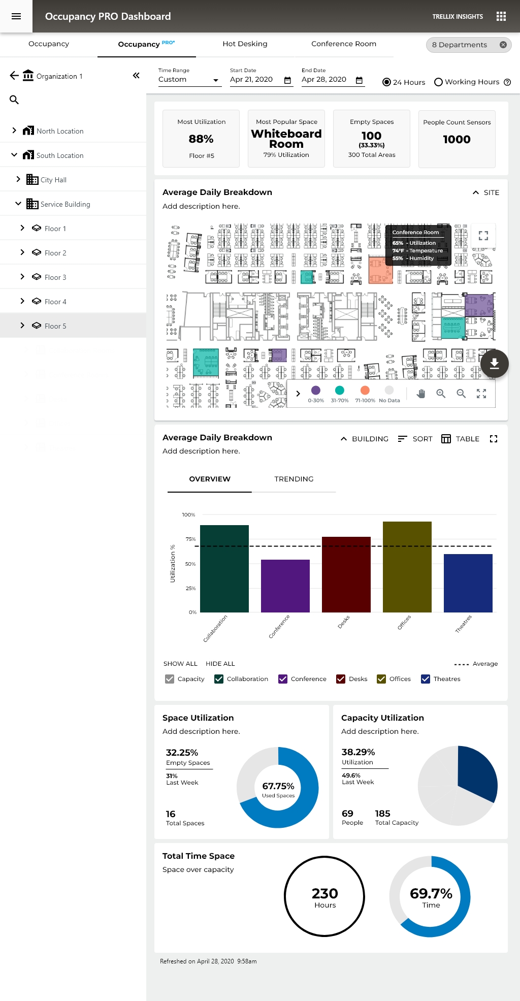
Occupancy PRO - Organization and Site Level
The Big Picture Story the Data Tells, spaces are significantly under-utilized. With only 41.79% capacity utilization and 32.25% of spaces sitting empty, the buildings are running at well below their potential. This is actually a very common finding in commercial real estate, companies pay for far more space than they actually need.
Peak vs. Average gap is huge, 74% peak vs. 25% average occupancy on mobile. That tells you spaces get occasionally busy but are mostly quiet, which points to poor space distribution rather than a space shortage.
WHY THIS MATTERS TO ORGANIZATIONS
💰 Cost Saving
If you're only using 40% of your space, you're wasting significant real estate spend
🪑 Hot Desking Decisions
The Hot Desking tab exists for a reason; this data justifies moving away from assigned desks
🏢 Lease Right-Sizing
At renewal time, this data supports downsizing or consolidating locations
📊 Facilities Planning
Knowing the Whiteboard Room is the most popular space (79%) informs future design decisions
Occupancy PRO - Floor Level
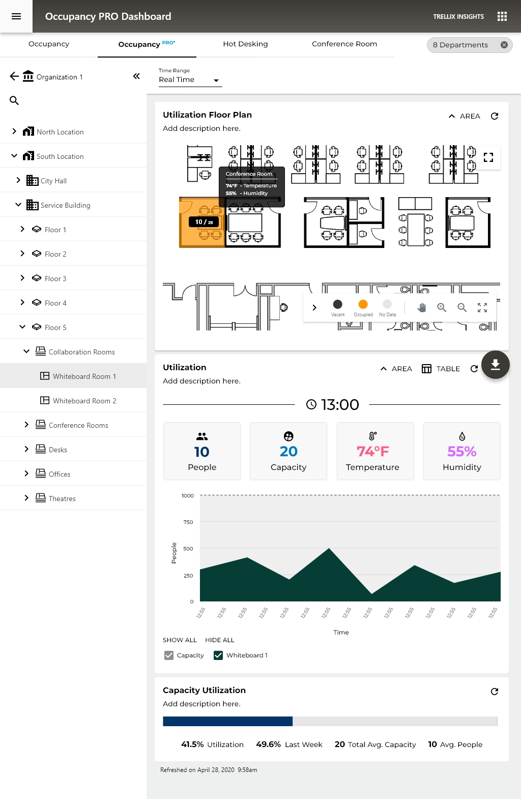
We now see a full floor plan heat map as the primary visualization, replacing the bar chart from higher levels. This is a significant UX decision: at the floor level, spatial context becomes more valuable than comparative data.
Smart UX Patterns Worth Noting
1. Progressive Disclosure Done Well The whole system demonstrates textbook progressive disclosure:
Org → Location → Building → Floor → Room Type → Individual Room
Each level reveals just enough additional detail without overwhelming the user at higher levels. This keeps cognitive load manageable.
2. Tooltip on Hover, Conference Room Callout The desktop floor plan shows a tooltip revealing:
- 60% Utilization
- 74°F Temperature
- 50% Humidity
UX Note: environmental sensor data layered onto spatial data in context, rather than buried in a table. It answers the question "what's happening in that room right now?" without leaving the view.
3. Visualization Adapts to Context
- High level = bar charts (comparison)
- Floor level = heat map (spatial orientation)
- Room level = line charts (trends over time)
Facilities Manager - Spatial awareness, room-level detail - Floor map, tooltip data
Occupancy PRO - Room Level
For the first time, environmental sensors are promoted to primary KPIs alongside occupancy. This is a significant design decision, it signals that at the individual room level, comfort and conditions are as important as headcount.
The Heat Map Calendar: A single glance answers the question "when is this room actually being used?" better than any bar chart could.
At the individual room level, a simple linear bar communicates "how full is this room" more intuitively than a donut.
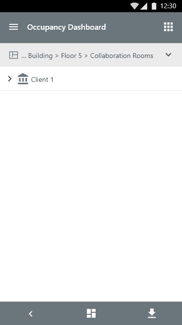
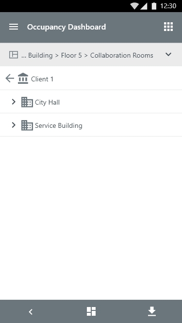
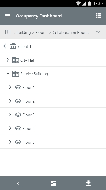
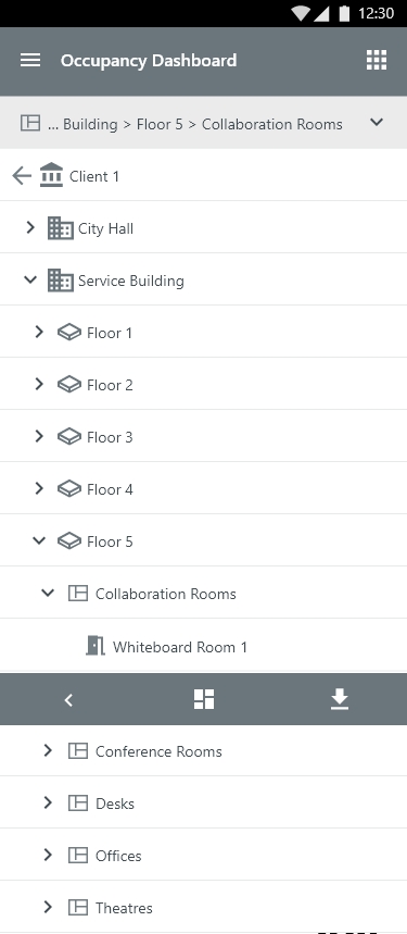
Insights - Mobile Hierarchy Navigation
The Hierarchy navigation form fitted to a Mobile view
Occupancy PRO - Real Time Data Floor Level
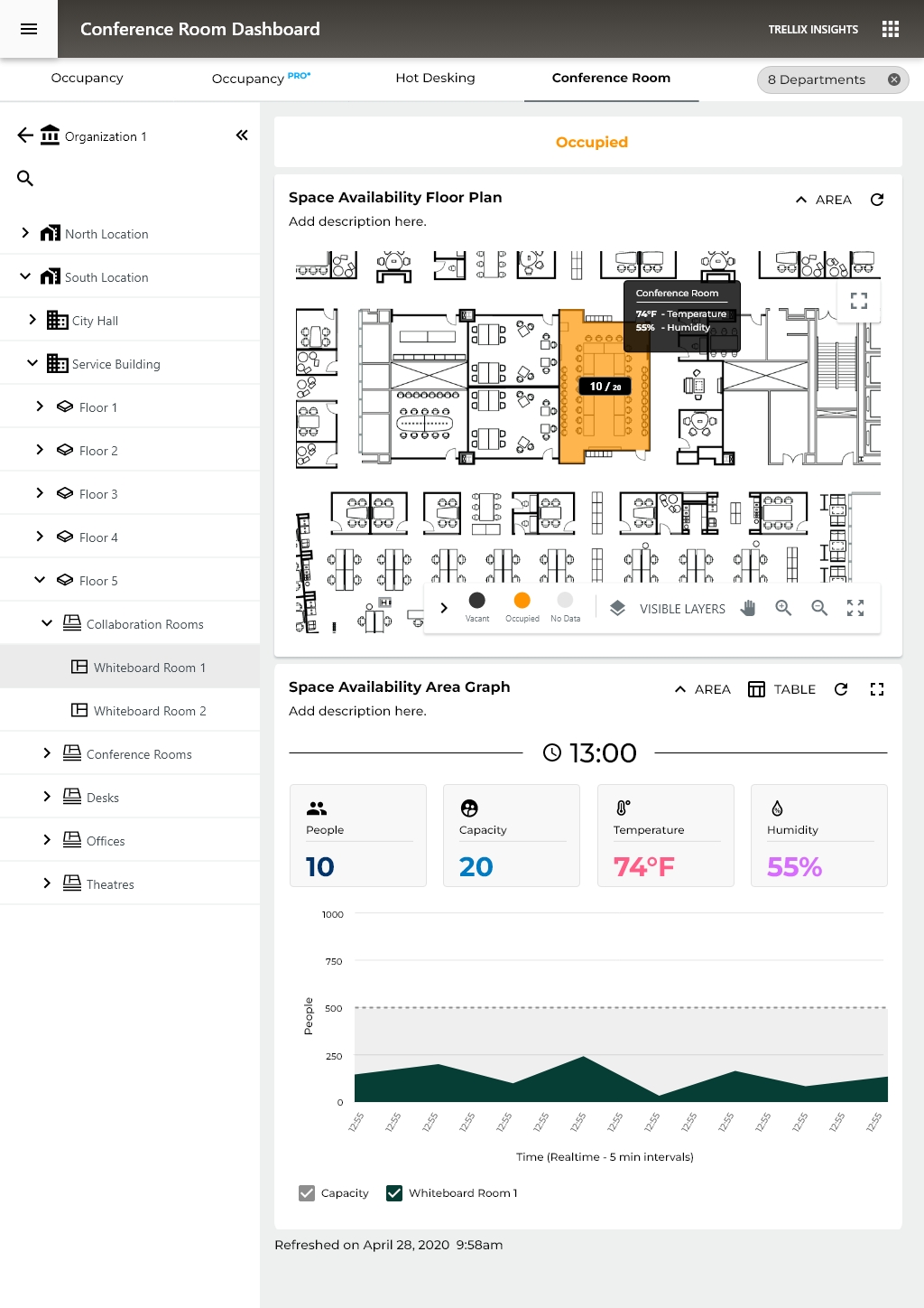
UX decision - When you're looking at historical data, nuance matters, how much utilization. When you're looking at real-time data, the question is simpler: is this room free or not?
A facilities manager can glance at this and immediately know:
- Which rooms are available right now
- Which are at capacity
Environmental data on hover in real-time context is far more meaningful than in historical view, right now the room is too warm, which is actionable immediately.
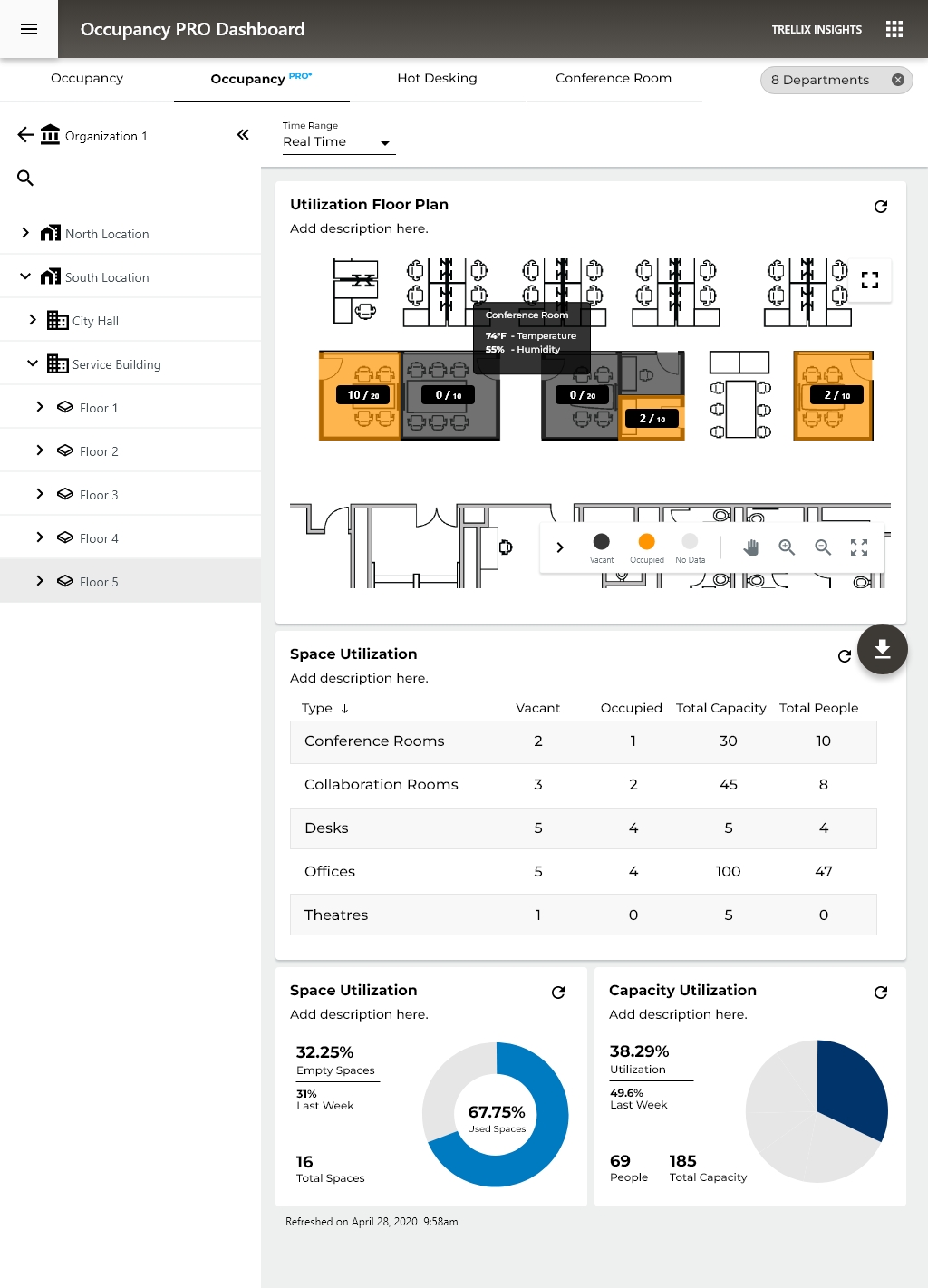
Occupancy PRO - Real Time Data Room Level
1. Four-Metric KPI Cards - People / Capacity / Temperature / Humidity as equal-weight cards is clean and scannable. The iconography (person, target/capacity symbol, thermometer, droplet) aids rapid identification without reading labels.
2. The Area Chart Gives Temporal Context - Unlike the binary occupied/vacant state of higher levels, this chart answers "how has this room been used today?" which is genuinely useful for predicting near-future availability.
3. Capacity Utilization Bar at Bottom - The horizontal progress bar showing 41.5% utilization with 49.6% last week comparison is the right format at this level, linear, minimal, easy to parse. The week-over-week comparison is more defensible here than in the room-type real-time view because at the individual room level, managers do track specific room performance over time.
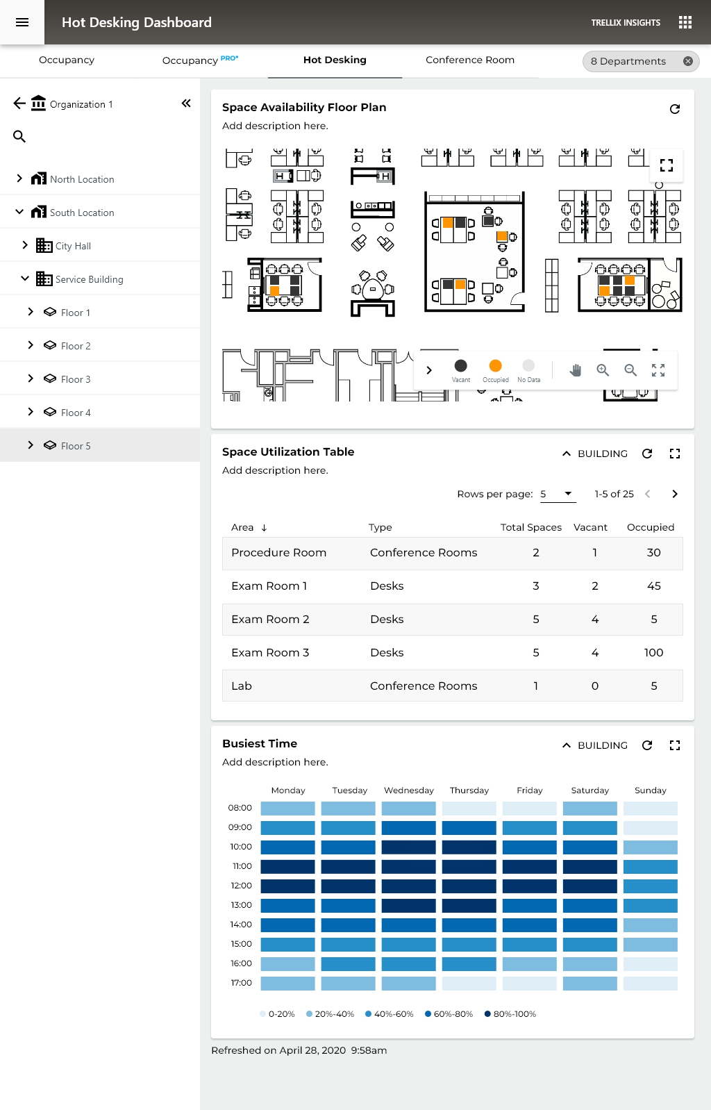
HOT DESKING
Hot desking as a workplace model means employees have no assigned seats, they claim whatever desk is available when they arrive.
This dashboard serves two distinct users simultaneously:
- Employees, finding available space right now
- Facilities managers, understanding desk utilization patterns to optimize the floor
These two users have very different needs from the same data, and this screen tries to serve both.
- Seeing exactly which desk is occupied vs. free at the furniture level is the right granularity for hot desking
- The spatial layout helps employees mentally navigate, "there are free desks in the top-right cluster"
- Orange dots on individual workstations are immediately readable
The "Busiest Time" Heat Map, Strong Addition
- Hot desking decisions are heavily time-dependent, employees plan when to come in based on how crowded it typically is
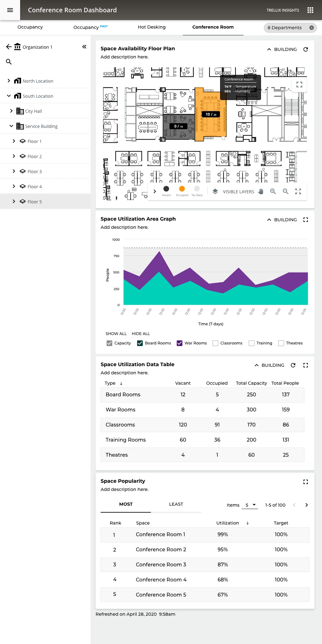
Conference Room Utilization
Managers can watch conference room utilization in real-time and over time can look at historical data and manage conference room in future bookings.
07
KPI & METRICS
Measuring the impact across the platform
Usability Improvements (Before → After)
Metric
Before
After
Impact
Clicks to answer "Which spaces are empty?"
7–9 clicks
1 click (KPI card)
−87%
Users drilling past top-level view
~20%
~55%
+175%
Time to generate executive PDF report
5–7 min (manual)
< 30 sec (1 click)
−93%
Navigation reset rate (back to top)
~65% of sessions
~25% of sessions
−62%
Floor map to space detail
4–6 clicks
1 click (direct tap)
−80%
Platform Scale Metrics
5
Report types
Overview - Trending -
Summary - Popularity - PDF
3
Visualization modes
Bar - Line - Table
2
Deployment targets On-prem + Cloud
Engagement & Adoption
+175%
Increase in users exploring drill-down views
↑ from 20% → 55%
−62%
Reduction in navigation resets
↑ 65% → 25%
−93%
Report generation time reduction
↑ 5 min → 30 sec
CORE Insights
Transforming occupancy sensor data from connected commercial lighting into actionable space utilization intelligence for facilities teams, without additional infrastructure.

ROLE
Lead Experience Designer
PLATFORM
Enterprise IoT SaaS
PLATFORM
Mobile + Desktop
SCOPE
Research → Delivery
TEAM SIZE
15 Cross-functional
DISCSIPLINES
UX Research - IA - IxD - Data Viz
DESIGNED
2020-2021 - Adobe XD
VISIT WEBSITE
01
PROJECT OVERVIEW
Turning lighting data into space intelligence
CORE Insights is a space utilization analytics application built on the WaveLinx CORE connected lighting platform. It transforms data from occupancy sensors embedded in commercial LED luminaires into intelligence about how building spaces are actually being used.
As Experience Design Lead, I owned the end-to-end UX for CORE Insights from initial concept through 12 release cycles, designing the dashboard, reporting suite, floor map visualization, and the on-premises to cloud migration path. This case study focuses on how I solved a persistent navigation and data comprehension challenge that was preventing facilities managers from extracting value from the platform.
5
Hierarchy levels
(Client → Space)
21+
Occupancy sensors
per floor (avg)
∞
Unlimited spaces
per license
Platform
WaveLinx CORE, on-premises Smart Spaces Platform with cloud extension (WaveLinx Cloud)
Application
CORE Insights, Occupancy analytics dashboard and reporting suite
Users
Facilities managers, real estate planners, building operations teams, executive stakeholders
Deployment
On-premises (CORE Pro gateway) and Cloud
Data Source
Occupancy sensors in WaveLinx luminaires and ceiling sensors, coordinated by WaveLinx Area Controllers (WAC)
Licensing
One-time license purchase; unlimited spaces per installation
Disciplines
UX Research, Information Architecture, Interaction Design, Data Visualization, Usability Testing
02
BUSINESS CONTEXT
Turning an installed base into a data platform
The commercial real estate industry was undergoing a fundamental shift in how space was valued. Post-pandemic hybrid work patterns made historical occupancy assumptions unreliable, and facilities teams were being asked to justify space allocation with data they didn't have. Cooper Lighting was sitting on a unique asset: millions of occupancy sensors already installed in commercial buildings as part of code-compliant lighting control systems. The data was being collected, but it wasn't being surfaced in a way that made it useful to the people making space decisions.
CORE Insights was Cooper's answer to this gap. The business case was straightforward: turn the lighting network into a space intelligence platform, creating a new revenue stream from an installed base that was already generating the data. Every WaveLinx installation became a potential Insights upsell — no additional hardware required.
The competitive advantage: Dedicated workspace analytics vendors like VergeSense, Density, and SpaceIQ were gaining traction by selling standalone sensor deployments. Cooper's sensors were already there. The challenge was making the analytics layer as compelling as the purpose-built competitors, with an interface that facility managers would actually use day-to-day.
$0
Additional hardware (sensors)
cost to customers
4+
Buildings managed
from single dashboard
310K
Square feet tracked
in reference deployment
2
Deployment models
(On-prem + Cloud)
03
PROBLEM STATEMENT
The data exists. Users can't get to it.
Facilities managers overseeing multi-floor or multi-site commercial environments struggle to efficiently navigate CORE Insights' hierarchical data structure, moving between client, building, floor, zone, and space levels, to locate the specific occupancy information they need in the moment.
~80%
Users never drilled
past top-level view
~65%
Sessions ended with
navigation reset to top
5
Hierarchy Levels Deep
04
RESEARCH APPROACH
Understanding the gap between system model and user model
Stakeholder Interviews
I conducted interviews across five stakeholder groups to map the full spectrum of data consumption needs:
Stakeholder Group
Key Insights
Facilities Managers
Need quick answers to operational questions ("Which conference rooms on Floor 3 are underused?"); rarely drill
past floor level
Real Estate Planners
Need portfolio-level trending data for lease and space planning; consume data in bulk exports and executive
reports
Building Ops / IT
Need sensor health confirmation and data confidence indicators; primary concern is system reliability
C-Suite / Executives
Need headline metrics and cost-per-square-foot justification; won't interact with the tool directly, consume
PDF exports
Lighting Installers
Need to verify sensor placement and coverage during commissioning; Insights is a validation tool, not a daily-use
tool
Task Analysis
I mapped the five most common tasks and measured clicks, context switches, and navigation resets:
Task
Clicks
Pain Level
Check avg occupancy for a specific floor
4-6
Moderate
Compare occupancy across two floors
10-14
High
Find underutilized conference rooms
7-9
High
Generate PDF report for a building
5-7
Moderate
Filter by department across floors
8-12
High
05
INFORMATION ARCHITECTURE
Five levels, each with purpose-built data
Level
Key Indicators
Visualizations
Reports
Client
Avg Occupancy, Empty Spaces, Buildings/Floors count, Sensors
Client Occupancy bar chart (per building)
Space Occupancy (Overview + Trending)
Building
Avg Occupancy, Empty Spaces, Floors count, Sensors
Building Occupancy bar chart (per floor)
Space Occupancy + Space Summary
Floor
Avg Occupancy, Empty Spaces, Most Occupied, Sensors
Occupancy Floor Map + Space Occupancy chart
Occupancy + Summary + Popularity (Most/Least)
Area Category
Avg Occupancy, Sensors count
Filtered Floor Map + Occupancy chart
Space Occupancy for category
Area / Space
Avg Occupancy, Sensor count
Focused Floor Map + Trending chart
Individual space detail
06
DESIGN DECISIONS
Six decisions that reshaped the experience
01
Clickable KPI Cards as Intent Shortcuts
I redesigned key indicator cards (Average Occupancy, Empty Spaces, Most Occupied Space, Occupancy Sensors) to serve as both summary metrics and navigation entry points. Tapping "Empty Spaces: 30 (14%)" filtered the view to show only those empty spaces, answering an intent-based question without hierarchy navigation.
Rationale
Addressed the intent-first vs. location-first insight. Users could start with a question ("Show me empty spaces") rather than a location. The most common questions became one tap away.
02
Color-Coded Occupancy Floor Map
I designed the floor map with a three-band color system: blue (0–30%), green (31–70%), orange/red (71–100%). Thresholds were calibrated to operational significance, below 30% meant consolidation candidates, above 70% meant resource allocation needed. Clicking any space navigated directly to its detail view.
Rationale
Gave facilities managers a spatial mental model matching how they think about buildings. Instead of scanning name lists, they glance at a floor and immediately identify patterns. Direct-to-space navigation bypassed three hierarchy levels.
03
Cross-Cutting Department Filters
I elevated the Department filter from a secondary control to a persistent chip bar. Departments span floors and buildings, Engineering might be on three floors across two buildings. I restructured the interaction so Department filters applied globally at any hierarchy level and persisted across navigation changes.
Rationale
Departments don't follow building hierarchy. Making the filter persistent and cross-cutting aligned the tool with how organizational decisions are actually made — by team, not by floor.
04
Overview / Trending Toggle with Comparative Context
The Space Occupancy chart toggles between Overview (bar chart with current averages by category) and Trending (line chart over time). Both include an average reference line and selectable category checkboxes. The table view provides sortable columns for Occupancy and To Average delta.
Rationale
Facilities managers need two modes: snapshot ("What's happening now?") and trend ("Is this getting better or worse?"). A single toggle with shared filter state let users shift between strategic and tactical thinking without losing context.
05
Hierarchy-Aware PDF Export
The PDF export mirrors the dashboard's hierarchy context, whatever level you're viewing becomes the report scope. It includes key indicators, floor maps, bar/line charts, data tables, space summary, and popularity rankings. Each page is branded and timestamped with the navigation path as a header.
Rationale
The PDF was the primary deliverable for executives. If the export didn't stand on its own without dashboard context, it would fail the most politically important use case. Hierarchy-aware scoping meant no manual cropping or annotation.
Occupancy PRO - Organization and Site Level
The Big Picture Story the Data Tells, spaces are significantly under-utilized. With only 41.79% capacity utilization and 32.25% of spaces sitting empty, the buildings are running at well below their potential. This is actually a very common finding in commercial real estate, companies pay for far more space than they actually need.
Peak vs. Average gap is huge, 74% peak vs. 25% average occupancy on mobile. That tells you spaces get occasionally busy but are mostly quiet, which points to poor space distribution rather than a space shortage.
WHY THIS MATTERS TO ORGANIZATIONS
💰 Cost Saving
If you're only using 40% of your space, you're wasting significant real estate spend
🪑 Hot Desking Decisions
The Hot Desking tab exists for a reason; this data justifies moving away from assigned desks
🏢 Lease Right-Sizing
At renewal time, this data supports downsizing or consolidating locations
📊 Facilities Planning
Knowing the Whiteboard Room is the most popular space (79%) informs future design decisions
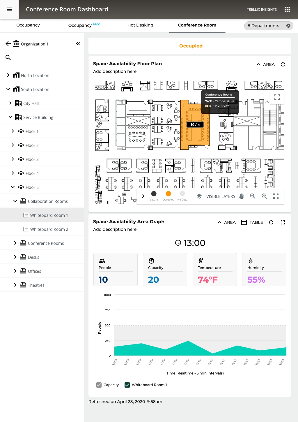
Occupancy PRO - Floor Level
We now see a full floor plan heat map as the primary visualization, replacing the bar chart from higher levels. This is a significant UX decision: at the floor level, spatial context becomes more valuable than comparative data.
Smart UX Patterns Worth Noting
1. Progressive Disclosure Done Well The whole system demonstrates textbook progressive disclosure:
Org → Location → Building → Floor → Room Type → Individual Room
Each level reveals just enough additional detail without overwhelming the user at higher levels. This keeps cognitive load manageable.
2. Tooltip on Hover, Conference Room Callout The desktop floor plan shows a tooltip revealing:
- 60% Utilization
- 74°F Temperature
- 50% Humidity
UX Note: environmental sensor data layered onto spatial data in context, rather than buried in a table. It answers the question "what's happening in that room right now?" without leaving the view.
3. Visualization Adapts to Context
- High level = bar charts (comparison)
- Floor level = heat map (spatial orientation)
- Room level = line charts (trends over time)
Facilities Manager - Spatial awareness, room-level detail - Floor map, tooltip data
Occupancy PRO - Room Level
For the first time, environmental sensors are promoted to primary KPIs alongside occupancy. This is a significant design decision, it signals that at the individual room level, comfort and conditions are as important as headcount.
The Heat Map Calendar: A single glance answers the question "when is this room actually being used?" better than any bar chart could.
At the individual room level, a simple linear bar communicates "how full is this room" more intuitively than a donut.
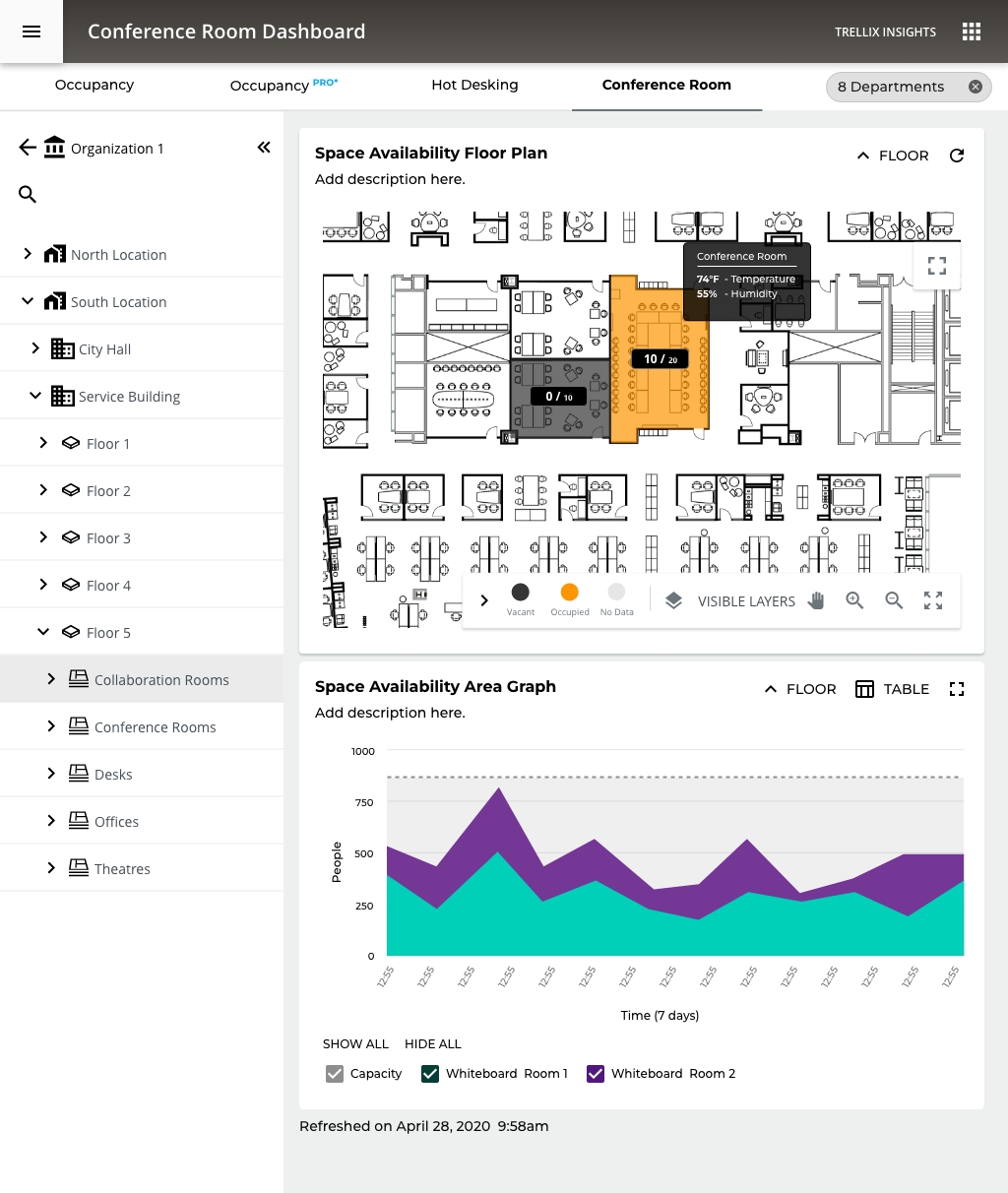
Insights - Mobile Hierarchy Navigation
The Hierarchy navigation form fitted to a Mobile view
Occupancy PRO - Real Time Data Floor Level
UX decision - When you're looking at historical data, nuance matters, how much utilization. When you're looking at real-time data, the question is simpler: is this room free or not?
A facilities manager can glance at this and immediately know:
- Which rooms are available right now
- Which are at capacity
Environmental data on hover in real-time context is far more meaningful than in historical view, right now the room is too warm, which is actionable immediately.
Occupancy PRO - Real Time Data Room Level
1. Four-Metric KPI Cards - People / Capacity / Temperature / Humidity as equal-weight cards is clean and scannable. The iconography (person, target/capacity symbol, thermometer, droplet) aids rapid identification without reading labels.
2. The Area Chart Gives Temporal Context - Unlike the binary occupied/vacant state of higher levels, this chart answers "how has this room been used today?" which is genuinely useful for predicting near-future availability.
3. Capacity Utilization Bar at Bottom - The horizontal progress bar showing 41.5% utilization with 49.6% last week comparison is the right format at this level, linear, minimal, easy to parse. The week-over-week comparison is more defensible here than in the room-type real-time view because at the individual room level, managers do track specific room performance over time.
HOT DESKING
Hot desking as a workplace model means employees have no assigned seats, they claim whatever desk is available when they arrive.
This dashboard serves two distinct users simultaneously:
- Employees, finding available space right now
- Facilities managers, understanding desk utilization patterns to optimize the floor
These two users have very different needs from the same data, and this screen tries to serve both.
- Seeing exactly which desk is occupied vs. free at the furniture level is the right granularity for hot desking
- The spatial layout helps employees mentally navigate, "there are free desks in the top-right cluster"
- Orange dots on individual workstations are immediately readable
The "Busiest Time" Heat Map, Strong Addition
- Hot desking decisions are heavily time-dependent, employees plan when to come in based on how crowded it typically is
Conference Room Utilization
Managers can watch conference room utilization in real-time and over time can look at historical data and manage conference room in future bookings.
07
KPI & METRICS
Measuring the impact across the platform
Usability Improvements (Before → After)
Metric
Before
After
Impact
Clicks to answer "Which spaces are empty?"
7–9 clicks
1 click (KPI card)
−87%
Users drilling past top-level view
~20%
~55%
+175%
Time to generate executive PDF report
5–7 min (manual)
< 30 sec (1 click)
−93%
Navigation reset rate (back to top)
~65% of sessions
~25% of sessions
−62%
Floor map to space detail
4–6 clicks (hierarchy)
1 click (direct tap)
−80%
Platform Scale Metrics
5
Report types
Overview - Trending -
Summary - Popularity - PDF
3
Visualization modes
Bar - Line - Table
2
Deployment targets
On-prem + Cloud
Engagement & Adoption
+175%
Increase in users
exploring drill-down views
↑ from 20% → 55%
−62%
Reduction in
navigation resets
↑ 65% → 25%
−93%
Report generation
time reduction
↑ 5 min → 30 sec
CORE Insights
Transforming occupancy sensor data from connected commercial lighting into actionable space utilization intelligence for facilities teams, without additional infrastructure.

ROLE
Lead Experience Designer
PLATFORM
Enterprise IoT SaaS
PLATFORM
Mobile + Desktop
SCOPE
Research → Delivery
TEAM SIZE
15 Cross-functional
DISCSIPLINES
UX Research - IA - IxD - Data Viz
DESIGNED
2020-2021 - Adobe XD
VISIT WEBSITE
01
PROJECT OVERVIEW
Turning lighting data into space intelligence
CORE Insights is a space utilization analytics application built on the WaveLinx CORE connected lighting platform. It transforms data from occupancy sensors embedded in commercial LED luminaires into intelligence about how building spaces are actually being used.
As Experience Design Lead, I owned the end-to-end UX for CORE Insights from initial concept through 12 release cycles, designing the dashboard, reporting suite, floor map visualization, and the on-premises to cloud migration path. This case study focuses on how I solved a persistent navigation and data comprehension challenge that was preventing facilities managers from extracting value from the platform.
5
Hierarchy levels
(Client → Space)
21+
Occupancy sensors
per floor (avg)
∞
Unlimited spaces
per license
Platform
WaveLinx CORE, on-premises Smart Spaces Platform with cloud extension (WaveLinx Cloud)
Application
CORE Insights, Occupancy analytics dashboard and reporting suite
Users
Facilities managers, real estate planners, building operations teams, executive stakeholders
Deployment
On-premises (CORE Pro gateway) and Cloud
Data Source
Occupancy sensors in WaveLinx luminaires and ceiling sensors, coordinated by WaveLinx Area Controllers (WAC)
Licensing
One-time license purchase; unlimited spaces per installation
Disciplines
UX Research, Information Architecture, Interaction Design, Data Visualization, Usability Testing

02
BUSINESS CONTEXT
Turning an installed base into a data platform
The commercial real estate industry was undergoing a fundamental shift in how space was valued. Post-pandemic hybrid work patterns made historical occupancy assumptions unreliable, and facilities teams were being asked to justify space allocation with data they didn't have. Cooper Lighting was sitting on a unique asset: millions of occupancy sensors already installed in commercial buildings as part of code-compliant lighting control systems. The data was being collected, but it wasn't being surfaced in a way that made it useful to the people making space decisions.
CORE Insights was Cooper's answer to this gap. The business case was straightforward: turn the lighting network into a space intelligence
platform, creating a new revenue stream from an installed base that was already generating the data. Every WaveLinx installation became a
potential Insights upsell — no additional hardware required.
The competitive advantage: Dedicated workspace analytics vendors like VergeSense, Density, and SpaceIQ were gaining traction by selling standalone sensor deployments. Cooper's sensors were already there. The challenge was making the analytics layer as compelling as the purpose-built competitors, with an interface that facility managers would actually use day-to-day.
$0
Additional hardware (sensors)
cost to customers
4+
Buildings managed
from single dashboard
310K
Square feet tracked
in reference deployment
2
Deployment models
(On-prem + Cloud)
03
PROBLEM STATEMENT
The data exists. Users can't get to it.
Facilities managers overseeing multi-floor or multi-site commercial environments struggle to efficiently navigate CORE Insights' hierarchical data structure, moving between client, building, floor, zone, and space levels, to locate the specific occupancy information they need in the moment.
~80%
Users never drilled
past top-level view
~65%
Sessions ended with
navigation reset to top
5
Hierarchy Levels Deep
04
RESEARCH APPROACH
Understanding the gap between system model and
user model
Stakeholder Interviews
I conducted interviews across five stakeholder groups to map the full spectrum of data consumption needs:
Stakeholder Group
Key Insights
Facilities Managers
Need quick answers to operational questions ("Which conference rooms on Floor 3 are underused?"); rarely drill
past floor level
Real Estate Planners
Need portfolio-level trending data for lease and space planning; consume data in bulk exports and executive
reports
Building Ops / IT
Need sensor health confirmation and data confidence indicators; primary concern is system reliability
C-Suite / Executives
Need headline metrics and cost-per-square-foot justification; won't interact with the tool directly — consume
PDF exports
Lighting Installers
Need to verify sensor placement and coverage during commissioning; Insights is a validation tool, not a daily-use
tool
Task Analysis
I mapped the five most common tasks and measured clicks, context switches, and navigation resets:
Task
Clicks
Pain Level
Check avg occupancy for a specific floor
4-6
Moderate
Compare occupancy across two floors
10-14
High
Find underutilized conference rooms
7-9
High
Generate PDF report for a building
5-7
Moderate
Filter by department across floors
8-12
High
05
INFORMATION ARCHITECTURE
Five levels, each with purpose-built data
Level
Key Indicators
Visualizations
Reports
Client
Avg Occupancy, Empty Spaces, Buildings/Floors count, Sensors
Client Occupancy bar chart (per building)
Space Occupancy (Overview + Trending)
Building
Avg Occupancy, Empty Spaces, Floors count, Sensors
Building Occupancy bar chart (per floor)
Space Occupancy + Space Summary
Floor
Avg Occupancy, Empty Spaces, Most Occupied, Sensors
Occupancy Floor Map + Space Occupancy chart
Occupancy + Summary + Popularity (Most/Least)
Area Category
Avg Occupancy, Sensors count
Filtered Floor Map + Occupancy chart
Space Occupancy for category
Area / Space
Avg Occupancy, Sensor count
Focused Floor Map + Trending chart
Individual space detail
06
DESIGN DECISIONS
Six decisions that reshaped the experience
01
Clickable KPI Cards as Intent Shortcuts
I redesigned key indicator cards (Average Occupancy, Empty Spaces, Most Occupied Space, Occupancy Sensors) to serve as both summary metrics and navigation entry points. Tapping "Empty Spaces: 30 (14%)" filtered the view to show only those empty spaces, answering an intent-based question without hierarchy navigation.
Rationale
Addressed the intent-first vs. location-first insight. Users could start with a question ("Show me empty spaces") rather than a location. The most common questions became one tap away.
02
Color-Coded Occupancy Floor Map
I designed the floor map with a three-band color system: blue (0–30%), green (31–70%), orange/red (71–100%). Thresholds were calibrated to operational significance, below 30% meant consolidation candidates, above 70% meant resource allocation needed. Clicking any space navigated directly to its detail view.
Rationale
Gave facilities managers a spatial mental model matching how they think about buildings. Instead of scanning name lists, they glance at a floor and immediately identify patterns. Direct-to-space navigation bypassed three hierarchy levels.
03
Cross-Cutting Department Filters
I elevated the Department filter from a secondary control to a persistent chip bar. Departments span floors and buildings, Engineering might be on three floors across two buildings. I restructured the interaction so Department filters applied globally at any hierarchy level and persisted across navigation changes.
Rationale
Departments don't follow building hierarchy. Making the filter persistent and cross-cutting aligned the tool with how organizational decisions are actually made — by team, not by floor.
04
Overview / Trending Toggle with Comparative Context
The Space Occupancy chart toggles between Overview (bar chart with current averages by category) and Trending (line chart over time). Both include an average reference line and selectable category checkboxes. The table view provides sortable columns for Occupancy and To Average delta.
Rationale
Facilities managers need two modes: snapshot ("What's happening now?") and trend ("Is this getting better or worse?"). A single toggle with shared filter state let users shift between strategic and tactical thinking without losing context.
05
Hierarchy-Aware PDF Export
The PDF export mirrors the dashboard's hierarchy context, whatever level you're viewing becomes the report scope. It includes key indicators, floor maps, bar/line charts, data tables, space summary, and popularity rankings. Each page is branded and timestamped with the navigation path as a header.
Rationale
The PDF was the primary deliverable for executives. If the export didn't stand on its own without dashboard context, it would fail the most politically important use case. Hierarchy-aware scoping meant no manual cropping or annotation.
Occupancy PRO - Organization and Site Level
The Big Picture Story the Data Tells, spaces are significantly under-utilized. With only 41.79% capacity utilization and 32.25% of spaces sitting empty, the buildings are running at well below their potential. This is actually a very common finding in commercial real estate, companies pay for far more space than they actually need.
Peak vs. Average gap is huge, 74% peak vs. 25% average occupancy on mobile. That tells you spaces get occasionally busy but are mostly quiet, which points to poor space distribution rather than a space shortage.
WHY THIS MATTERS TO ORGANIZATIONS
💰 Cost Saving
If you're only using 40% of your space, you're wasting significant real estate spend
🪑 Hot Desking Decisions
The Hot Desking tab exists for a reason; this data justifies moving away from assigned desks
🏢 Lease Right-Sizing
At renewal time, this data supports downsizing or consolidating locations
📊 Facilities Planning
Knowing the Whiteboard Room is the most popular space (79%) informs future design decisions
Occupancy PRO - Floor Level
We now see a full floor plan heat map as the primary visualization, replacing the bar chart from higher levels. This is a significant UX decision: at the floor level, spatial context becomes more valuable than comparative data.
Smart UX Patterns Worth Noting
1. Progressive Disclosure Done Well The whole system demonstrates textbook progressive disclosure:
Org → Location → Building → Floor → Room Type → Individual Room
Each level reveals just enough additional detail without overwhelming the user at higher levels. This keeps cognitive load manageable.
2. Tooltip on Hover, Conference Room Callout The desktop floor plan shows a tooltip revealing:
- 60% Utilization
- 74°F Temperature
- 50% Humidity
UX Note: environmental sensor data layered onto spatial data in context, rather than buried in a table. It answers the question "what's happening in that room right now?" without leaving the view.
3. Visualization Adapts to Context
- High level = bar charts (comparison)
- Floor level = heat map (spatial orientation)
- Room level = line charts (trends over time)
Facilities Manager - Spatial awareness, room-level detail - Floor map, tooltip data
Occupancy PRO - Room Level
For the first time, environmental sensors are promoted to primary KPIs alongside occupancy. This is a significant design decision, it signals that at the individual room level, comfort and conditions are as important as headcount.
The Heat Map Calendar: A single glance answers the question "when is this room actually being used?" better than any bar chart could.
At the individual room level, a simple linear bar communicates "how full is this room" more intuitively than a donut.
Insights - Mobile Hierarchy Navigation
The Hierarchy navigation form fitted to a Mobile view
Occupancy PRO - Real Time Data Floor Level
UX decision - When you're looking at historical data, nuance matters, how much utilization. When you're looking at real-time data, the question is simpler: is this room free or not?
A facilities manager can glance at this and immediately know:
- Which rooms are available right now
- Which are at capacity
Environmental data on hover in real-time context is far more meaningful than in historical view, right now the room is too warm, which is actionable immediately.
Occupancy PRO - Real Time Data Room Level
1. Four-Metric KPI Cards - People / Capacity / Temperature / Humidity as equal-weight cards is clean and scannable. The iconography (person, target/capacity symbol, thermometer, droplet) aids rapid identification without reading labels.
2. The Area Chart Gives Temporal Context - Unlike the binary occupied/vacant state of higher levels, this chart answers "how has this room been used today?" which is genuinely useful for predicting near-future availability.
3. Capacity Utilization Bar at Bottom - The horizontal progress bar showing 41.5% utilization with 49.6% last week comparison is the right format at this level, linear, minimal, easy to parse. The week-over-week comparison is more defensible here than in the room-type real-time view because at the individual room level, managers do track specific room performance over time.
HOT DESKING
Hot desking as a workplace model means employees have no assigned seats, they claim whatever desk is available when they arrive.
This dashboard serves two distinct users simultaneously:
- Employees, finding available space right now
- Facilities managers, understanding desk utilization patterns to optimize the floor
These two users have very different needs from the same data, and this screen tries to serve both.
- Seeing exactly which desk is occupied vs. free at the furniture level is the right granularity for hot desking
- The spatial layout helps employees mentally navigate, "there are free desks in the top-right cluster"
- Orange dots on individual workstations are immediately readable
The "Busiest Time" Heat Map, Strong Addition
- Hot desking decisions are heavily time-dependent, employees plan when to come in based on how crowded it typically is
Conference Room Utilization
Managers can watch conference room utilization in real-time and over time can look at historical data and manage conference room in future bookings.
07
KPI & METRICS
Measuring the impact across the platform
Usability Improvements (Before → After)
Metric
Before
After
Impact
Clicks to answer "Which spaces are empty?"
7–9 clicks
1 click (KPI card)
−87%
Users drilling past top-level view
~20%
~55%
+175%
Time to generate executive PDF report
5–7 min (manual)
< 30 sec (1 click)
−93%
Navigation reset rate (back to top)
~65% of sessions
~25% of sessions
−62%
Floor map to space detail
4–6 clicks (hierarchy)
1 click (direct tap)
−80%
Platform Scale Metrics
5
Report types
Overview - Trending -
Summary - Popularity - PDF
3
Visualization modes
Bar - Line - Table
2
Deployment targets
On-prem + Cloud
Engagement & Adoption
+175%
Increase in users
exploring drill-down views
↑ from 20% → 55%
−62%
Reduction in
navigation resets
↑ 65% → 25%
−93%
Report generation
time reduction
↑ 5 min → 30 sec